 We’ve just finished our first round of tests with one of our new partners & have interesting results that can help in your next optimization test.
The product enables customers to design & personalize their own invitations, greeting cards, slideshows and more. As a photo service, they allow to quickly turn life’s moments into magical digital creations to share with others.
The Goal
The test goal was simple: increase the amount of sales. The status was that users would download the app and pay for the service, our mission was to get more people paying.
At my latest event I spoke about the reason people buy products or services.
To put in a nutshell: We buy products because of what they make us feel about others and ourselves. This is the basic psychological status of our purchasing habits. This is where Neuromarketing hacks step in.
- For example, people who buy Apple products buy them to feel sophisticated, unique, different & smart. Yes the product is great too, but it comes with a dream and a sense of achievement. Price is not a factor (mostly).
There are many companies selling the same product or service as you are, and it is up to you to give your potential clients a promise, to sell the dream that comes with your product and not its features. This is what we set out to do in our test using different Neuromarketing tactics.
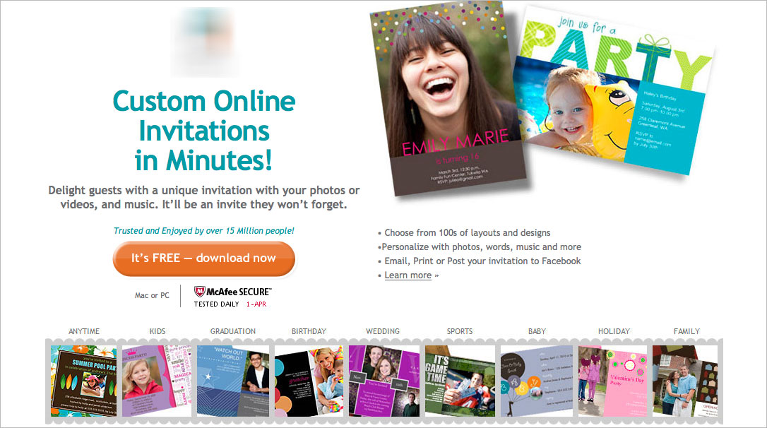
The original landing page
Once we reviewed our client’s landing pages and completed our research we set off to design a new funnel.
Our research showed that we should focus on the ‘promise’. We won’t be selling invitations or birthday cards, we’ll be selling an unforgettable event, the dream of a perfect event and the perfect wedding/birthday that everyone will remember.
The Test
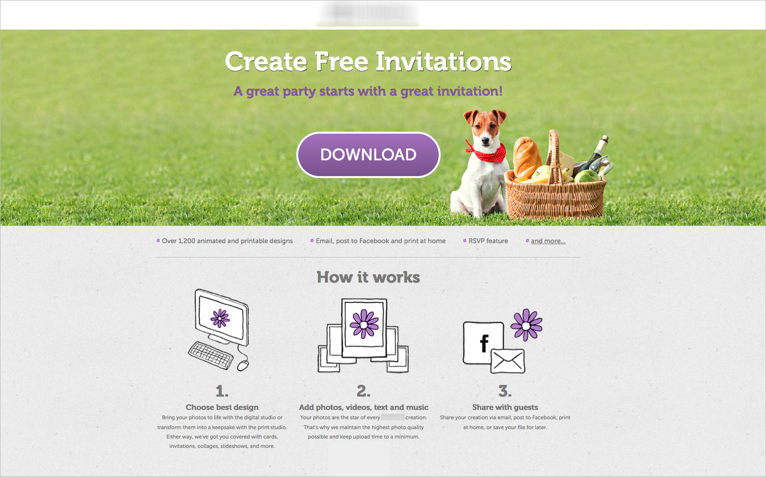
Variation 1
Variation 2
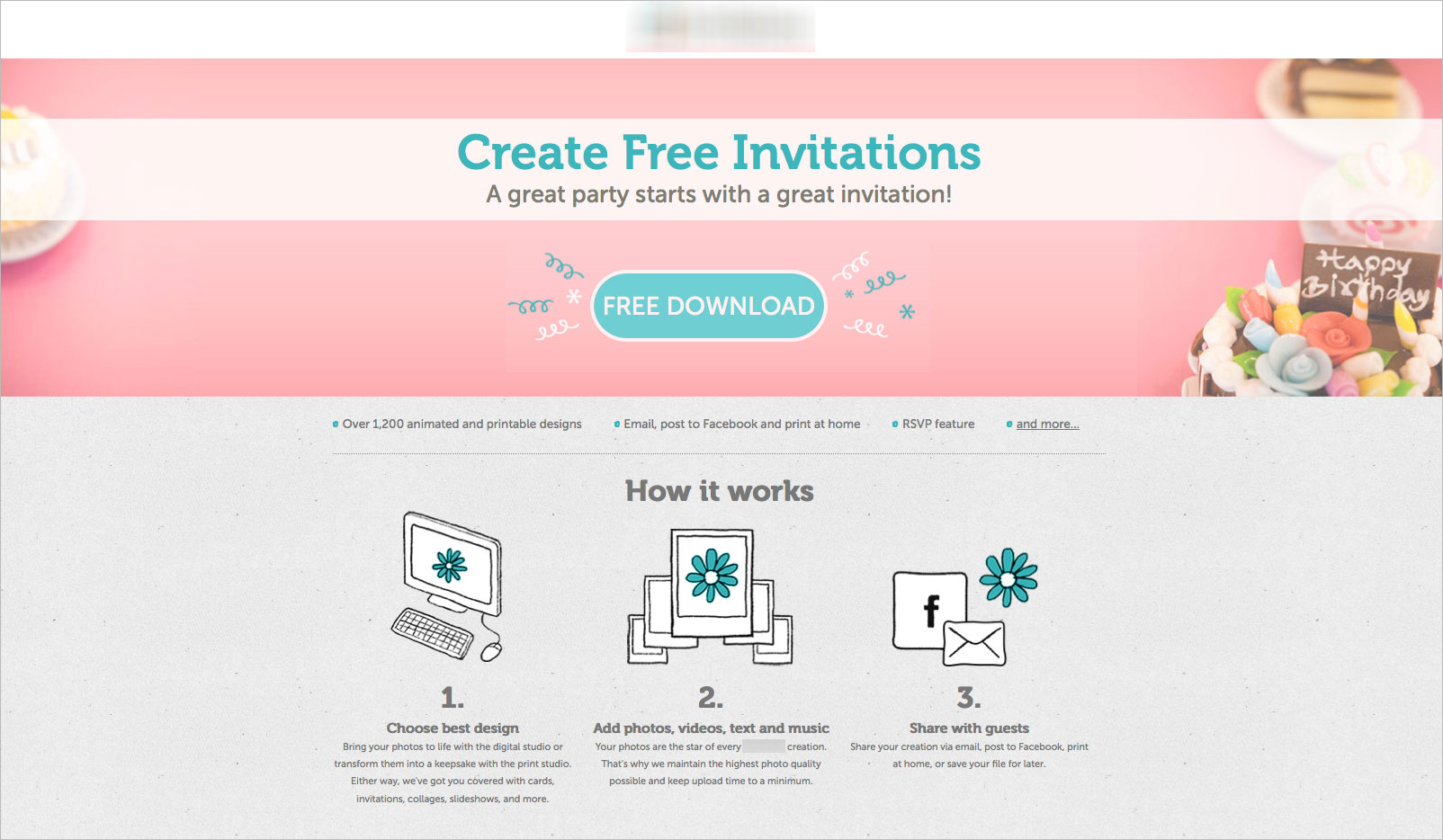
The first step in the funnel was creating the landing pages. Each landing page was designed by text and image to create an experience that enhances fun, love and cherished moments that will come.
The pink colors were chosen to increase femininity and romance while the green color was chosen to establish wealth, relaxation, cool. Green is also known as the easiest color for the eyes to process that making it easier for people to focus on the action (more about the emotional power of color and its effect on conversion optimization).
Other Neuromarketing hacks were introduced via messaging and text and in addition each landing page contained a fair amount of data below the fold helping users and navigating them through each step of the way.
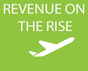
The Results:
Ok be honest, without looking at the results below: which landing page do you think won? (Comment below, we’d love to know)
So, the most interesting thing we established and always tell our clients is that every part of the funnel matters, from banner to checkout. Usually when companies want to improve their online sales, the first place they want to optimize is the checkout but that’s not always the right way to go. What matters is the process, and doing things in a methodological way that can educate us and help us establish a conversion optimization strategy.
And here’s how we prove it; the landing pages didn’t have a huge increase in downloads. Even though at first glance the page is about downloading the app, we didn’t see a large increase in downloads, what we did see is an 65% increase in revenue in the first round of testing! The similar amount of people were downloading the platform but 65% more were purchasing the product. This is to do with the messaging and emotional triggers used on the landing page and why it is important to know where to start optimizing. The entire funnel is important, emotional conversion optimization is about making the small changes along the funnel that trigger something in the user that won’t necessarily increase that particular part of the funnel but will have a huge impact on the funnel as a whole.
We’re already working on the next steps in the funnel and the landing page optimization process, we’ll keep you posted as we go. By the way, the winner is variation 1 
Looking forward to your comments!
Simple Neuromarketing Hacks That Increased Revenue by 65% In The First Round 5.00/5 (100.00%) 5 votes
Related Posts


Simple Neuromarketing Hacks That Increased Revenue by 65% In The First Round
The product enables customers to design & personalize their own invitations, greeting cards, slideshows and more. As a photo service, they allow to quickly turn life’s moments into magical digital creations to share with others.
The Goal
The test goal was simple: increase the amount of sales. The status was that users would download the app and pay for the service, our mission was to get more people paying.
At my latest event I spoke about the reason people buy products or services.
To put in a nutshell: We buy products because of what they make us feel about others and ourselves. This is the basic psychological status of our purchasing habits. This is where Neuromarketing hacks step in.
There are many companies selling the same product or service as you are, and it is up to you to give your potential clients a promise, to sell the dream that comes with your product and not its features. This is what we set out to do in our test using different Neuromarketing tactics.
The original landing page
Once we reviewed our client’s landing pages and completed our research we set off to design a new funnel.
Our research showed that we should focus on the ‘promise’. We won’t be selling invitations or birthday cards, we’ll be selling an unforgettable event, the dream of a perfect event and the perfect wedding/birthday that everyone will remember.
The Test
Variation 1
Variation 2
The first step in the funnel was creating the landing pages. Each landing page was designed by text and image to create an experience that enhances fun, love and cherished moments that will come.
The pink colors were chosen to increase femininity and romance while the green color was chosen to establish wealth, relaxation, cool. Green is also known as the easiest color for the eyes to process that making it easier for people to focus on the action (more about the emotional power of color and its effect on conversion optimization).
Other Neuromarketing hacks were introduced via messaging and text and in addition each landing page contained a fair amount of data below the fold helping users and navigating them through each step of the way.
The Results:
Ok be honest, without looking at the results below: which landing page do you think won? (Comment below, we’d love to know)
So, the most interesting thing we established and always tell our clients is that every part of the funnel matters, from banner to checkout. Usually when companies want to improve their online sales, the first place they want to optimize is the checkout but that’s not always the right way to go. What matters is the process, and doing things in a methodological way that can educate us and help us establish a conversion optimization strategy.
And here’s how we prove it; the landing pages didn’t have a huge increase in downloads. Even though at first glance the page is about downloading the app, we didn’t see a large increase in downloads, what we did see is an 65% increase in revenue in the first round of testing! The similar amount of people were downloading the platform but 65% more were purchasing the product. This is to do with the messaging and emotional triggers used on the landing page and why it is important to know where to start optimizing. The entire funnel is important, emotional conversion optimization is about making the small changes along the funnel that trigger something in the user that won’t necessarily increase that particular part of the funnel but will have a huge impact on the funnel as a whole.
We’re already working on the next steps in the funnel and the landing page optimization process, we’ll keep you posted as we go. By the way, the winner is variation 1
Looking forward to your comments!
Related Posts
Tags: