Implementing an Emotional Targeting Strategy- A Case Study
Last month we completed our first round of optimization with Piktochart.
For those of you not familiar with the product (you should check them out), Piktochart is one of the top infographic tools in the world. With hundreds of creative templates, it allows marketers without design experience to create productive, professional infographics in minutes.
We’ve been working with them on optimizing their entire funnel, from sign ups to paying customers. Piktochart are always up for testing and learning in order to provide the best experience for their users, which is a great attitude, and we were excited to join the team!
This is their original homepage:
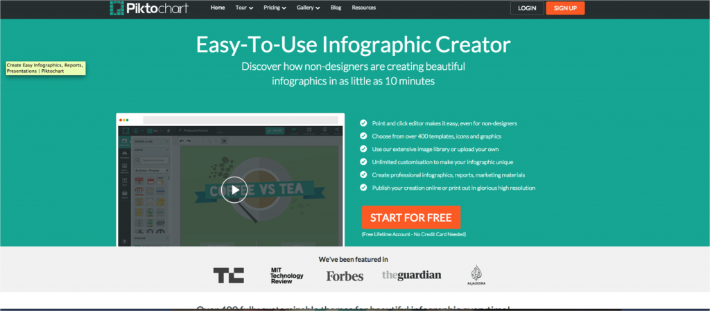
The current homepage already has some good tactics for conversion. They have a brightly colored call to action, a large headline, copy with the word “Discover” (which is a great attention grabber), and easy to digest bullet points.
They also use social proof and write where they have been featured, so that users can see how serious and well known Piktochart is.
The video shows how users can create their infographic – but it is not constantly running, so it does not distract users attention from the call to action, but rather allows the user to control their experience.
Piktochart wanted to work on the emotional targeting strategy and learn more about their customers, so we decided to take the current homepage, and kick it up a notch in terms of the strategy – bringing about the emotional triggers we want the users to feel in order to take action on the homepage.
We hypothesized, based on our marketing personas (discussed later), that our main emotional triggers were empowerment and energy. Our goal was to to give the user the immediate understanding of what they will be getting with this product, and the energy and empowerment to see themselves creating these infographics!
Our Mission: To Increase Sign Ups
Our Ship: The Homepage
Our Map: Research and Strategy
Step 1: The Ground Work
After researching the market and the competition and understanding the stage better, we discussed Piktochart’s goals and what they wanted to improve. Piktochart was interested not only in signing more people up to their service but also in getting more people to create an infographic and complete it- so we kept this final conversion goal in mind throughout the process as well.
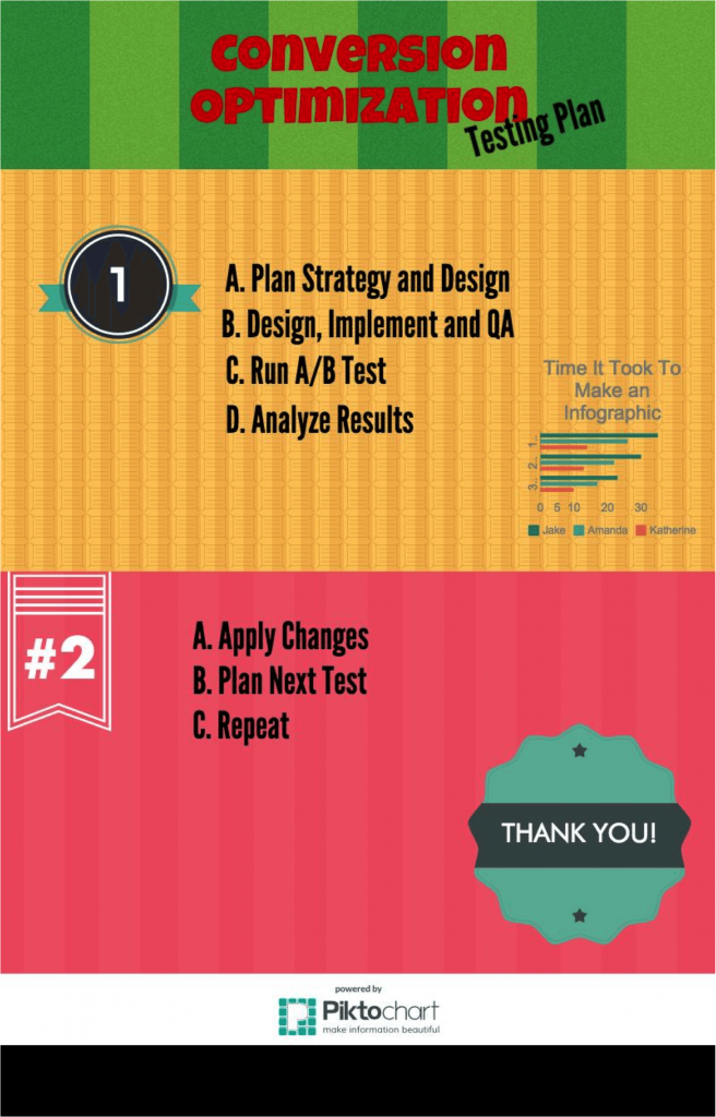
My Own Infographic Creation on Piktochart! On the Conversion Optimization Testing Plan!
Our research showed that we should test making users feel a personal connection to the product, and feel empowered to design, as well as energized to continue designing from the homepage through the entire template creation process.
We started with an analysis of the product, the market, and the target audience. We researched the competitors and the target audience, and studied Piktochart’s user data with Google Analytics, Kissmetrics, and Crazy Egg heatmaps.
Step 2: Recognizing and Understanding the Target Audience
Once we had this data, we created several Marketing Personas. With our marketing personas, we were able to develop our strategy and tactics based on the emotions that would trigger our personas.
|
Name: |
Fiona Gardner |
 |
|
Occupation |
Content Writer & Blogger |
|
|
Profile |
Young blogger looking to create new, exciting ways to express her content and make fun and engaging presentations! |
This is part of one of our marketing personas – as an example for you!
Step 3: Developing Your Strategy
The next step was combining the behavioral information we researched with the emotional research results to define a clear strategy. So we considered what emotional needs will pull our users to take action, and developed tactics that would fulfill those needs.
Step 4: Designing for CRO
When designing for Conversion Optimization, one must consider coloring (and branding), imagery, and copy while keeping those emotional triggers in mind!
Based on our research on the target audience, we knew that many of our users were professionals and students, not graphic designers, who wanted to turn their content into something beautiful even with their lack of design skills. So our copy reflected our understanding – they want to create something impressive, and quickly too.
Here is the variation we created:
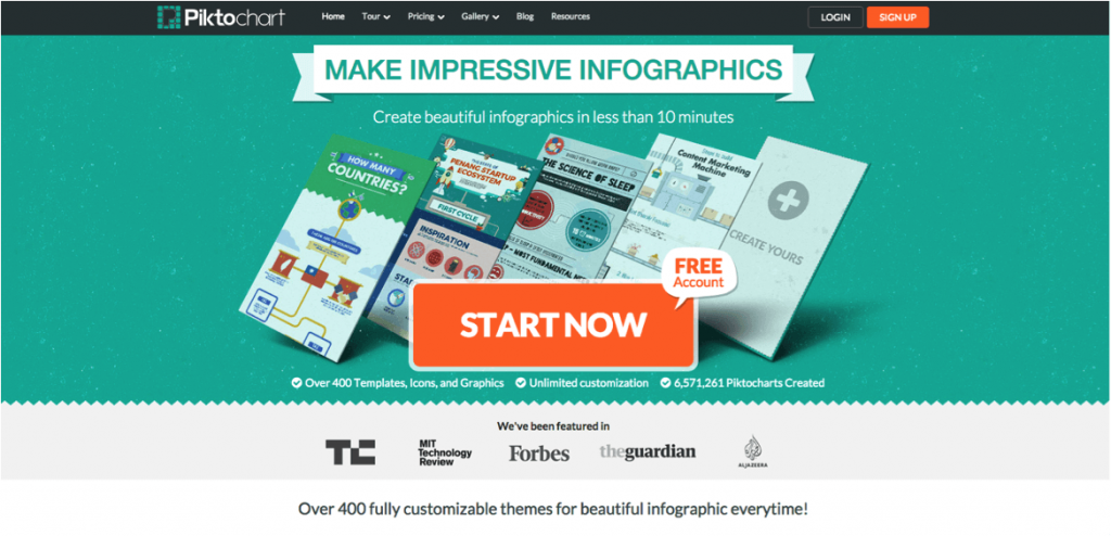
The Changes:
1) Image: We wanted to express value and energy, so we changed the image to reflect the end product – the infographic.
2) CTA: The focus was to create infographics, so we put in a clear Call To Action button.
3) Overall Design: To give an overall infographic feel to the whole page we put the title in an infographic style banner, added some texture to the background and cool edges on the page.
4) Bullet Points: Due to the fact that research shows that users read less than 28% of text on the page, we wanted to reduce the overall amount of text on the page, and we kept what we felt are the most important (Nielsen Norman Group). So we selected three bullet points, based on user surveys of what features were important to users and heatmaps, and shortened the subtitle.
5) Copy: In order to make maximum emotional impact, we wanted to refer directly to the user – because we know those words have greater power. So we changed the copy to speak directly to the user.

Step 5: Testing
We ran the test for 10 days, using Optimizely, with a 50/50 division for traffic between the Original and the Variation. The variation design improved registration by an overall of 11.4% with an improvement of 14% and 15% on Google+ and Facebook Registration respectively, and an improvement of over 20% on certain browsers like Firefox and Google Chrome.
Next Steps:
After increasing conversion of user flow to sign ups, our next step for the emotional targeting strategy is to optimize the registration page and we’ve just launched it! Our goal is to continue the same strategy through the process of the user funnel. This is the variation we created vs. the original design:
Original:
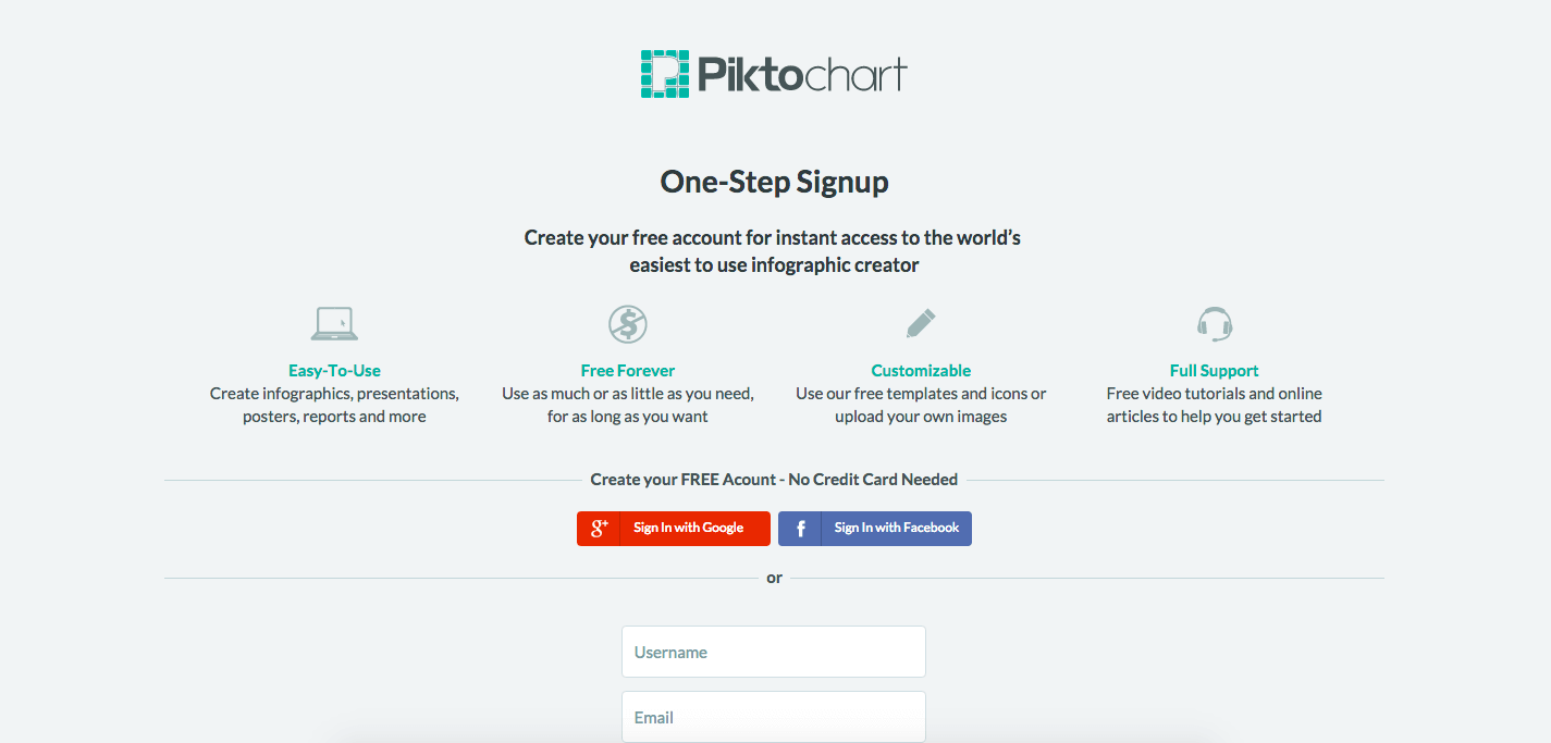
Variation:
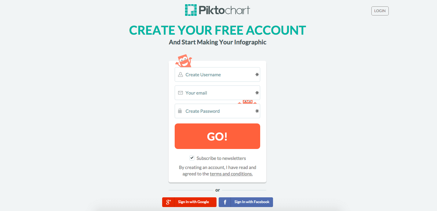
Which variation do you think is going to win?


Pingback: Stay Informed: 39 Conversion Optimization Blogs for You to Follow | The Invesp Blog()
Pingback: 25 Proven Ideas to Make Your Site a Conversion Machine by @shane_barker | Web ROI Agency()
Pingback: 25 Proven Ideas to Make Your Site a Conversion Machine by @shane_barker | SEO Bodhi()
Pingback: How to Turn Your Site into a Conversion Machine | SEJ()