3 tips to improve your call to action buttons
One of the most important steps in improving conversion on your landing pages, is designing a call to action that will work. A call to action is an element on a web page that is meant to encourage the visitor to perform an action. The most common type of call to action element is a clickable button that contains phrases like ‘Download’ or ‘Sign up’.
Designing a proper CTA (call to action) button requires careful planning, understanding of your users and testing. Here are 3 quick tips that will help you improve your conversion immediately.
Size:
The size of a web page element indicates its importance. Start by deciding on the importance of your call to action button and create its size accordingly. You may notice on some landing pages that the size of the CTA button is noticeably larger than the company logo. Although the logo is at the top of the page the call to action button is probably the first thing you notice because of its relative size to other elements on the page.
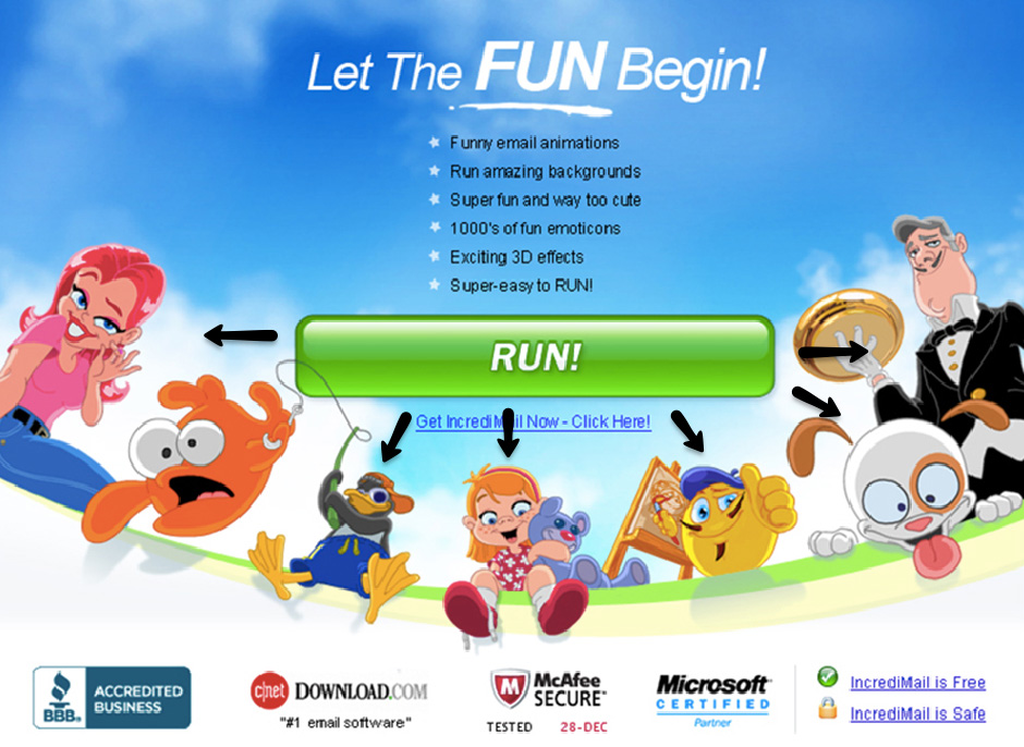
During our work with Incredimail we made sure the call to action button was larger than the logo and that all other elements were pointing to it. Although there are many colorful elements on the page, your eyes are drawn to the call to action button due to its size and relation to other elements on the page.
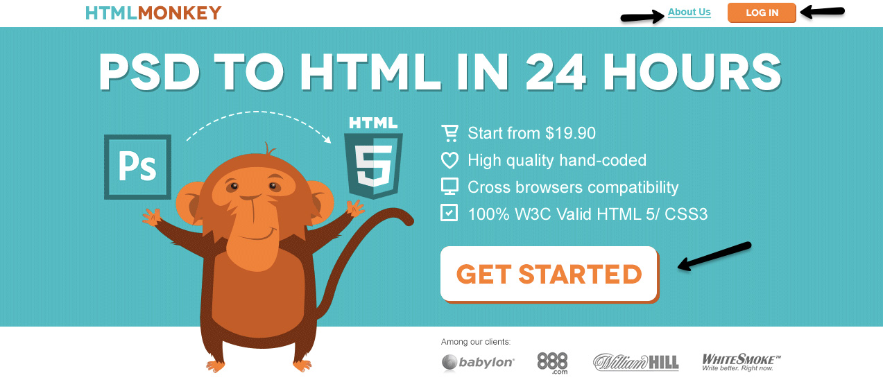
HTMLMONKEY has multiple CTA buttons. As you can see, to indicate between the important and the less, we designed the “getting started” button to be much larger than any other action item on the page.
Position:
The position of the call to action button on the page is very important. To improve your CTA’s conversion, all main CTA’s must be visible above the fold, Meaning: the first 400px of the landing page.
Note how we placed the CTA button above the fold on Banc De Binary. The part marked in red is the top 400PX of the landing page and the rest will only be seen once the user scrolls.

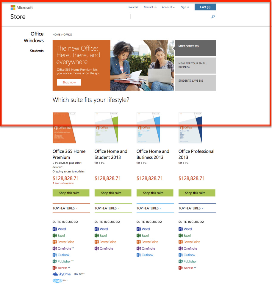
Check out Microsoft’s landing page. The part marked in red is the top 400PX of the landing page, the CTA button will only be visible once the user scrolls down.
Another way to place the button in a noticeable position is to make it appear as if it is ‘floating’ above the page. This will means the CTA button will follow the user throughout the landing page.
When designing for Wix.com we positioned one large call to action button at the top of the page (first 400px) and then added an additional CTA that followed the users as they scrolled.

After Scroll

White Space:
Utilizing Whitespace to Distinguish Call to Action Buttons
Framing the CTA button with “whitespace” is a great way to make it stand out from the rest of the page. The space shouldn’t be too big as it may disconnect the CTA button from other elements on the page. Create the right amount of space between your CTA button and other elements so they are still pointing towards the CTA while making it stand out.
As you can see, on this Wix.com page we created enough whitespace between the CTA button and the rest of the page elements, yet the other elements such as the title and image are still pointing towards it.

Most importantly:
ALWAYS run tests! Have one more landing page with the same design testing different CTA buttons. Try different colors, copy, positions and sizes.
Don’t forget:
- Make sure the test is easy – test one element only so you can draw concrete conclusions from it.
- Track Track Track – Make sure you’re tracking your tests on Google Analytics.


Pingback: 4 SIMPLE TIPS TO GET YOUR PRICING PAGES SELLING | GeekTime()