We oftentimes find that our clients haphazardly choose images for their websites; they don’t feel like putting too much energy into the process. For us, a lot more work should be involved. With an ecommerce client that operates an online watch store, we were able to increase overall purchases by 220% just by choosing the right image to show customers.
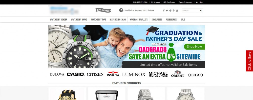
Here’s how this client’s homepage looked at the start:
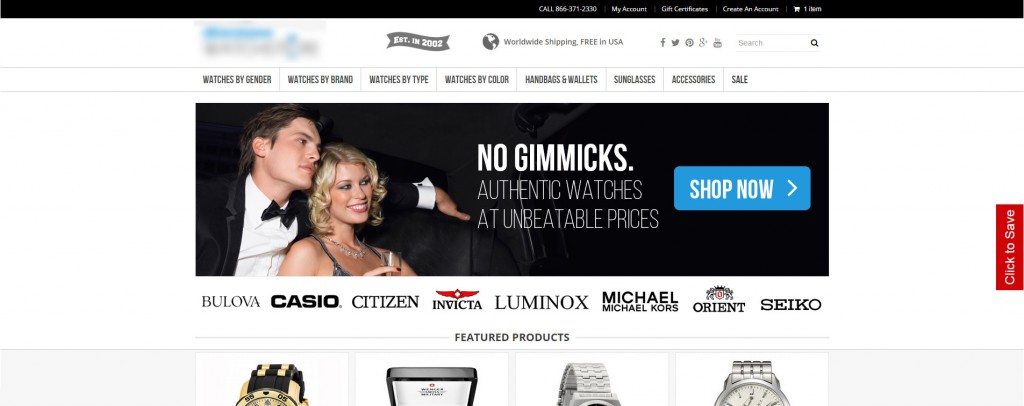
Test #1 – Our Folly
In this ecommerce conversion case study, understanding the audience is absolutely key. This watch store sells mainly to men, and sells popular products like Invicta, Casio, Seiko, and more. The target audience age range is on average 25-38.
Generally, with this young, male audience, and especially among the watch-buying segment of this audience, what sells? Fast cars, pretty women, and the like. So, in our first test we tried to adapt that concept to our research.
From our research, we knew that two informational points were essential conditions for this audience:
-
Authenticity – When buying a watch, no one wants to get a fake watch. There are a number of sketchy dealers online and people need reassurance that they’re dealing with a credible vendor.
-
Price – According to the Google Analytics data, people get to this website by searching for “cheap watches” or something similar. Price is an important factor to this consumer.
In this first design, we incorporated our two informational points, but with very heavy emphasis on imaging according to our typical profile of the young, male, watch consumer.
In the end, this design barely tipped the scale in terms of overall purchases, but it was more successful than the original in getting people to go to product pages, add to cart, and go to checkout. In determining what went wrong, we theorized that we screwed up in three places:
-
Picture/colors – Here, the picture of the fancy couple was, well, just too fancy for this audience. It gave off more of a luxurious, sexy vibe rather than a youthful, inexpensive one. The picture, as well as the dark, mysterious colors, were not congruent with the price.
-
Price – If you noticed, we removed the coupon for the variation. We didn’t think it was necessary to include even though we knew that cheap was important. In retrospect how could we backtrack so much on price from the original? Now we think that people reached the checkout page and didn’t purchase because the final price scared them off – especially as compared to the price w/ coupon as per the original design.
-
CTA – Our call to action here says “shop now” but in reality, the button didn’t take users anywhere special. In ecommerce sites, it’s hard to have general calls to action because there’s no way of knowing what users want to buy.
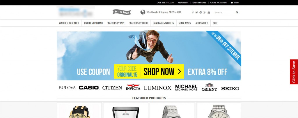
Test #2 – Recovery & Beyond
For the second test, we stuck true to our research and veered away from the cliche designs that are typical of this market.
Given that 85% of our target audience is male, we decided to go with a solo male, one that young professionals would more realistically want to emulate. He’s cool, he’s skydiving while wearing a suit, and most of all he’s having fun.
This second test was a three way split test. Both had the same image and structure, but each had its own copy.
For the first version:
Here is the second version:
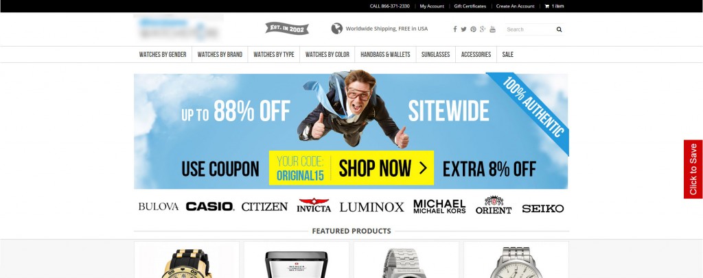
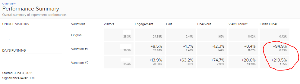
Can you guess which one won? One increased final purchases by 95% and the other by 220%. That’s right, just by changing a feature image, we increased purchases by 220%.
While they are both enormous winners, Version 2 was the one that increased conversions by 220%. See the screenshot from Optimizely:
The real only differences between the two versions were:
Would you have known that writing “100% Authentic” would have increased conversions by so much? It was our hypothesis, but we certainly didn’t know so beforehand. We thought price was important, and quality too, and it turns out we were right! Only by testing did we learn how to increase conversions for this specific client. Now, moving forward, we can use this knowledge to place the proper messaging elsewhere in the website.
What we learned:
-
The importance of deep investigating. Without understanding the importance of watch authenticity to this audience, we couldn’t have done what we did. Learn what are the most important one or two features to your audience and make sure you slap them right on your homepage.
-
Make 2 versions when testing. In our second test, we almost only tested Variation 1 without considering Variation 2 since Variation 2 looks a bit cluttered. If we didn’t make the second version, I would be writing this post right now about how we increased conversions by 94%, not 220%. If you have the resources to run another version in your tests – go for it; little harm can come.
-
The simple stuff works just as well as the big stuff. Here we just changed the main image on the website’s homepage. This demonstrates the power of first impressions. Sometimes we think we need to make major website overhauls when in reality we can achieve the best result working on simple, important aspects of a website.
Case Study: Ecommerce Store Increases Purchases by 200% 5.00/5 (100.00%) 5 votes
Related Posts


Case Study: Ecommerce Store Increases Purchases by 200%
We oftentimes find that our clients haphazardly choose images for their websites; they don’t feel like putting too much energy into the process. For us, a lot more work should be involved. With an ecommerce client that operates an online watch store, we were able to increase overall purchases by 220% just by choosing the right image to show customers.
Here’s how this client’s homepage looked at the start:
Test #1 – Our Folly
In this ecommerce conversion case study, understanding the audience is absolutely key. This watch store sells mainly to men, and sells popular products like Invicta, Casio, Seiko, and more. The target audience age range is on average 25-38.
Generally, with this young, male audience, and especially among the watch-buying segment of this audience, what sells? Fast cars, pretty women, and the like. So, in our first test we tried to adapt that concept to our research.
From our research, we knew that two informational points were essential conditions for this audience:
Authenticity – When buying a watch, no one wants to get a fake watch. There are a number of sketchy dealers online and people need reassurance that they’re dealing with a credible vendor.
Price – According to the Google Analytics data, people get to this website by searching for “cheap watches” or something similar. Price is an important factor to this consumer.
In this first design, we incorporated our two informational points, but with very heavy emphasis on imaging according to our typical profile of the young, male, watch consumer.
In the end, this design barely tipped the scale in terms of overall purchases, but it was more successful than the original in getting people to go to product pages, add to cart, and go to checkout. In determining what went wrong, we theorized that we screwed up in three places:
Picture/colors – Here, the picture of the fancy couple was, well, just too fancy for this audience. It gave off more of a luxurious, sexy vibe rather than a youthful, inexpensive one. The picture, as well as the dark, mysterious colors, were not congruent with the price.
Price – If you noticed, we removed the coupon for the variation. We didn’t think it was necessary to include even though we knew that cheap was important. In retrospect how could we backtrack so much on price from the original? Now we think that people reached the checkout page and didn’t purchase because the final price scared them off – especially as compared to the price w/ coupon as per the original design.
CTA – Our call to action here says “shop now” but in reality, the button didn’t take users anywhere special. In ecommerce sites, it’s hard to have general calls to action because there’s no way of knowing what users want to buy.
Test #2 – Recovery & Beyond
For the second test, we stuck true to our research and veered away from the cliche designs that are typical of this market.
Given that 85% of our target audience is male, we decided to go with a solo male, one that young professionals would more realistically want to emulate. He’s cool, he’s skydiving while wearing a suit, and most of all he’s having fun.
This second test was a three way split test. Both had the same image and structure, but each had its own copy.
For the first version:
Here is the second version:
Can you guess which one won? One increased final purchases by 95% and the other by 220%. That’s right, just by changing a feature image, we increased purchases by 220%.
While they are both enormous winners, Version 2 was the one that increased conversions by 220%. See the screenshot from Optimizely:
The real only differences between the two versions were:
Including the words “100% Authentic” on the second version
The text placement
Would you have known that writing “100% Authentic” would have increased conversions by so much? It was our hypothesis, but we certainly didn’t know so beforehand. We thought price was important, and quality too, and it turns out we were right! Only by testing did we learn how to increase conversions for this specific client. Now, moving forward, we can use this knowledge to place the proper messaging elsewhere in the website.
What we learned:
The importance of deep investigating. Without understanding the importance of watch authenticity to this audience, we couldn’t have done what we did. Learn what are the most important one or two features to your audience and make sure you slap them right on your homepage.
Make 2 versions when testing. In our second test, we almost only tested Variation 1 without considering Variation 2 since Variation 2 looks a bit cluttered. If we didn’t make the second version, I would be writing this post right now about how we increased conversions by 94%, not 220%. If you have the resources to run another version in your tests – go for it; little harm can come.
The simple stuff works just as well as the big stuff. Here we just changed the main image on the website’s homepage. This demonstrates the power of first impressions. Sometimes we think we need to make major website overhauls when in reality we can achieve the best result working on simple, important aspects of a website.
Related Posts