In this day and age of online retail, more and more people are heading to the internet to buy the things they need.
However, problems with online selling, such as shopping cart abandonment (which reached an all-time high at 72%), are real threats to your business. And since ecommerce is becoming so popular, everyone is working full-throttle to make their site the best. How can you beat out the competition and create an ecommerce site that will increase conversion rates?
In this article I’m going to talk about 12 different steps people take when purchasing on an ecommerce site, and show you exactly how to improve those areas of your site in order to increase your conversion rate.
The Home Page
Avoid Complicated Home Pages
If the page that people open up to is, for example, like this…
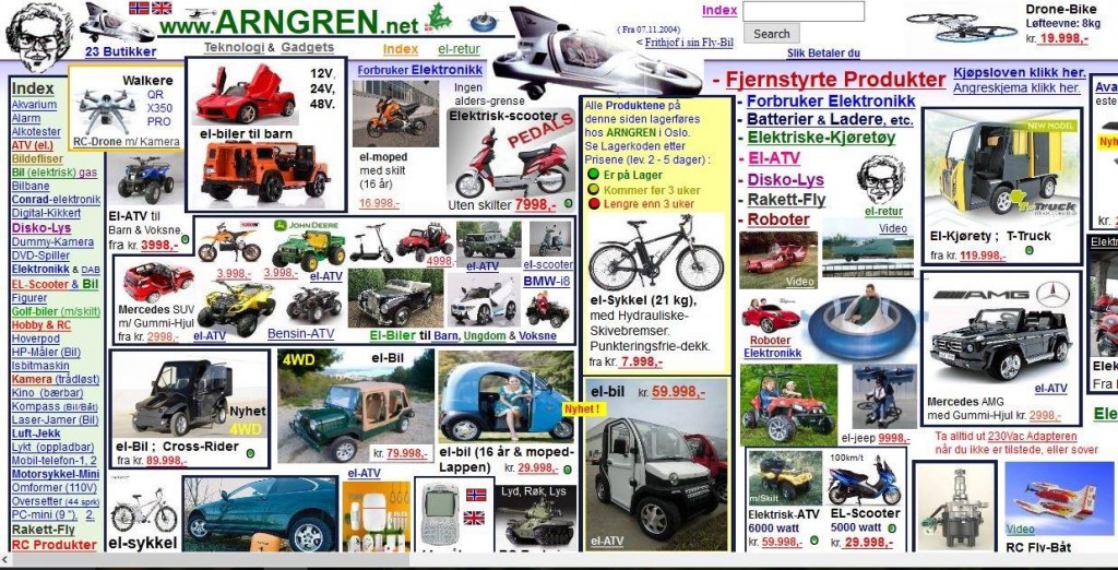
…then that is an immediate turn off. There is way too much complication, too many colors, pictures, things of different sizes. Even the menu is colorful! Honestly, a page like this will just induce anxiety in your customers, and that’s obviously not what you want.
Instead, create a home page that is simple and uncluttered, avoiding too many bright and wacky colors.
Apple’s home page is a good example:
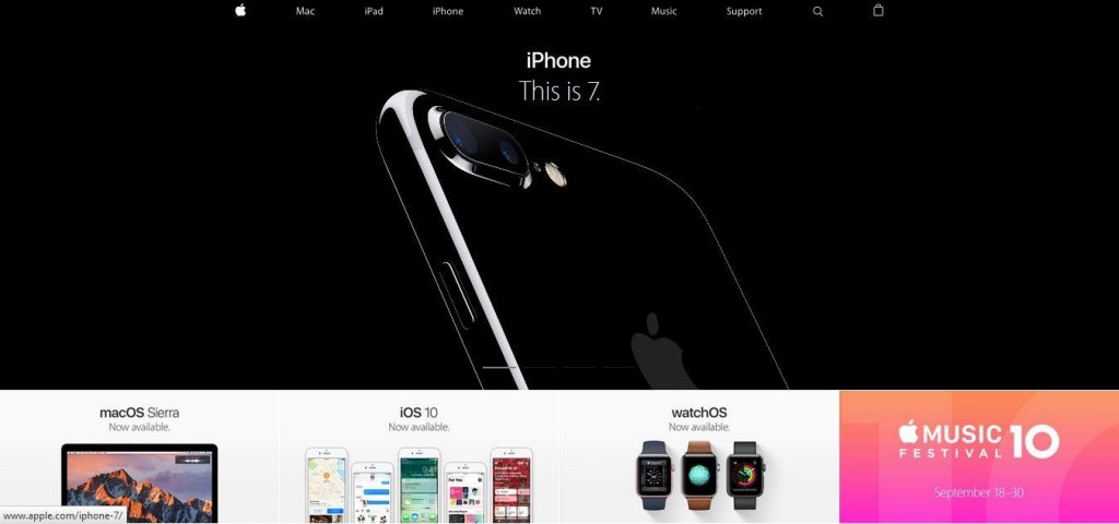
Simple, elegant, and with exactly what you need to know. Don’t stuff your home page with offers and deals. Just show your best, and allow people to browse for anything else.
Let People Know Who You Are
If I stumble upon the page of an online clothes store that I’ve never heard of, I might wonder what kind of styles they specialize in, or what their focus is. Do they do more punk, emo type clothes? Are they a site that sells prom dresses and ball gowns? I don’t know unless they tell me.
Here is a bad example of this:
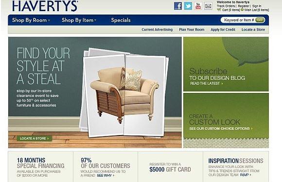
Who are they? Why should I buy from them and not some other online store? I have no idea.
That’s why it’s so good for your main page to feature why your business is unique. For example, you could use a byline, a short sentence that could appear underneath the logo, for example, to explain in a few words what your business is, what it does, and why it’s different or better than its competitors.
Make Sales and Specials Stand Out
People love deals, and when they’re shopping online they want to make sure they get the best deal possible.
If you’re advertising different products on sale, such as a certain end of season line, or special deals on particular products, it’s an excellent idea to collect these into one page where people can go and view your deals.
One E-Tailing Group study discovered that almost half of all online buyers would only purchase products that were discounted, and a whopping 62% were specifically looking for a section of sales and specials.
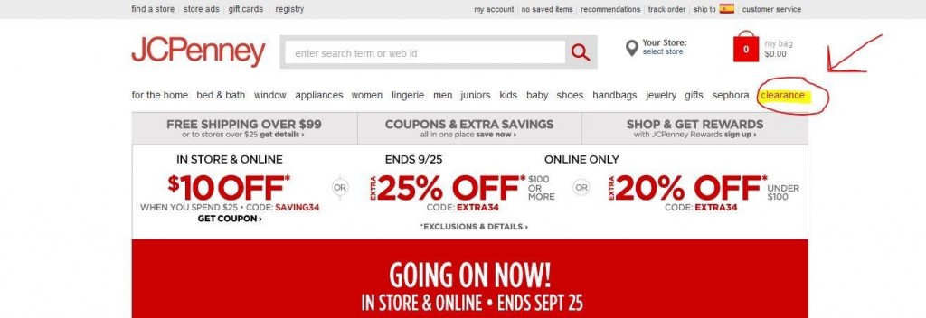
JCPenny does a great job of this:
The Product Page
Good Pictures Can Make or Break Sales
This is in this list. People need to see exactly what they’re going to buy before they buy it, and this means that YOU need to provide them with everything they need to see in pictures.
Here is a good example from Tobi.com:
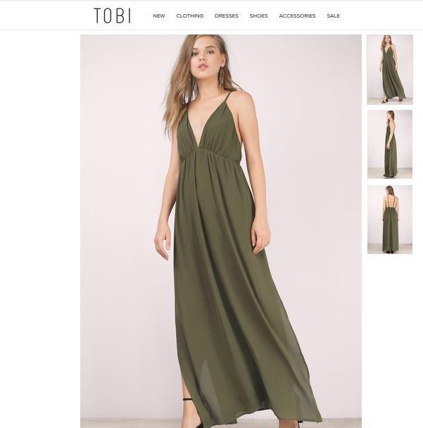
We can see the dress from all different angles: front, back, and side. We can see the length of the dress, and the person wearing the dress shows us exactly how long it is.
Here’s a bad example:
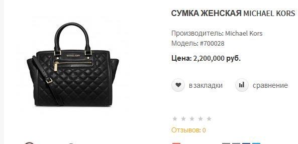
With just the front of the bag showing, we have no idea how big it is inside, whether it has a zipper or a magnet, or how wide it is.
Your photos need to be varied, showing all sides, in and out and all around. Let people see it as well as they would in a brick and mortar store.
Get Ahead of the Game with Product Videos
Video descriptions of your products are becoming the future of online marketing. Videos show people exactly what they want to see. It doesn’t matter what your product is, show a video and let them see it in real life!
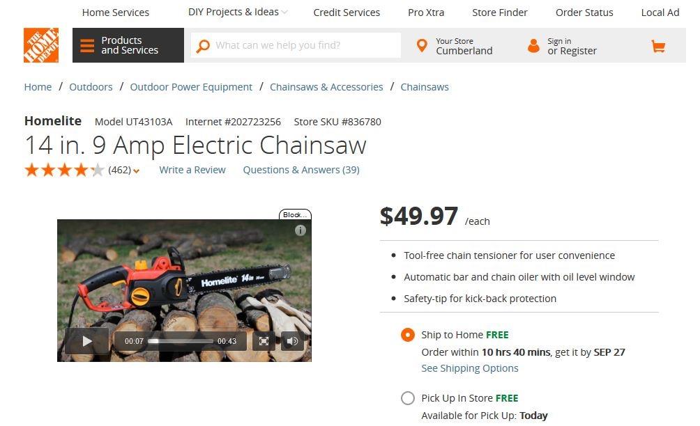
Home Depot does a great job of this with detailed product videos describing and showing their products in action:
Content Counts
Your product descriptions are not meant to be lists of what your product is and what it does.
Boring your customers into buying something isn’t a good marketing strategy. Instead, find the features of your product and turn those into benefits, showing people specific ways that your product will improve their life.
See how it’s done with this hand soap description:
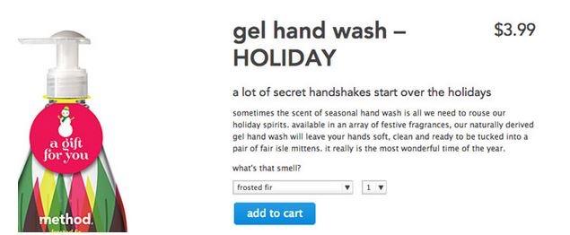
So not only will this soap wash your hands, but will actually improve your holiday spirit!
See how they drew you in there?
What you write also has a bearing in your Call to Action buttons. For example, Dewalt was testing different call to action button text to see what words brought the best conversion rate. Upon changing one such button in a product page from ‘Shop Now’ to ‘Buy Now’, they got 17% more clicks!
Such simple changes can create big differences.
Respond to People’s Doubts and Fears
People worry about shipping costs, returns, and other questions that are related to your product. Let them have responses to those concerns. For example, add a tab in your description of the product that details shipping and return policies. For clothing, have a sizing chart so people know exactly how the piece will fit them.
Adding an FAQ with answers, or even a Live Chat system, will assuredly increase your conversion rates. In fact, adding answers to FAQ questions on the product page increased conversion rates for Roller Skate Nation by 69%!
Check out this very well put together product page:
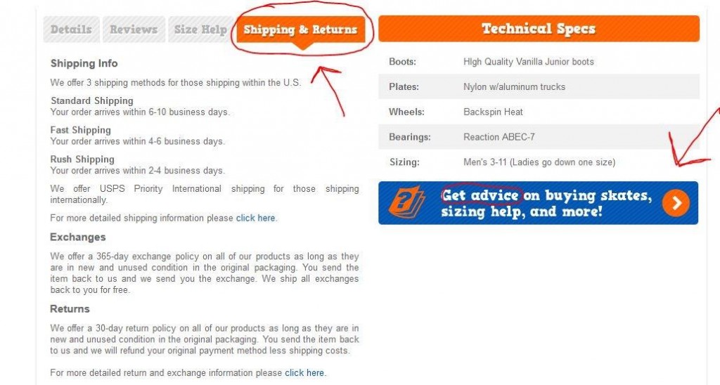
They provide extensive information on shipping on returns, and offer more advice for any other needs that the client has. These are things that will definitely increase conversion!
The Cart and Checkout
Be the Best Price (And Flaunt it!)
If your product has a better price for quality than your competitors, don’t be afraid to make that known! Many people compare-shop, and will abandon the cart that has the more expensive product. Avoid abandonment by showing your customers exactly how much they are saving.
Allow Customers to See What’s in the Cart While they Browse
Do you ever add things to your cart and then continue shopping? Obviously.
Do you then forget what is in the cart, or how much total you’re spending? Most likely.
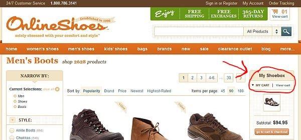
Keep the customer aware of what he’s doing by showing him what’s going on in his cart, such as how many items he has and the subtotal of what he’s spending, like this:
Send Follow-Up Emails to Shopping Cart Abandoners
Don’t let those abandoners get away! Have them enter their email as they put things in their online shopping cart. Then, if they abandon the cart, get that follow up email to them as quickly as possible! After that, make sure you can track the results.
KISS – Keep It Simple Stupid
Forced registration to a website, exaggerated forms to fill out, and not enough payment options are all reasons people abandon carts.
Make your checkout process as simple as possible for the customer, and don’t force them to go through hoops to finish their purchase.
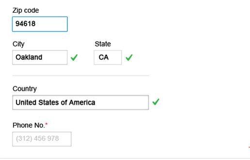
For example, in this checkout scenario we see that the zip code is input first, and once the customer puts in their zip code, the other information is automatically filled in, thus making it much easier for the user!
Why Free Shipping Is a Must
If you charge for shipping, you are putting yourself into the losing half of the ecommerce industry. Yes, over half of online sellers offer free shipping to their customers.
Why?
Because in this study, 73% of online shoppers said that free shipping was critical to their online purchase, and another study discovered the fact that nearly every person who shops online will be encouraged to purchase more products if free shipping is offered.
This is not an option, this is a must if you really want to increase conversion rates.
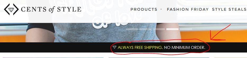
JCPenny is a great example of one way to offer free shipping, and that is by setting a minimum spending amount to reach free shipping (in their case being $50).
An example of how well this works is the company 2BigFeet, whose conversions increased by 50% overnight when they started offering free shipping for orders over $100.
Free shipping will appeal to buyers and ultimately lead them to a satisfactory shopping experience, which is exactly what your business needs in order to find true success.
Summary
In total, these are relatively small changes that will make a big difference. Starting from when customers first visit your page, make them feel comfortable and invite them in by letting them know who you are and convincing them that you are unique in some way. Make your products stand out by letting the customer see them in videos, pictures, and by creating fantastic copy that answers questions and refutes doubts. Finally, make the checkout experience a great one by ensure the easiest finish to the buying process, and making sure they don’t abandon their cart. Implementing these tips is a sure way to increase conversion and reach your full potential as a business.
Ecommerce Optimization – 12 Proven Tips To Success 5.00/5 (100.00%) 1 vote
Related Posts


Ecommerce Optimization – 12 Proven Tips To Success
In this day and age of online retail, more and more people are heading to the internet to buy the things they need.
However, problems with online selling, such as shopping cart abandonment (which reached an all-time high at 72%), are real threats to your business. And since ecommerce is becoming so popular, everyone is working full-throttle to make their site the best. How can you beat out the competition and create an ecommerce site that will increase conversion rates?
In this article I’m going to talk about 12 different steps people take when purchasing on an ecommerce site, and show you exactly how to improve those areas of your site in order to increase your conversion rate.
The Home Page
Avoid Complicated Home Pages
If the page that people open up to is, for example, like this…
…then that is an immediate turn off. There is way too much complication, too many colors, pictures, things of different sizes. Even the menu is colorful! Honestly, a page like this will just induce anxiety in your customers, and that’s obviously not what you want.
Instead, create a home page that is simple and uncluttered, avoiding too many bright and wacky colors.
Apple’s home page is a good example:
Simple, elegant, and with exactly what you need to know. Don’t stuff your home page with offers and deals. Just show your best, and allow people to browse for anything else.
Let People Know Who You Are
If I stumble upon the page of an online clothes store that I’ve never heard of, I might wonder what kind of styles they specialize in, or what their focus is. Do they do more punk, emo type clothes? Are they a site that sells prom dresses and ball gowns? I don’t know unless they tell me.
Here is a bad example of this:
Who are they? Why should I buy from them and not some other online store? I have no idea.
That’s why it’s so good for your main page to feature why your business is unique. For example, you could use a byline, a short sentence that could appear underneath the logo, for example, to explain in a few words what your business is, what it does, and why it’s different or better than its competitors.
Make Sales and Specials Stand Out
People love deals, and when they’re shopping online they want to make sure they get the best deal possible.
If you’re advertising different products on sale, such as a certain end of season line, or special deals on particular products, it’s an excellent idea to collect these into one page where people can go and view your deals.
One E-Tailing Group study discovered that almost half of all online buyers would only purchase products that were discounted, and a whopping 62% were specifically looking for a section of sales and specials.
JCPenny does a great job of this:
The Product Page
Good Pictures Can Make or Break Sales
This is in this list. People need to see exactly what they’re going to buy before they buy it, and this means that YOU need to provide them with everything they need to see in pictures.
Here is a good example from Tobi.com:
We can see the dress from all different angles: front, back, and side. We can see the length of the dress, and the person wearing the dress shows us exactly how long it is.
Here’s a bad example:
With just the front of the bag showing, we have no idea how big it is inside, whether it has a zipper or a magnet, or how wide it is.
Your photos need to be varied, showing all sides, in and out and all around. Let people see it as well as they would in a brick and mortar store.
Get Ahead of the Game with Product Videos
Video descriptions of your products are becoming the future of online marketing. Videos show people exactly what they want to see. It doesn’t matter what your product is, show a video and let them see it in real life!
Home Depot does a great job of this with detailed product videos describing and showing their products in action:
Content Counts
Your product descriptions are not meant to be lists of what your product is and what it does.
Boring your customers into buying something isn’t a good marketing strategy. Instead, find the features of your product and turn those into benefits, showing people specific ways that your product will improve their life.
See how it’s done with this hand soap description:
So not only will this soap wash your hands, but will actually improve your holiday spirit!
See how they drew you in there?
What you write also has a bearing in your Call to Action buttons. For example, Dewalt was testing different call to action button text to see what words brought the best conversion rate. Upon changing one such button in a product page from ‘Shop Now’ to ‘Buy Now’, they got 17% more clicks!
Such simple changes can create big differences.
Respond to People’s Doubts and Fears
People worry about shipping costs, returns, and other questions that are related to your product. Let them have responses to those concerns. For example, add a tab in your description of the product that details shipping and return policies. For clothing, have a sizing chart so people know exactly how the piece will fit them.
Adding an FAQ with answers, or even a Live Chat system, will assuredly increase your conversion rates. In fact, adding answers to FAQ questions on the product page increased conversion rates for Roller Skate Nation by 69%!
Check out this very well put together product page:
They provide extensive information on shipping on returns, and offer more advice for any other needs that the client has. These are things that will definitely increase conversion!
The Cart and Checkout
Be the Best Price (And Flaunt it!)
If your product has a better price for quality than your competitors, don’t be afraid to make that known! Many people compare-shop, and will abandon the cart that has the more expensive product. Avoid abandonment by showing your customers exactly how much they are saving.
Allow Customers to See What’s in the Cart While they Browse
Do you ever add things to your cart and then continue shopping? Obviously.
Do you then forget what is in the cart, or how much total you’re spending? Most likely.
Keep the customer aware of what he’s doing by showing him what’s going on in his cart, such as how many items he has and the subtotal of what he’s spending, like this:
Send Follow-Up Emails to Shopping Cart Abandoners
Don’t let those abandoners get away! Have them enter their email as they put things in their online shopping cart. Then, if they abandon the cart, get that follow up email to them as quickly as possible! After that, make sure you can track the results.
KISS – Keep It Simple Stupid
Forced registration to a website, exaggerated forms to fill out, and not enough payment options are all reasons people abandon carts.
Make your checkout process as simple as possible for the customer, and don’t force them to go through hoops to finish their purchase.
For example, in this checkout scenario we see that the zip code is input first, and once the customer puts in their zip code, the other information is automatically filled in, thus making it much easier for the user!
Why Free Shipping Is a Must
If you charge for shipping, you are putting yourself into the losing half of the ecommerce industry. Yes, over half of online sellers offer free shipping to their customers.
Why?
Because in this study, 73% of online shoppers said that free shipping was critical to their online purchase, and another study discovered the fact that nearly every person who shops online will be encouraged to purchase more products if free shipping is offered.
This is not an option, this is a must if you really want to increase conversion rates.
JCPenny is a great example of one way to offer free shipping, and that is by setting a minimum spending amount to reach free shipping (in their case being $50).
An example of how well this works is the company 2BigFeet, whose conversions increased by 50% overnight when they started offering free shipping for orders over $100.
Free shipping will appeal to buyers and ultimately lead them to a satisfactory shopping experience, which is exactly what your business needs in order to find true success.
Summary
In total, these are relatively small changes that will make a big difference. Starting from when customers first visit your page, make them feel comfortable and invite them in by letting them know who you are and convincing them that you are unique in some way. Make your products stand out by letting the customer see them in videos, pictures, and by creating fantastic copy that answers questions and refutes doubts. Finally, make the checkout experience a great one by ensure the easiest finish to the buying process, and making sure they don’t abandon their cart. Implementing these tips is a sure way to increase conversion and reach your full potential as a business.
Related Posts
Tags: