If you already have an e-commerce website, you know the importance of your product pages. The real magic of the purchase happens there, and eventually, no matter how much energy you put in promoting your home page or maybe well-built blog posts – your product page will either “close the deal” or not. In my opinion, a good product page can affect the conversions even more than the checkout funnel, so there is no doubt you should do something to optimize them.
In this post I’m going to share my proven, best practices about product page optimization, and give you some tips that will make your product pages amazing.
1. Design & Focus
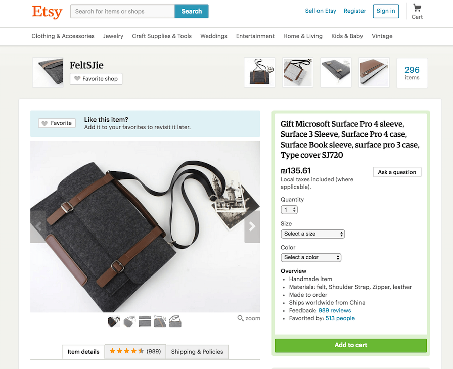
The real purchase process starts from the product page, so you want your product to stand out by removing all distractions while your visitors begin the purchasing funnel.
That means, you want your product to appear above the fold with no other distractions such as special offers or best blog posts to read, so that the visitors will stay focused on the page.
The design should be appealing; the pictures of the product should attract and the page should include a variety of sizes and colors.
Take a look at this great example of a good page design in this product page by Etsy:
2. Use Amazing Product Photos
Since we’re discussing online store product pages, your visitors can’t feel the product in their hands, so you must showcase your product in the best possible way. Today, with social media, the world had transferred from communicating with words to communicating with pictures of “being in the moment”, so you want to use this state of mind in order to sell your product better!
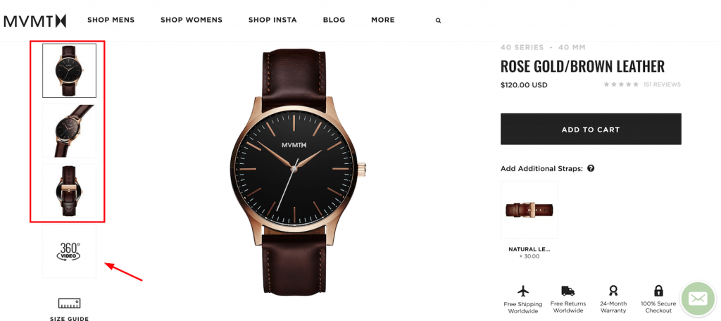
Make sure you upload high-quality photos of your product from several angles and add an option to zoom-in on the photos.
If possible, even upload a 360 footage to maximize the experience. Here is a nice example of what MVMT Watches did, the photos are in really high quality and you can also have a nice 360 view of their product before buying it :
3. Create Great Micro-Copy
A product page should not contain a lot of text, as opposed to other kinds of pages you might have in your website, which makes every word counts.
You should use micro-copy strategies in this case – create an idea and a unique feeling for your website’s language and not just copy-paste your product’s (boring) features. Remember, you want to stand-out from your competitors. You want to make your users excited about your product. And if you have no way for the potential buyer to feel the product, use words to describe it and make your visitor excited about it.
Here’s a great example of what Mellisa shoes did with their product:
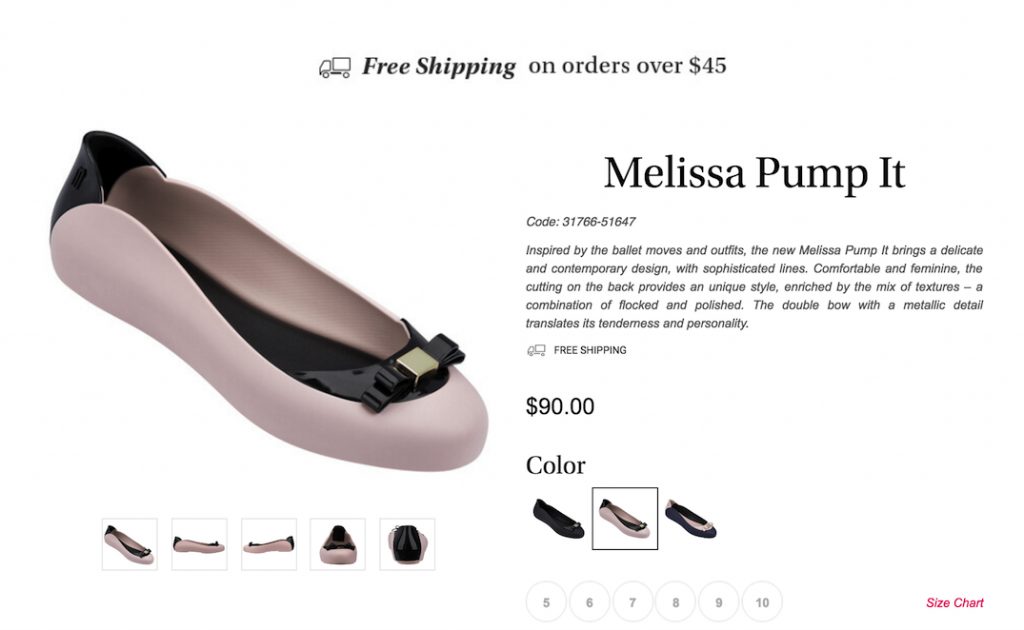
We can see the name of the product has a cool and hip feeling. The description is also unique and explains the inspiration and kind of a “short-history” for the creation and design of this shoe.
The page opens with the announcement of Free Shipping, which we know today, that this method helps the visitor to seal the deal easier and increase the conversion rate. Using a unique language and adding micro-copy is the little, small words we usually don’t think people really care about or actually read, but let me tell you – they make a huge difference! Especially in the E-commerce world. It could be the “free shipping”, or a small CTA button, all of these are places where we can put our effort and increase our conversion rate.
This is a good example of a “not-so-exciting” product description from an online shop called freepeople.com:
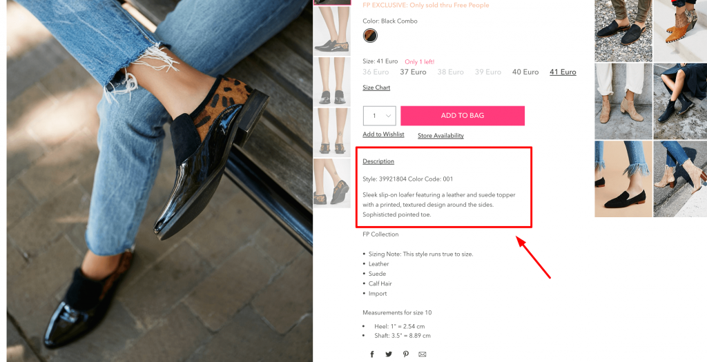
We can see the picture is high-quality and also interesting enough, but the description is quite anaemic and more-of-the-same as we are already use to see, there’s nothing that can actually create excitement for the visitor and encourage her to buy.
4. Use Customer Reviews & Product Rating for Your Benefit
Nowadays, it is all about communication and sharing ideas, fashion and products all over the world.
A woman from US can purchase the same item as a woman from Sweden or Australia and they all have interesting opinions which they would like to articulate.
So why not use this willing of globalization and idea sharing in order to increase your conversions and make your product relatable and accessible?
Here’s a great example of what Aussie Hair products did in their website:
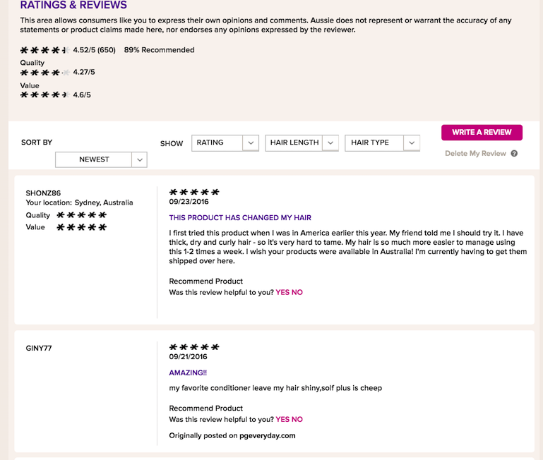
This example is quite unique because you can choose the product by the rating, hair length and hair type. Which means that other women with similar kinds of hair can tip and recommend each other about using Aussie hair product. I think we can learn a lot from this example about how to create a nice, cool, interactive reviews on a product in a way that will increase engagement with the page and also will help to increase the conversion rate.
5. Solve Uncertainties in Advance
Try to answer as much questions your users might have, before they have the time to ponder on them.
Popular questions we often see are “Is this website safe?”, “How much does shipping cost?”, “Do they have my size?”, “How can I return the product if I don’t want it?”
Make sure you have all the information available on your product page so the user won’t have to look for help on a different page and leave the funnel. Here’s a nice example of how ASOS did it:
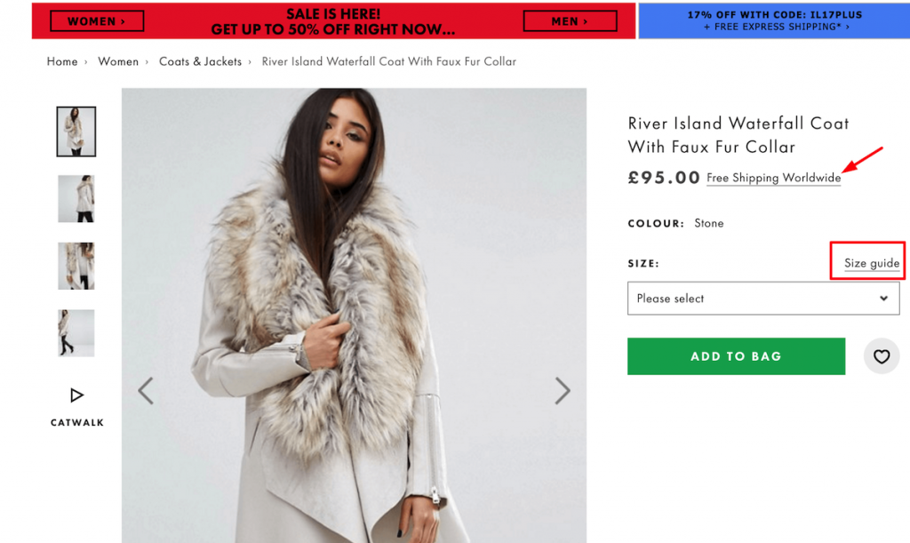
We can see they emphasize the free shipping worldwide, they have a button for the size guide, the price, and color. The website is also secured for purchasing which answer the “is it safe?” question. To warp it up – they give a lot of information in their product page for the visitors, which helps them purchase on the website.
6. Visible, Fun Add-to-Cart Button
Remember, the goal of your product page is first and foremost to sell!
The purchasing funnel begins with the product page but then continues to the “Add-to-cart”, registration and then reaches the final step of payment.
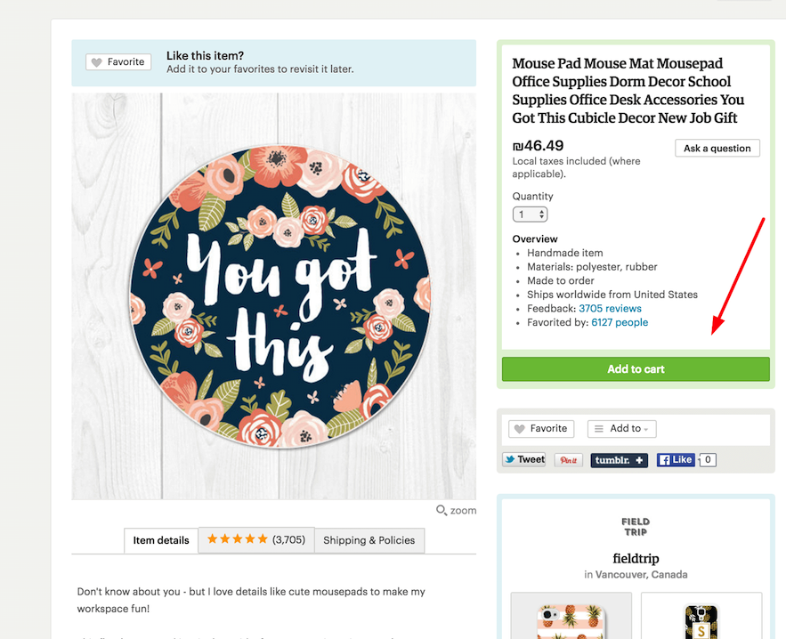
From that reason, if your add-to-cart button gets lost or is not that noticeable – you might miss a lot of sales you could have had. A good button is one that pops-out to the user’s eye; one which located above the fold, formated in a large, visible size and with a contrast color to the website’s color plate. Of course it depends on the colors of your website and most of the times I would not advise to use a red button (unless it’s the color of the other buttons in the website design). Today we know that there is a certain belief that orange and green buttons work best, however I would encourage you not to rely on assumptions and to always A/B test what works on your website and on your buyers.
Here’s a good example of Etsy’s Add-to-Cart button. You can’t miss it even if you try:
7. Related Products your User Might Actually LIKE
Cross-selling and up-selling is today’s hottest trend in the e-commerce field, and when you think about it, why not? Your user is already inside the purchasing funnel – why not use it to your own benefit?
Online marketing researches show that people like recommendations! I personally think they’re great. Their greatness is that they can reveal to your visitors other items they did not know existed in your shop. In addition, they will reveal the variety and richness that your shop has to offer.
So even if your visitor won’t buy another item at the same instant he/she will surely remember your shop the next time they shop online.
In addition, here’s an example of how Book Depository did it. You can see that the algorithm of the website give you more recommendation relying on past purchases and what other buyers which bought the same books as you did also liked. This feature is great because it gives your visitors an opportunity to discover more items they would probably like:

Summary and Key Takeaways
If you use all of these tips, you are guarantee to maximize your conversation rate. But also, don’t forget to track everything with Google Analytics in order to optimize and make your product page even better! Use A/B testing in order to better understand what your visitors like or dislike, and don’t forget to have a lot of fun while doing it! ☺
7 Easy Tips for eCommerce Product Pages Optimization 3.67/5 (73.33%) 3 votes
Related Posts


7 Easy Tips for eCommerce Product Pages Optimization
If you already have an e-commerce website, you know the importance of your product pages. The real magic of the purchase happens there, and eventually, no matter how much energy you put in promoting your home page or maybe well-built blog posts – your product page will either “close the deal” or not. In my opinion, a good product page can affect the conversions even more than the checkout funnel, so there is no doubt you should do something to optimize them.
In this post I’m going to share my proven, best practices about product page optimization, and give you some tips that will make your product pages amazing.
1. Design & Focus
The real purchase process starts from the product page, so you want your product to stand out by removing all distractions while your visitors begin the purchasing funnel.
That means, you want your product to appear above the fold with no other distractions such as special offers or best blog posts to read, so that the visitors will stay focused on the page.
The design should be appealing; the pictures of the product should attract and the page should include a variety of sizes and colors.
Take a look at this great example of a good page design in this product page by Etsy:
2. Use Amazing Product Photos
Since we’re discussing online store product pages, your visitors can’t feel the product in their hands, so you must showcase your product in the best possible way. Today, with social media, the world had transferred from communicating with words to communicating with pictures of “being in the moment”, so you want to use this state of mind in order to sell your product better!
Make sure you upload high-quality photos of your product from several angles and add an option to zoom-in on the photos.
If possible, even upload a 360 footage to maximize the experience. Here is a nice example of what MVMT Watches did, the photos are in really high quality and you can also have a nice 360 view of their product before buying it :
3. Create Great Micro-Copy
A product page should not contain a lot of text, as opposed to other kinds of pages you might have in your website, which makes every word counts.
You should use micro-copy strategies in this case – create an idea and a unique feeling for your website’s language and not just copy-paste your product’s (boring) features. Remember, you want to stand-out from your competitors. You want to make your users excited about your product. And if you have no way for the potential buyer to feel the product, use words to describe it and make your visitor excited about it.
Here’s a great example of what Mellisa shoes did with their product:
We can see the name of the product has a cool and hip feeling. The description is also unique and explains the inspiration and kind of a “short-history” for the creation and design of this shoe.
The page opens with the announcement of Free Shipping, which we know today, that this method helps the visitor to seal the deal easier and increase the conversion rate. Using a unique language and adding micro-copy is the little, small words we usually don’t think people really care about or actually read, but let me tell you – they make a huge difference! Especially in the E-commerce world. It could be the “free shipping”, or a small CTA button, all of these are places where we can put our effort and increase our conversion rate.
This is a good example of a “not-so-exciting” product description from an online shop called freepeople.com:
We can see the picture is high-quality and also interesting enough, but the description is quite anaemic and more-of-the-same as we are already use to see, there’s nothing that can actually create excitement for the visitor and encourage her to buy.
4. Use Customer Reviews & Product Rating for Your Benefit
Nowadays, it is all about communication and sharing ideas, fashion and products all over the world.
A woman from US can purchase the same item as a woman from Sweden or Australia and they all have interesting opinions which they would like to articulate.
So why not use this willing of globalization and idea sharing in order to increase your conversions and make your product relatable and accessible?
Here’s a great example of what Aussie Hair products did in their website:
This example is quite unique because you can choose the product by the rating, hair length and hair type. Which means that other women with similar kinds of hair can tip and recommend each other about using Aussie hair product. I think we can learn a lot from this example about how to create a nice, cool, interactive reviews on a product in a way that will increase engagement with the page and also will help to increase the conversion rate.
5. Solve Uncertainties in Advance
Try to answer as much questions your users might have, before they have the time to ponder on them.
Popular questions we often see are “Is this website safe?”, “How much does shipping cost?”, “Do they have my size?”, “How can I return the product if I don’t want it?”
Make sure you have all the information available on your product page so the user won’t have to look for help on a different page and leave the funnel. Here’s a nice example of how ASOS did it:
We can see they emphasize the free shipping worldwide, they have a button for the size guide, the price, and color. The website is also secured for purchasing which answer the “is it safe?” question. To warp it up – they give a lot of information in their product page for the visitors, which helps them purchase on the website.
6. Visible, Fun Add-to-Cart Button
Remember, the goal of your product page is first and foremost to sell!
The purchasing funnel begins with the product page but then continues to the “Add-to-cart”, registration and then reaches the final step of payment.
From that reason, if your add-to-cart button gets lost or is not that noticeable – you might miss a lot of sales you could have had. A good button is one that pops-out to the user’s eye; one which located above the fold, formated in a large, visible size and with a contrast color to the website’s color plate. Of course it depends on the colors of your website and most of the times I would not advise to use a red button (unless it’s the color of the other buttons in the website design). Today we know that there is a certain belief that orange and green buttons work best, however I would encourage you not to rely on assumptions and to always A/B test what works on your website and on your buyers.
Here’s a good example of Etsy’s Add-to-Cart button. You can’t miss it even if you try:
7. Related Products your User Might Actually LIKE
Cross-selling and up-selling is today’s hottest trend in the e-commerce field, and when you think about it, why not? Your user is already inside the purchasing funnel – why not use it to your own benefit?
Online marketing researches show that people like recommendations! I personally think they’re great. Their greatness is that they can reveal to your visitors other items they did not know existed in your shop. In addition, they will reveal the variety and richness that your shop has to offer.
So even if your visitor won’t buy another item at the same instant he/she will surely remember your shop the next time they shop online.
In addition, here’s an example of how Book Depository did it. You can see that the algorithm of the website give you more recommendation relying on past purchases and what other buyers which bought the same books as you did also liked. This feature is great because it gives your visitors an opportunity to discover more items they would probably like:
Summary and Key Takeaways
If you use all of these tips, you are guarantee to maximize your conversation rate. But also, don’t forget to track everything with Google Analytics in order to optimize and make your product page even better! Use A/B testing in order to better understand what your visitors like or dislike, and don’t forget to have a lot of fun while doing it! ☺
Related Posts
Tags: