How Using Emotional Triggers Increased Conversion By 78% In The First Round Of Testing
We’ve just completed the first round of tests for one of our latest clients. Below are results, and more importantly, the methodology of this test to help you build the right test plan for your product.
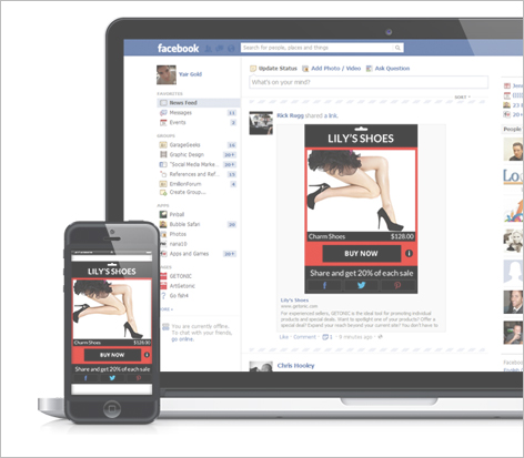
The test subject: A social e-commerce platform.
A service that allows you to sell your products on social networks, inside your Facebook feed (Customers can actually click on a “Buy Now” button straight from within the Facebook feed). This product is used by different types of users who either already have an online store (Amazon/eBay for example) and are looking to actively spread their product to larger audiences or users who don’t have an online store but would like to utilize social networks to their benefit.
When we set out to start testing we had two targets:
- Increase signups – With steady facebook PPC traffic, the goal was to increase signups while using the same budget.
- Increase “open store” – Increasing the amount of people who open a store once they’ve signed up – This happens to a lot of companies, many signup but not enough users actually complete registration or start using the product.
At first we set out to do our research and after studying the current statistics we started segmenting the users according to psycho-emotional triggers. We segmented the users into 3 triggers calling them: Jonathan, Walter and Michelle. Our research showed us that most people don’t understand the service completely, which is probably leading to the outcome of not enough people completing the funnel and actually opening a store.
Following our research we decided to start by testing 3 things:
- Emotional Trigger – To start out we decided to test “Jonathan” first.
- Jonathan was identified in our research as a person who already has an online store.
- Ambitious, a go getter, push to the limits, sit up till 4am kind of guy who considers himself a winner by all mean.
- “The social ecommerce store is just a tool, my product will self itself”.
Using different copy and design elements we’re going to motivate people into opening a store and grasp the importance of a store like this.
- Messaging – With information overflowing the web today, users are very quick to click on the “back” button and we only have 2.3 seconds to convince users to stay and try our product. To do this we need to create the right messaging both in copy and design that will give the users the understanding of what they’re going to receive by signing up.
- UI – One thing we wanted to check out is the actual sign up button. FB connect is a great way to increase conversion to sign up but not necessarily to get users to complete a process. To check this we added an additional step in the funnel that required users to first click on “Create your store” and only then get the FB connect button. Our assumption was we’d see less sign ups but more people creating an actual store
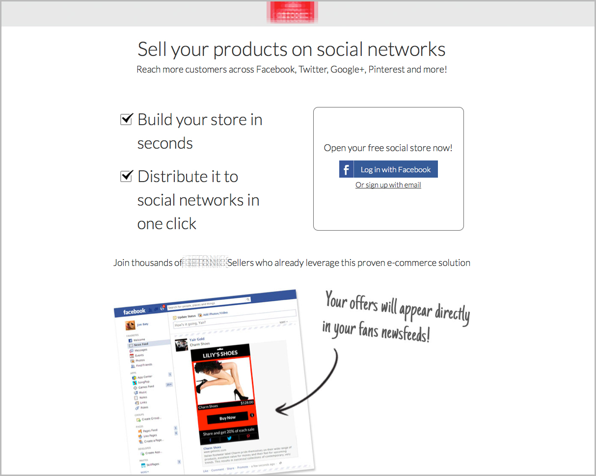
The client’s original page:
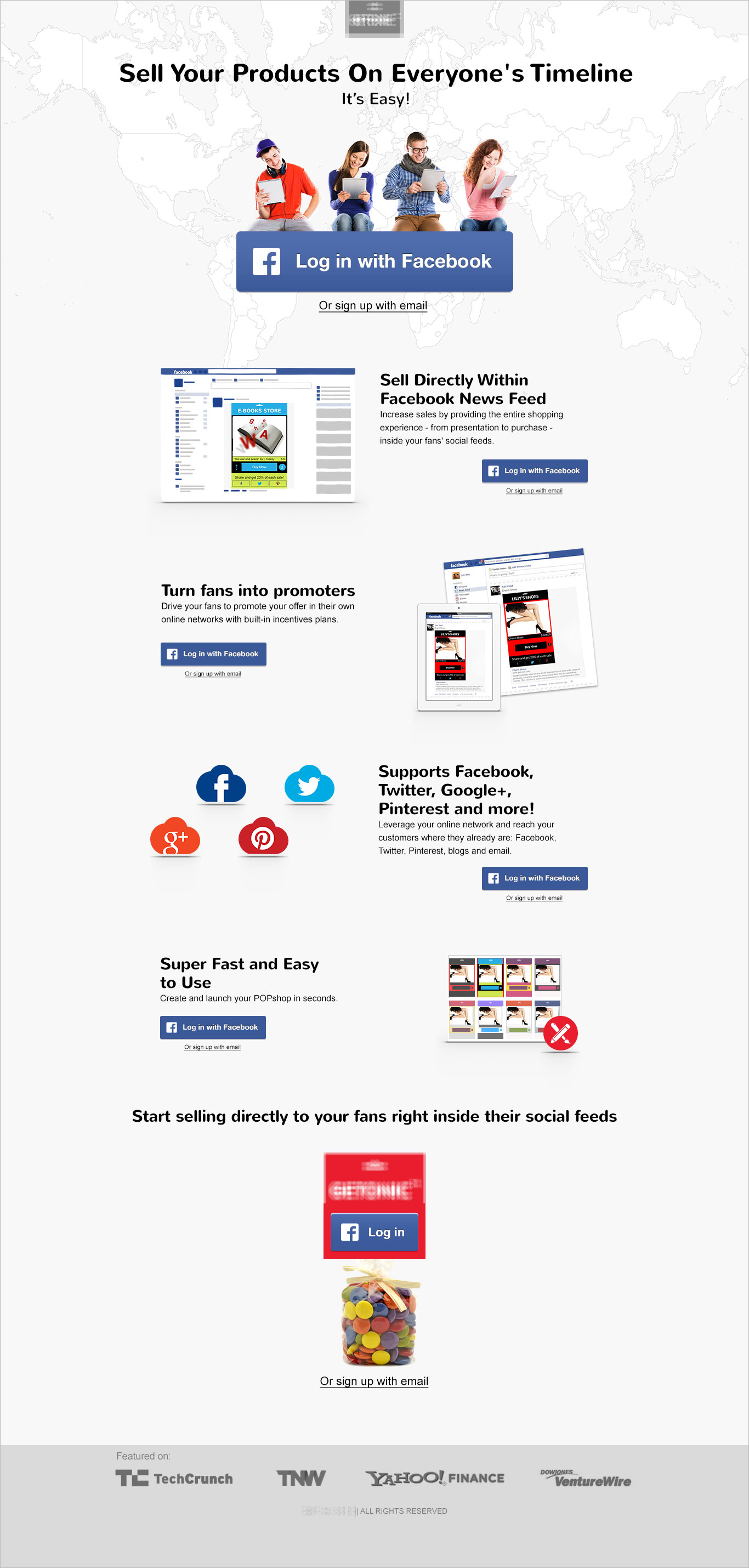
Variation 1:
- Message – In this version we focused on explaining the product to the user and refining the message. Instead of selling your products on social networks, we refined it to “Sell your products on everyone’s timeline”.
- Psycho emotional triggers – Introducing different elements of copy and design throughout the page enabled us to engage users in understanding that it’s not just any other e-commerce store but a store that will allow everyone to see you and will give will give you great exposure.
- Info – Notice the amount of information we’ve added to the page. Making sure the largest call to action is above the fold we decided to introduce as much info as possible for those who need it below the fold. To ensure we don’t lose conversions while users scroll, we added many call to action buttons along the entire page.
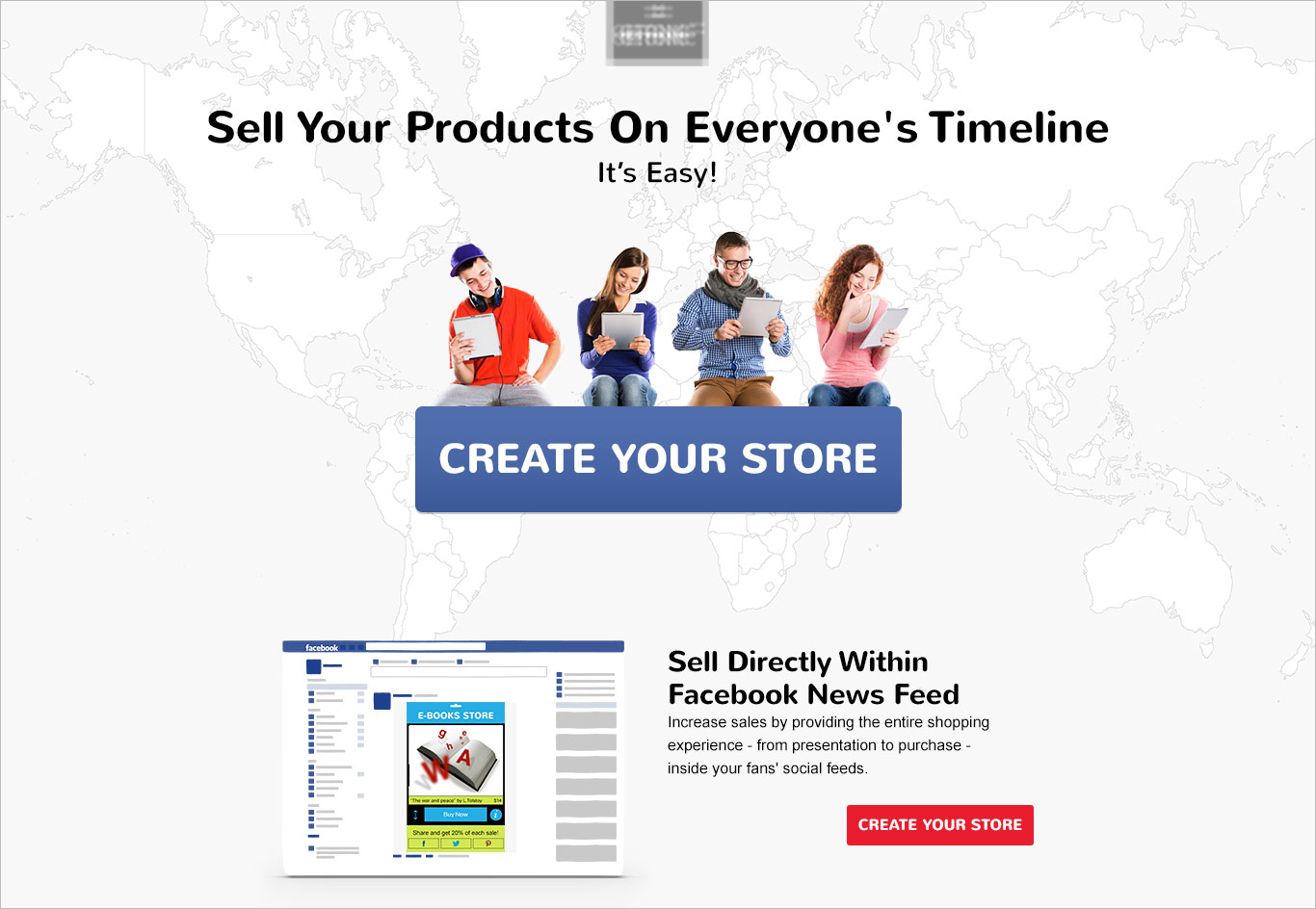
Variation2:
This version was focused on getting more people to create a store and complete the entire funnel. Though we knew less people would sign up we wanted to see the outcome of a test of this sort. This variation is the exact copy as the first landing page (with all the information) but instead of the “Login with facebook” button it had a “Create your store” button, and only once clicking on it would it provoke the “login” button:
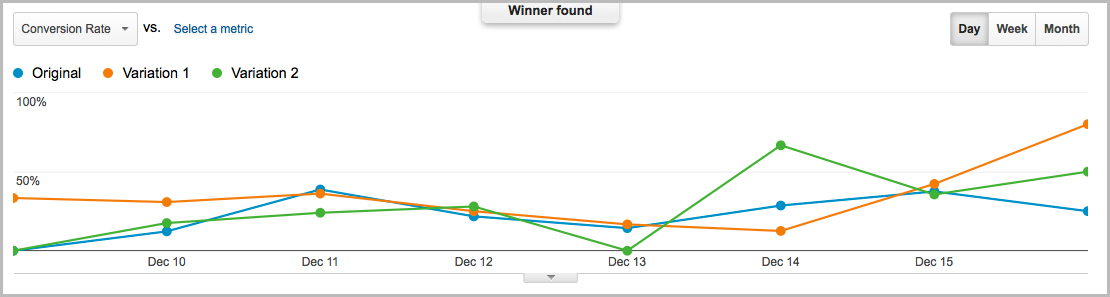
The results:
Quickly enough we saw the results we were looking for:
- 35% increase in signups
- And an outstanding result of 78% increase in creating a store
As predicted, there were less signups from variation2 but many more people completed the funnel, created a store and started using it.
This is an amazing opportunity to discuss the fact that there’s no need to be “scared” in adding another step in the funnel. Yes, in some cases asking the users to perform to many clicks and actions can be a conversion downer, but in some cases it might very well be the opposite.
Optimizing:
The next step in our test will be testing variation 1 against variation 2 only (removing the original). Before doing so we optimized variation 2 and have now launched a test to see which works better. While testing these variations we are already launching new tests for other traffic sources (non Facebook). We’ll keep you update on the results of the next tests. In the meanwhile, check out how we increased conversion to sign up by 316% using emotional triggers.
Have you had any experience in adding a step to the funnel and increasing conversion?


Pingback: Optimisation des conversions : vos solutions pour 2016 | GrowthMamma()