A few weeks ago we finished running our first rounds of conversion optimization tests for one of Asia’s dating sites.
One of the most important and unique things about emotional conversion optimization is the possibility of increasing revenue right from the first step of your funnel before starting to optimize the checkout process. In less than 3 weeks the tested strategies increased signups by 38% and more importantly increased the number of paying users by 304%.
In this conversion optimization case study I will explain what we did, why we did it and what was the conversion optimization strategy. I will also discuss the methodology of the test and of course, the results and the winner of the test.
 Test subject: A dating service website. The service itself is offered for free while you’re also asked to upgrade for further matchmaking services and help.
Test goal: Our main target was to increase sign ups (thus getting more leads) and more importantly getting more people to complete the online purchase funnel instead of completing it on the phone with a sales representative.
The Research:
As we do at the start of every emotional targeting research, we start by going through the funnel, locating leaks and recognizing frictions.
It’s extremely common to find many issues with Google Analytics account. The najority of companies are usually not tracking information well or don’t have the right goals set up. We found 2 technical issues on Google Analytics that needed to be addressed:
Issue #1: First, the goal for sign up completion was set with a destination URL. All users, including already signed in users enter this URL, therefore we had no way of knowing who converted from the new landing pages, and who was already an existing user.
Issue #2: The second issue we found related to the paying subscribers. Again, the goal for payment for each of the pricing packages was defined as a destination URL. However all paying users were sent to the same URL, giving us no way of telling which user purchased which package.
The solution: For both technical issues the solution was the same – We added a parameter in the URL that distinguished between new customers and existing users.
Following the technical part of our research we started inspecting the target audience, and we found major differences in the motives, reasons and behavior of different people within the platform. As usual, different people use the service in different ways and need different emotional triggers. The result of the research was building 2 different emotional strategies that covered: Trust and variety.
Strategy & Emotional Targeting:
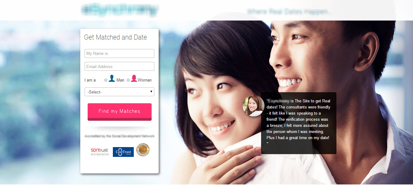
The original landing page:
On this landing page you can see a great use of image pointing towards the call to action. In addition, the usage of testimonials and known icons are a great way to increase conversion.
Variation 1
The first strategy we designed was trust. We chose a romantic picture of a couple on a sunny day in the beach and created messaging designed to be more personal. We wanted to present the service and brand as unique, experienced and reliable – giving people the understanding that they will find their match in this place.

Variation 2
The second strategy revolved around creating a design that demonstrates the great variety of people they can meet if they use this service. The importance of this strategy was to show the simplicity of the service following the high success and satisfaction rate.

So, what do you think? Which of the variations won? We’ll get to that soon.
First, here are the main elements we changed in the landing pages:
-
Design and colors: The images we used all have very pronounce eye contact. Showing the happiness of a young couple in love on one hand, and showing the variety of attractive people on the other hand makes the service become more real and vivid. Both landing pages keep soft and hopeful colors which are associated with feelings of love such as pink, white and soft blue.
The Results:
Variation 2 won the test. As mentioned earlier, signups were increased by 38% and the number of paying users was increased by 304%. Different emotional targeting triggers were applied along with technical changes that made all the difference. Our current test includes a mobile conversion optimization process and optimization to the desktop funnel. We’ll keep you posted.
How to increase revenues by 304% using emotional targeting 4.82/5 (96.36%) 11 votes
Related Posts


How to increase revenues by 304% using emotional targeting
A few weeks ago we finished running our first rounds of conversion optimization tests for one of Asia’s dating sites.
One of the most important and unique things about emotional conversion optimization is the possibility of increasing revenue right from the first step of your funnel before starting to optimize the checkout process. In less than 3 weeks the tested strategies increased signups by 38% and more importantly increased the number of paying users by 304%.
In this conversion optimization case study I will explain what we did, why we did it and what was the conversion optimization strategy. I will also discuss the methodology of the test and of course, the results and the winner of the test.
Test goal: Our main target was to increase sign ups (thus getting more leads) and more importantly getting more people to complete the online purchase funnel instead of completing it on the phone with a sales representative.
The Research:
As we do at the start of every emotional targeting research, we start by going through the funnel, locating leaks and recognizing frictions.
It’s extremely common to find many issues with Google Analytics account. The najority of companies are usually not tracking information well or don’t have the right goals set up. We found 2 technical issues on Google Analytics that needed to be addressed:
Issue #1: First, the goal for sign up completion was set with a destination URL. All users, including already signed in users enter this URL, therefore we had no way of knowing who converted from the new landing pages, and who was already an existing user.
Issue #2: The second issue we found related to the paying subscribers. Again, the goal for payment for each of the pricing packages was defined as a destination URL. However all paying users were sent to the same URL, giving us no way of telling which user purchased which package.
The solution: For both technical issues the solution was the same – We added a parameter in the URL that distinguished between new customers and existing users.
Following the technical part of our research we started inspecting the target audience, and we found major differences in the motives, reasons and behavior of different people within the platform. As usual, different people use the service in different ways and need different emotional triggers. The result of the research was building 2 different emotional strategies that covered: Trust and variety.
Strategy & Emotional Targeting:
The original landing page:
On this landing page you can see a great use of image pointing towards the call to action. In addition, the usage of testimonials and known icons are a great way to increase conversion.
Variation 1
The first strategy we designed was trust. We chose a romantic picture of a couple on a sunny day in the beach and created messaging designed to be more personal. We wanted to present the service and brand as unique, experienced and reliable – giving people the understanding that they will find their match in this place.
Variation 2
The second strategy revolved around creating a design that demonstrates the great variety of people they can meet if they use this service. The importance of this strategy was to show the simplicity of the service following the high success and satisfaction rate.
So, what do you think? Which of the variations won? We’ll get to that soon.
First, here are the main elements we changed in the landing pages:
Design and colors: The images we used all have very pronounce eye contact. Showing the happiness of a young couple in love on one hand, and showing the variety of attractive people on the other hand makes the service become more real and vivid. Both landing pages keep soft and hopeful colors which are associated with feelings of love such as pink, white and soft blue.
Messaging: The entire messaging on the pages focused on finding the match of your life. Further more we wanted to show that the dream of finding your soul-mate can come true and is closer than ever. By using specific messaging for these young men & women we were able to trigger a hopeful reality for them which brought them closer towards their dream of finding a partner.
Call to action: For both our variations we changed the titles and subtitles in order to add a call to action to them, making the call to action more visible and converting.
The Results:
Variation 2 won the test. As mentioned earlier, signups were increased by 38% and the number of paying users was increased by 304%. Different emotional targeting triggers were applied along with technical changes that made all the difference. Our current test includes a mobile conversion optimization process and optimization to the desktop funnel. We’ll keep you posted.
Related Posts
Tags: