In my previous landing page overview post I discussed Adobe’s landing page. In that post I established the importance of the landing pages and its elements. The landing page is one of the first steps in the funnel which users convert from, and has a huge impact on your ROI. Optimizing your landing page should be an ongoing process and continuous (Tips on landing page optimization).
In this post, I decided to focus on Shutterstock’s Landing Page. I’ve been seeing it around quite a bit and thought it would be interesting to analyze it.

From theory to real life – Shutterstock’s landing page
-
Headlines
A good headline is one that contains a call to action. After all you do want your visitors to take an action, so why not motivate them from the first words they see on the page?
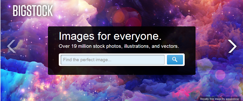
We have also discussed the importance of describing the benefits of your product on your landing page, not the features. – What’s in it for me? Check out the headline in bigstock. They’re headline is “Images for everyone” – making it accessible, real & easy. These benefits makes the headline more convincing and interesting.
Shutterstock’s headline is “Access 30 million images”. The focus in this headline is on the feature (variety) and not on the benefit to the visitor (be unique, or you don’t need to look anywhere else). It does contain a call to action which is very important, however it lacks any emotional message, therefore not fulfilling its potential for creating an impact. On the other hand this headline is following the number 1 rule for headlines: Short and to the point.
-
Call To Action
The call to action is one of the most important elements on your landing page. Shutterstock’s call to action is a red “Start Downloading Now” button. To be sure, your call to action must always be above the fold. Placing it under the fold can be a conversion killer. If you want your visitors to hit the button, it has to appear in a place on the page that doesn’t require scrolling. A better option for Shutterstock would be to place a large button below the headline, and place the rest of the text below the button.
A very strong and useful call to action for Shutterstock could be “Download Images Now”. Not sure why Shutterstock chose to say “Start Downloading Images Now”, but it’s always a good idea to A/B test your call to action buttons and use less words. Read more about A/B test here.
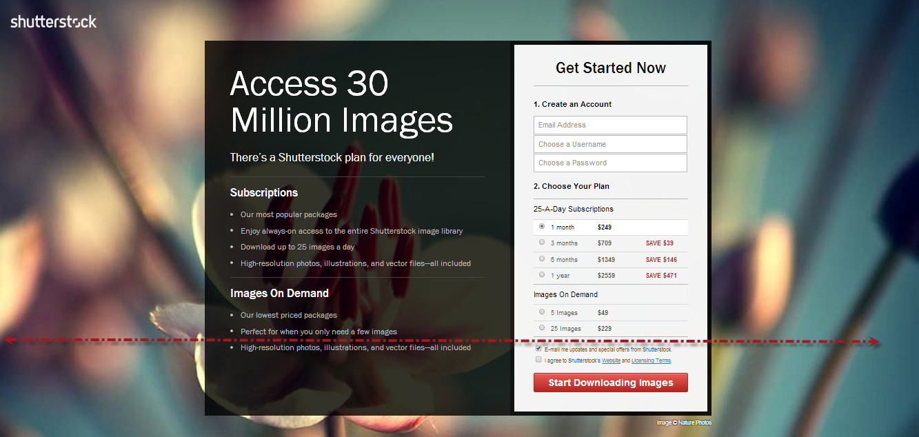
* The fold is marked in – - -
What about the choice of red for your call to action button? I’ll get to that later.
Learn how to improve your Call To Action buttons.
-
Trust
Shutterstock’s landing page doesn’t have any trust icons. Trust icons come in handy a lot, especially when you present prices to your visitors. Visitors need to know it’s safe to make a purchase on your website and trust icons help achieve that. Your visitors shouldn’t have to think twice about the security and credibility of your site. The only trust related elements are the links to the “website and licensing terms” above the call the action. There you can see one trust icon which I would recommend placing in the landing page. On the other hand Shutterstock is a very well known brand, and that is priceless when talking about trust.
This blog post gives good tips on how to increase trust on landing pages
-
Choice of colors
So, I’ve mentioned Shutterstock chose to use red for their call to action button. Red is associated with increased excitement, energy, passion, action and desire (emotional color guide).
Generally speaking, any color that is in contrast to the rest of the page is a good color for a call to action button. However in Shutterstock’s site even the red button, which is usually a strong color that stands out, manages to blend in and is not be prominent enough. It would probably make more sense to increase the size of the button and increase the color contrast.
This landing page should also feature an image. This can make the page more memorable. A mind blowing image is to be expected from a website which sells beautiful images.
For example take a look at this landing page by Depositphotos, Shutterstock’s competitors.
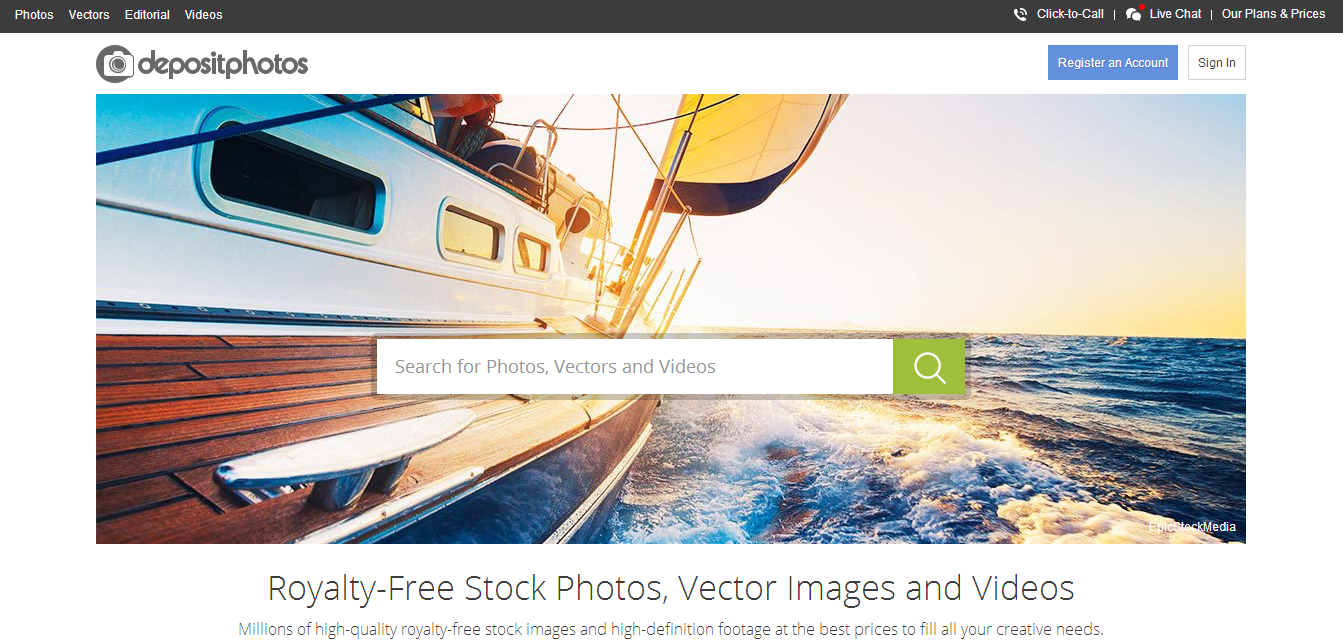
The image is quite attention grabbing, and this makes all the difference.
-
Load time
There are many tools out there that test your site’s speed (a very helpful tool that gives tips and recommendations on how to improve your site speed).
On my browser Shutterstock’s load time is about 3.3 sec. Remember, you have about 2 seconds before your visitors become impatient. A longer load time may result in a skyrocketing bounce rate.
What else?
There are many other elements you can discuss about on this page, for example form optimization. Every field you remove from your form can increase your conversions. One way to do so is by progressive profiling – gathering your leads over time instead of all at once as Shutterstock tries to do on this page. You reduce the number of fields and use subsequent forms to gather the additional data you need. The advantage is a high conversion rate, with higher qualified leads because of their continuous interaction with the website.
Conclusion
Shutterstock is a well known stock photography website, entered by millions of visitors from around the world. For a high profiled site as this, I would consider taking the mentioned steps to optimize the landing page in order to increase conversions.
Having said that, remember that everything you change on your landing page should be tested. Every element you alter should have a clear conversion optimization strategy behind it, and this strategy should be well defined before you start your tests.
Learn more on optimization your landing page here.
It’s your chance to determine who takes the next spotlight, which brands would you like us to analyze next?
5 Ways Shutterstock’s Landing Page Misses The Spot 5.00/5 (100.00%) 6 votes
Related Posts


5 Ways Shutterstock’s Landing Page Misses The Spot
In my previous landing page overview post I discussed Adobe’s landing page. In that post I established the importance of the landing pages and its elements. The landing page is one of the first steps in the funnel which users convert from, and has a huge impact on your ROI. Optimizing your landing page should be an ongoing process and continuous (Tips on landing page optimization).
In this post, I decided to focus on Shutterstock’s Landing Page. I’ve been seeing it around quite a bit and thought it would be interesting to analyze it.
From theory to real life – Shutterstock’s landing page
Headlines
A good headline is one that contains a call to action. After all you do want your visitors to take an action, so why not motivate them from the first words they see on the page?
We have also discussed the importance of describing the benefits of your product on your landing page, not the features. – What’s in it for me? Check out the headline in bigstock. They’re headline is “Images for everyone” – making it accessible, real & easy. These benefits makes the headline more convincing and interesting.
Shutterstock’s headline is “Access 30 million images”. The focus in this headline is on the feature (variety) and not on the benefit to the visitor (be unique, or you don’t need to look anywhere else). It does contain a call to action which is very important, however it lacks any emotional message, therefore not fulfilling its potential for creating an impact. On the other hand this headline is following the number 1 rule for headlines: Short and to the point.
Call To Action
The call to action is one of the most important elements on your landing page. Shutterstock’s call to action is a red “Start Downloading Now” button. To be sure, your call to action must always be above the fold. Placing it under the fold can be a conversion killer. If you want your visitors to hit the button, it has to appear in a place on the page that doesn’t require scrolling. A better option for Shutterstock would be to place a large button below the headline, and place the rest of the text below the button.
A very strong and useful call to action for Shutterstock could be “Download Images Now”. Not sure why Shutterstock chose to say “Start Downloading Images Now”, but it’s always a good idea to A/B test your call to action buttons and use less words. Read more about A/B test here.
* The fold is marked in – - -
What about the choice of red for your call to action button? I’ll get to that later.
Learn how to improve your Call To Action buttons.
Trust
Shutterstock’s landing page doesn’t have any trust icons. Trust icons come in handy a lot, especially when you present prices to your visitors. Visitors need to know it’s safe to make a purchase on your website and trust icons help achieve that. Your visitors shouldn’t have to think twice about the security and credibility of your site. The only trust related elements are the links to the “website and licensing terms” above the call the action. There you can see one trust icon which I would recommend placing in the landing page. On the other hand Shutterstock is a very well known brand, and that is priceless when talking about trust.
This blog post gives good tips on how to increase trust on landing pages
Choice of colors
So, I’ve mentioned Shutterstock chose to use red for their call to action button. Red is associated with increased excitement, energy, passion, action and desire (emotional color guide).
Generally speaking, any color that is in contrast to the rest of the page is a good color for a call to action button. However in Shutterstock’s site even the red button, which is usually a strong color that stands out, manages to blend in and is not be prominent enough. It would probably make more sense to increase the size of the button and increase the color contrast.
This landing page should also feature an image. This can make the page more memorable. A mind blowing image is to be expected from a website which sells beautiful images.
For example take a look at this landing page by Depositphotos, Shutterstock’s competitors.
The image is quite attention grabbing, and this makes all the difference.
Load time
There are many tools out there that test your site’s speed (a very helpful tool that gives tips and recommendations on how to improve your site speed).
On my browser Shutterstock’s load time is about 3.3 sec. Remember, you have about 2 seconds before your visitors become impatient. A longer load time may result in a skyrocketing bounce rate.
What else?
There are many other elements you can discuss about on this page, for example form optimization. Every field you remove from your form can increase your conversions. One way to do so is by progressive profiling – gathering your leads over time instead of all at once as Shutterstock tries to do on this page. You reduce the number of fields and use subsequent forms to gather the additional data you need. The advantage is a high conversion rate, with higher qualified leads because of their continuous interaction with the website.
Conclusion
Shutterstock is a well known stock photography website, entered by millions of visitors from around the world. For a high profiled site as this, I would consider taking the mentioned steps to optimize the landing page in order to increase conversions.
Having said that, remember that everything you change on your landing page should be tested. Every element you alter should have a clear conversion optimization strategy behind it, and this strategy should be well defined before you start your tests.
Learn more on optimization your landing page here.
It’s your chance to determine who takes the next spotlight, which brands would you like us to analyze next?
Related Posts
Tags: