This is round 3 of landing pages overviews. In my previous landing page overview posts I discussed Adobe’s and Shutterstock’s landing pages. I discussed the important elements of landing pages and how to use them correctly. Landing pages have the potential to convert many users as they are the first page your visitors see and therefore they give the first impression of your product. You can read more on landing page optimization in our blog.
In this post, I decided to focus on Vertical response’s Landing Page. Known and used by several marketers, they allow you to create free email newsletter templates. So it will be interesting to analyze the advantages and disadvantages of the page and discover 5 quick landing page tips.
1. Above the fold
Marketers always talk about “above the fold” but what does it actually mean? The fold is approximately the top 400 pixels of your landing page (this changes across devices). The majority of visitors see only this part of the page without needing to scroll, a minimum of people actually make it to the bottom parts of pages. Therefore you should keep all your crucial elements above this section.
In the case of Vertical Response, the fold is marked below.
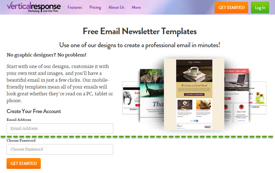
What do you think? Are all important elements of the page placed above the fold? Would you add anything else? Remove anything? I’ll get to what I would do in the end of the post.
2. Call to Action
A recent study by Marketing Sherpa showed that 48% of landing pages contain multiple offers. This statistic is amazing. One of the basic rules in landing page optimization is to focus on one call to action; Decide what is the most important step you want your users to do, and just ask them to do that. Too many options cause confusion and lead to Analysis Paralysis -a psychological state of over-analyzing a situation to the point where a decision is not made. This is the result of being presented with too many options. Therefore sometimes less is more.
In the case of Vertical response’s landing page, it contains multiple call to actions. You are asked to get started, log in, use the designs, start with the designs and create an account. In particular, showing users multiple buttons might be confusing. Vertical response uses their “get started” button 3 times on the page, which is great and recommendable, only when it comes to the “above the fold” section, you want to make sure your visitor focus on one part of the page only and drives into action. Another idea would be to turn the log in button into a text link. That would make the “get started” button stand out more. Another good point for Vertical response it the color contrast they chose for their button.
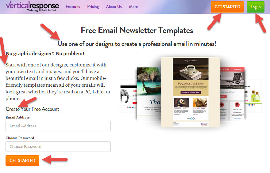
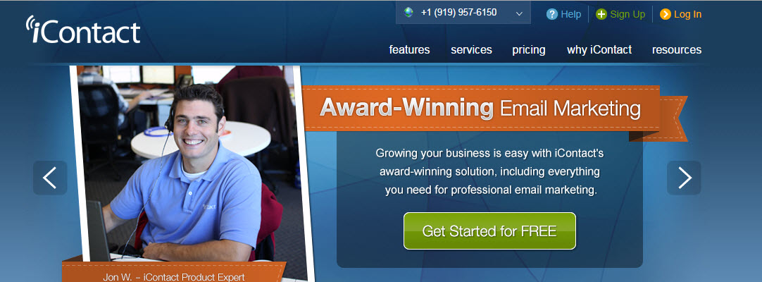
If we look at their competitor’s landing page iContact, we’ll see they place their button in a prominent area, with a strong contrasted color from the background, while the sign up and login options are placed at the header as text links which grab much less attention.
3. Title
“Headline writing is an art form” (Jennifer Lee, screenwriter at Disney).
Vertical response chose “free email newsletter templates” as their title. As I mentioned in the last paragraph, you should watch out from multiple call to actions, but there is one place where it is important to use a “call to action” which is the title. Usually, the title is the first thing your visitors see, therefore it should be focused on the benefit your users will get from using your product not the actual product. Free email newsletter templates are offered by many websites, Vertical response should find the emotional response they want to trigger in their users add that to their messaging.
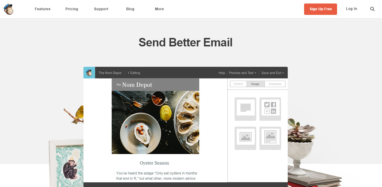
Let’s take a look at their competitor’s landing page from MailChimp: Their title is simply “Send better email”. This title is fantastic for 3 reasons: It’s short, contains a call to action and gives a benefit to the user.
4. Mobile & browser compatibility
This is how the landing page looks in my mobile phone.
As I mentioned about above the fold, the same rules apply in mobile. So the only thing I see when entering this landing page from my mobile is text, and I’m required to scroll down to get to a button. I would consider adding a button somewhere in there, to guide my users to the right place.
Another major element in landing page optimization is browser compatibility. You want to make sure all your users are able to access your page. For example, this landing page is not functional in Internet Explorer 8. I don’t know how many of their users are using this browser version but it may be worth checking and making it compatible.
5. Messaging – follow the KISS
Keep it simple stupid or KISS is a very good principle to take under account when building your page. It is always a temptation to write about everything you have to offer to your customers and all the wonderful features of your product. But similar to analysis paralysis – you don’t want to overwhelm your users with too much information. What might be considered a useful feature to one user, is completely useless to another. Therefore, create different landing pages, and minimize the number of benefits you choose to describe by showing different benefits in different pages. (Don’t see the point in creating multiple landing pages? businesses with over 40 landing pages generate 12 times more leads than those with 1-5 landing pages – according to hubspot).
I love the way Vertical response shows their features. They kept it simple by adding an icon to each section, and only give 1-2 bullets for each feature. Also the language they use is about the benefit or “what’s in it for me” and not just the feature or “see how good our product is”. Talking to the users in their language is always a good way to increase conversions.
So we are approaching the end of the post and I will finish the overview with my tip about above the fold. If you have read our posts in the past you know how important it is to keep your Call to Action button the first natural place a visitors looks at. Right now what the users see is a beginning of a form to create an account and some users might be discouraged because they think they are about to go through a long and exhausting form. To avoid this, I would bring the entire form higher and make sure the button is visible.
Do you have any other tips about landing page optimization? Share with us.
Would you like us to review your landing page? let us know in your comments.
5 Landing Page Tips: Landing Page Critique Round 3 4.67/5 (93.33%) 3 votes
Related Posts


5 Landing Page Tips: Landing Page Critique Round 3
This is round 3 of landing pages overviews. In my previous landing page overview posts I discussed Adobe’s and Shutterstock’s landing pages. I discussed the important elements of landing pages and how to use them correctly. Landing pages have the potential to convert many users as they are the first page your visitors see and therefore they give the first impression of your product. You can read more on landing page optimization in our blog.
In this post, I decided to focus on Vertical response’s Landing Page. Known and used by several marketers, they allow you to create free email newsletter templates. So it will be interesting to analyze the advantages and disadvantages of the page and discover 5 quick landing page tips.
1. Above the fold
Marketers always talk about “above the fold” but what does it actually mean? The fold is approximately the top 400 pixels of your landing page (this changes across devices). The majority of visitors see only this part of the page without needing to scroll, a minimum of people actually make it to the bottom parts of pages. Therefore you should keep all your crucial elements above this section.

In the case of Vertical Response, the fold is marked below.
What do you think? Are all important elements of the page placed above the fold? Would you add anything else? Remove anything? I’ll get to what I would do in the end of the post.
2. Call to Action
A recent study by Marketing Sherpa showed that 48% of landing pages contain multiple offers. This statistic is amazing. One of the basic rules in landing page optimization is to focus on one call to action; Decide what is the most important step you want your users to do, and just ask them to do that. Too many options cause confusion and lead to Analysis Paralysis -a psychological state of over-analyzing a situation to the point where a decision is not made. This is the result of being presented with too many options. Therefore sometimes less is more.
In the case of Vertical response’s landing page, it contains multiple call to actions. You are asked to get started, log in, use the designs, start with the designs and create an account. In particular, showing users multiple buttons might be confusing. Vertical response uses their “get started” button 3 times on the page, which is great and recommendable, only when it comes to the “above the fold” section, you want to make sure your visitor focus on one part of the page only and drives into action. Another idea would be to turn the log in button into a text link. That would make the “get started” button stand out more. Another good point for Vertical response it the color contrast they chose for their button.
If we look at their competitor’s landing page iContact, we’ll see they place their button in a prominent area, with a strong contrasted color from the background, while the sign up and login options are placed at the header as text links which grab much less attention.

3. Title
“Headline writing is an art form” (Jennifer Lee, screenwriter at Disney).
Vertical response chose “free email newsletter templates” as their title. As I mentioned in the last paragraph, you should watch out from multiple call to actions, but there is one place where it is important to use a “call to action” which is the title. Usually, the title is the first thing your visitors see, therefore it should be focused on the benefit your users will get from using your product not the actual product. Free email newsletter templates are offered by many websites, Vertical response should find the emotional response they want to trigger in their users add that to their messaging.
Let’s take a look at their competitor’s landing page from MailChimp: Their title is simply “Send better email”. This title is fantastic for 3 reasons: It’s short, contains a call to action and gives a benefit to the user.
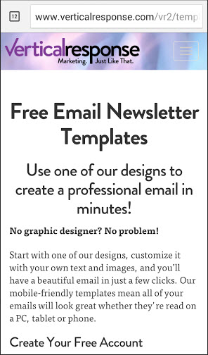
4. Mobile & browser compatibility
This is how the landing page looks in my mobile phone.
As I mentioned about above the fold, the same rules apply in mobile. So the only thing I see when entering this landing page from my mobile is text, and I’m required to scroll down to get to a button. I would consider adding a button somewhere in there, to guide my users to the right place.
Another major element in landing page optimization is browser compatibility. You want to make sure all your users are able to access your page. For example, this landing page is not functional in Internet Explorer 8. I don’t know how many of their users are using this browser version but it may be worth checking and making it compatible.
5. Messaging – follow the KISS
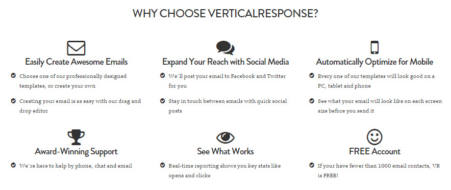
Keep it simple stupid or KISS is a very good principle to take under account when building your page. It is always a temptation to write about everything you have to offer to your customers and all the wonderful features of your product. But similar to analysis paralysis – you don’t want to overwhelm your users with too much information. What might be considered a useful feature to one user, is completely useless to another. Therefore, create different landing pages, and minimize the number of benefits you choose to describe by showing different benefits in different pages. (Don’t see the point in creating multiple landing pages? businesses with over 40 landing pages generate 12 times more leads than those with 1-5 landing pages – according to hubspot).
I love the way Vertical response shows their features. They kept it simple by adding an icon to each section, and only give 1-2 bullets for each feature. Also the language they use is about the benefit or “what’s in it for me” and not just the feature or “see how good our product is”. Talking to the users in their language is always a good way to increase conversions.
So we are approaching the end of the post and I will finish the overview with my tip about above the fold. If you have read our posts in the past you know how important it is to keep your Call to Action button the first natural place a visitors looks at. Right now what the users see is a beginning of a form to create an account and some users might be discouraged because they think they are about to go through a long and exhausting form. To avoid this, I would bring the entire form higher and make sure the button is visible.
Do you have any other tips about landing page optimization? Share with us.
Would you like us to review your landing page? let us know in your comments.
Related Posts
Tags: