Imagine going to a friend’s house for the first time. You get to the house and see a “welcome” sign, but no door. It doesn’t have any windows and basically there’s no way to get in. Seems strange right?
Your landing page is the front door to your website. It is the first thing your visitors see, and it needs to be inviting, welcoming and most importantly easy to understand and access.
To make sure your landing page is optimized in the best way there are various elements you should include on your landing pages. We’ve gathered the 5 most important of elements for you to implement:
1. The Call to Action
We wrote a whole post on call to action buttons alone, but here are some quick tips for CTA optimization, and making you call to action buttons stand out:
- Size- If you want your users to click on your call to action button, it is only logical to make it stand out. One important way to get your call to action buttons to stand out is making them the center of attention. Make sure the call to action button is large, and that no other element on the landing page is blocking its attention. For example, make sure the image or any other external links don’t overtake the attention from the button.
- Attention – Another way to attract attention to your call to action button is by using images, for example having an image of a human or animal looking at it, or an object pointing to it. Let’s take a look at two examples:
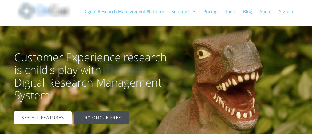
- The landing page below has an image that captures all the attention and does not compliment the call to action. The image makes it very hard to single out the call to action and use it.
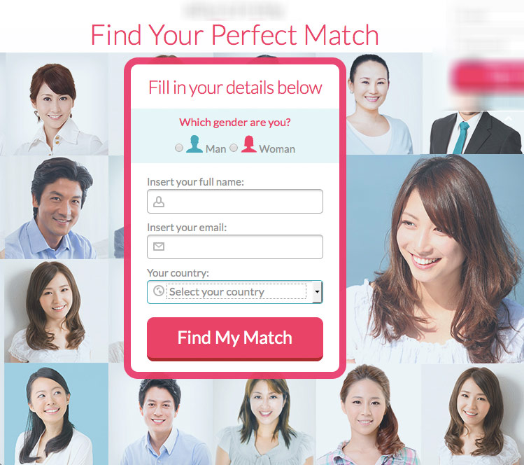
- This landing page has different images all pointing towards the call to cation and form section, making sure that the attention is towards the action:
- Color – color is yet another great way to make your call to action buttons stand out. Make sure your CTA is contrasted in color from the rest of the colors in the page. Also, allow space around your call to action button, to make sure it stands alone and is not interfered by anything around it.
- ONE call to action: Use one call to action on your page. Don’t confuse your visitors with too many messages and requests, decide what you want users to do and ask for that only.
2. The Colors
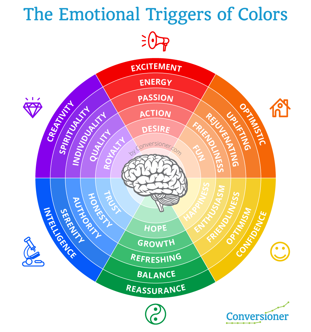
Colors have a huge role in driving your users into action. It is far more extended than just preferring one color over another, colors have proven emotional effects on people. Check out this emotional color guide we created to better understand what colors you should be using to provoke different emotions.
Each color triggers a different mood or emotion. Colors may affect us slightly differently as each individual has slightly different perceptions about each color, however some colors have a common universal perception.
Unfortunately there are no thumb rules to use when it comes to colors. For example, you will find endless case studies in which red buttons don’t work, and green buttons are the best, but you will also find case studies that show the opposite. I wish it was that simple, but what works for one landing page will not necessarily work for another. The truth is that everything should be tested, since the success of the color of your button may be depended on many factors such as the rest of the colors in your page, the layout, the images, the emotion you should convey and how they all interact together.
Important tip: Try not to have more than 2-3 colors in you page. More than 3 tends to confuse your users and will make it harder for you to draw their attention to places on the page which deserve their attention.
3. Titles & Content
A good title is one that is inviting, short and to the point, includes a call to action, and talks about the benefits to the users, rather than the features of the product. With emotional targeting, it’s crucial that your messaging focuses on what you want your visitors to feel and gain from your product or service and not the actual product.
In your landing page, keep your content short, relevant and valuable. You have a wonderful product with many great features? That’s great, but don’t give it all away. Most times less is more. Figuring out what your visitors are actually looking for in your product emotionally (not the price and features) can help you design better messaging and more accurate landing pages that will convert much more.
Pro font tip: Another good tip to avoid confusion and overload is to use the same font in the page. A simple thing as that can increase your conversions.
4. Images & Visuals
Content featuring images has 94% more total views than content without images (MDG Advertising). According to the Picture superiority effect, images are better remembered than words, so the pictures and images you use in your landing page have an enormous effect on how memorable you are, and this in turn can boost your conversions. What is a converting image? To know the answer to that, you should know your target audience. An animated image might be very converting in one landing page, but can drive your traffic away in another. Sometimes it is better to use an image of a cat or a dog, sometimes a baby and sometimes older folks. It depends on your product and the emotion you want to convey.
When choosing an image for your landing page optimization efforts remember to ask yourself 3 questions:
- What are my test goals? What do I want people to do?
- Why do people want my product or service?
- How do people feel about themselves once they’ve purchased my product/service?
These questions will help you better understand your audience and the emotions you want to convey.
Click to learn how to design a memorable logo.
5. Above The Fold
80% of our time online is spent above the fold (Nielsen Norman Group). Above the fold is the top 400 pixels of your landing page. Therefore, you should keep all of the elements I discussed above, and particularly your conversion actions in this area.
On a previous post about Shutterstock, I showed this image of their landing page, where you can see the call to action placed under the fold, forcing users to scroll down. 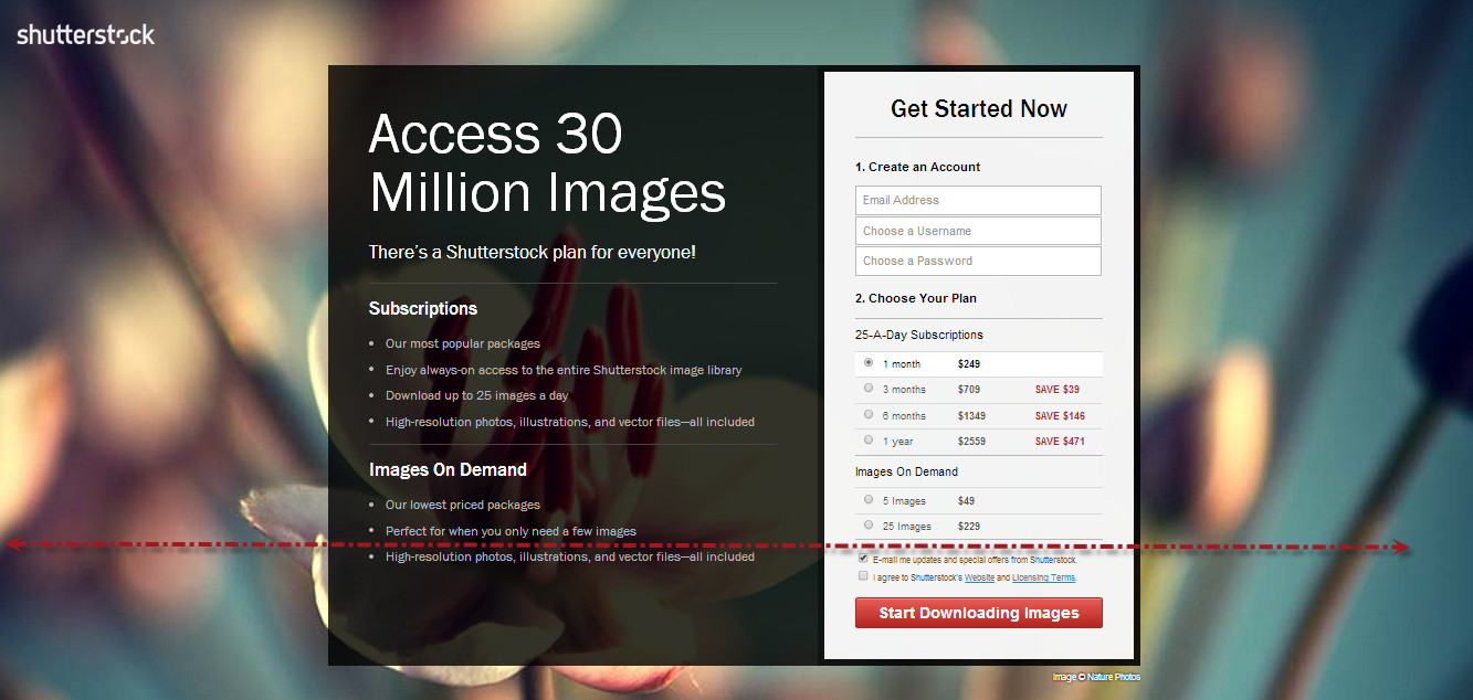
For the complete list of landing page tips, visit our landing page optimization tips article.
Want to dive in deeper into landing pages tips? Check out our checklist and see how well your landing page is doing.
The 5 Key Elements for Landing Page Optimization 5.00/5 (100.00%) 13 votes
Related Posts


The 5 Key Elements for Landing Page Optimization
Imagine going to a friend’s house for the first time. You get to the house and see a “welcome” sign, but no door. It doesn’t have any windows and basically there’s no way to get in. Seems strange right?
Your landing page is the front door to your website. It is the first thing your visitors see, and it needs to be inviting, welcoming and most importantly easy to understand and access.
To make sure your landing page is optimized in the best way there are various elements you should include on your landing pages. We’ve gathered the 5 most important of elements for you to implement:
1. The Call to Action
We wrote a whole post on call to action buttons alone, but here are some quick tips for CTA optimization, and making you call to action buttons stand out:
2. The Colors
Colors have a huge role in driving your users into action. It is far more extended than just preferring one color over another, colors have proven emotional effects on people. Check out this emotional color guide we created to better understand what colors you should be using to provoke different emotions.
Each color triggers a different mood or emotion. Colors may affect us slightly differently as each individual has slightly different perceptions about each color, however some colors have a common universal perception.
Unfortunately there are no thumb rules to use when it comes to colors. For example, you will find endless case studies in which red buttons don’t work, and green buttons are the best, but you will also find case studies that show the opposite. I wish it was that simple, but what works for one landing page will not necessarily work for another. The truth is that everything should be tested, since the success of the color of your button may be depended on many factors such as the rest of the colors in your page, the layout, the images, the emotion you should convey and how they all interact together.
Important tip: Try not to have more than 2-3 colors in you page. More than 3 tends to confuse your users and will make it harder for you to draw their attention to places on the page which deserve their attention.
3. Titles & Content
A good title is one that is inviting, short and to the point, includes a call to action, and talks about the benefits to the users, rather than the features of the product. With emotional targeting, it’s crucial that your messaging focuses on what you want your visitors to feel and gain from your product or service and not the actual product.
In your landing page, keep your content short, relevant and valuable. You have a wonderful product with many great features? That’s great, but don’t give it all away. Most times less is more. Figuring out what your visitors are actually looking for in your product emotionally (not the price and features) can help you design better messaging and more accurate landing pages that will convert much more.
Pro font tip: Another good tip to avoid confusion and overload is to use the same font in the page. A simple thing as that can increase your conversions.
4. Images & Visuals
Content featuring images has 94% more total views than content without images (MDG Advertising). According to the Picture superiority effect, images are better remembered than words, so the pictures and images you use in your landing page have an enormous effect on how memorable you are, and this in turn can boost your conversions. What is a converting image? To know the answer to that, you should know your target audience. An animated image might be very converting in one landing page, but can drive your traffic away in another. Sometimes it is better to use an image of a cat or a dog, sometimes a baby and sometimes older folks. It depends on your product and the emotion you want to convey.
When choosing an image for your landing page optimization efforts remember to ask yourself 3 questions:
These questions will help you better understand your audience and the emotions you want to convey.
Click to learn how to design a memorable logo.
5. Above The Fold
80% of our time online is spent above the fold (Nielsen Norman Group). Above the fold is the top 400 pixels of your landing page. Therefore, you should keep all of the elements I discussed above, and particularly your conversion actions in this area.
On a previous post about Shutterstock, I showed this image of their landing page, where you can see the call to action placed under the fold, forcing users to scroll down.
For the complete list of landing page tips, visit our landing page optimization tips article.
Want to dive in deeper into landing pages tips? Check out our checklist and see how well your landing page is doing.
Related Posts
Tags: