If you have ever created a landing page for your site, you probably know there are some basic guidelines to follow in order to create a truly converting landing page (some landing pages tips). The landing page is one of the first parts in the funnel in which users convert from and so it is extremely important to optimize it.
Since you want your landing page to be as converting as possible, you should build it based on your users’ needs, and the emotional triggers that will get them to convert, not based on what you think is right or they way you think you should market your product.
But how do these guidelines actually work in real life?
From theory to real life – Adobe’s landing page
You have less than 2 seconds to convince your visitors to stay on your page. After 2 seconds, up to 40% will abandon your website, which means you have to direct your efforts into keeping everything quick and simple.

-
Headlines
There are a number of things to remember about headlines:
-
Headlines should be short and persuasive
-
A good headline is one that makes visitors want to keep reading
-
Headlines should describe the benefits to the user, not the features of the product. For example, take a look at this headline in the “capital one” site.
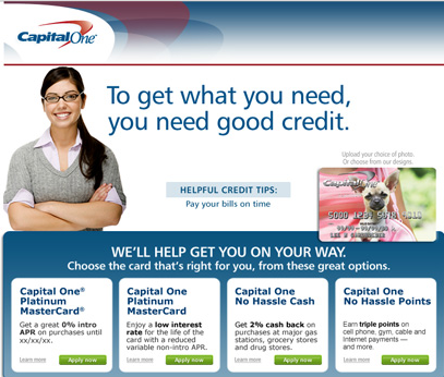
*taken from here.
The benefit to the user is very prominent and they even use the word “you” twice to make their statement more personalized.
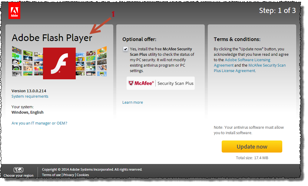
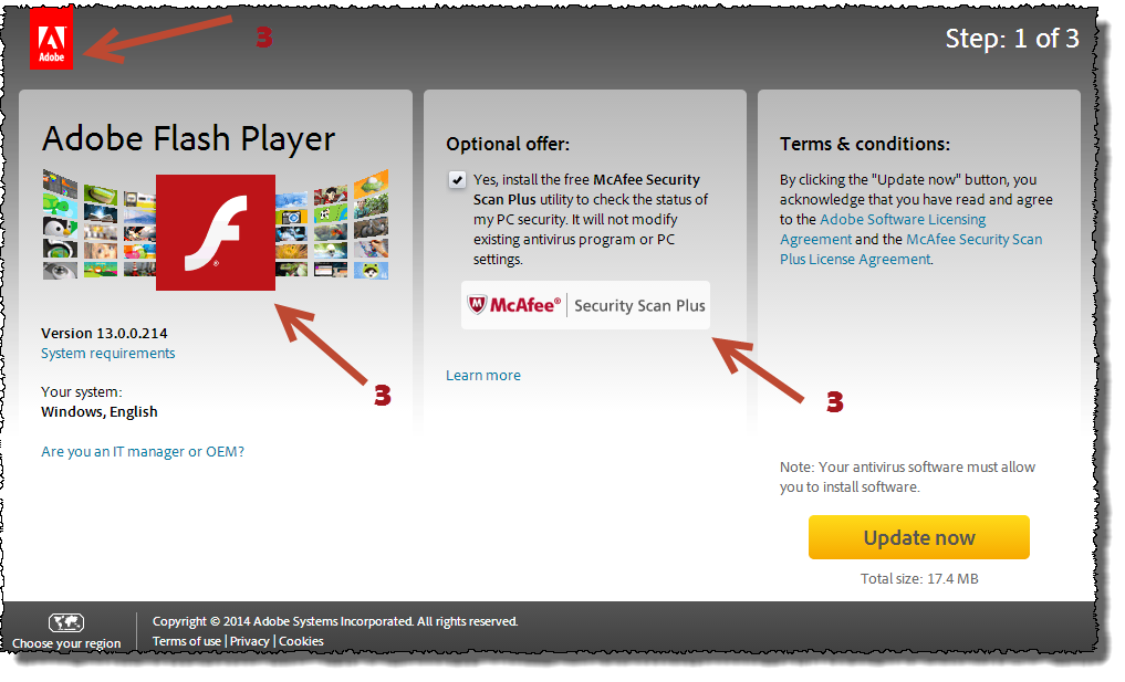
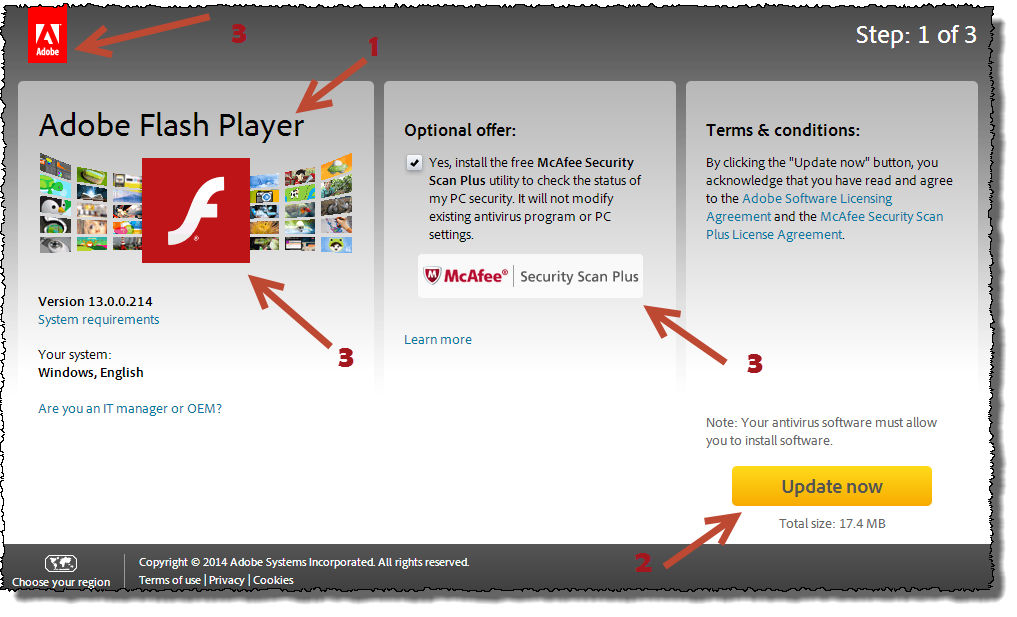
Adobe’s headline on the other hand is simply “Adobe flash player”. With no personal take to it, it lacks the emotional advantage other landing pages have and its vast potential for hitting a home run.
-
Call To Action
The call to action is one of the most important things on your landing page. It’s what your users see when they wonder whether they should make a move or not. An efficient call to action button is big, bold, contrasted in color from the other elements of the landing page, and in other words – one that users can’t ignore. The text on the button should make an offer that the users won’t be able to refuse.
Get more tips on how to improve your CTA buttons here.
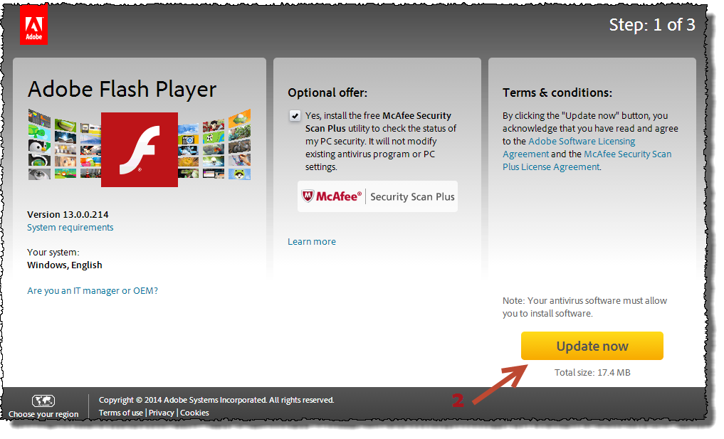
On one hand, Adobe’s call to action is a bold “update now” button. Its yellow-orange color stands out in comparison to the rest of the page which is in shades of grey. On the other hand, the most dominant feature on the landing page is Adobe’s logo and not the actual call to action button.
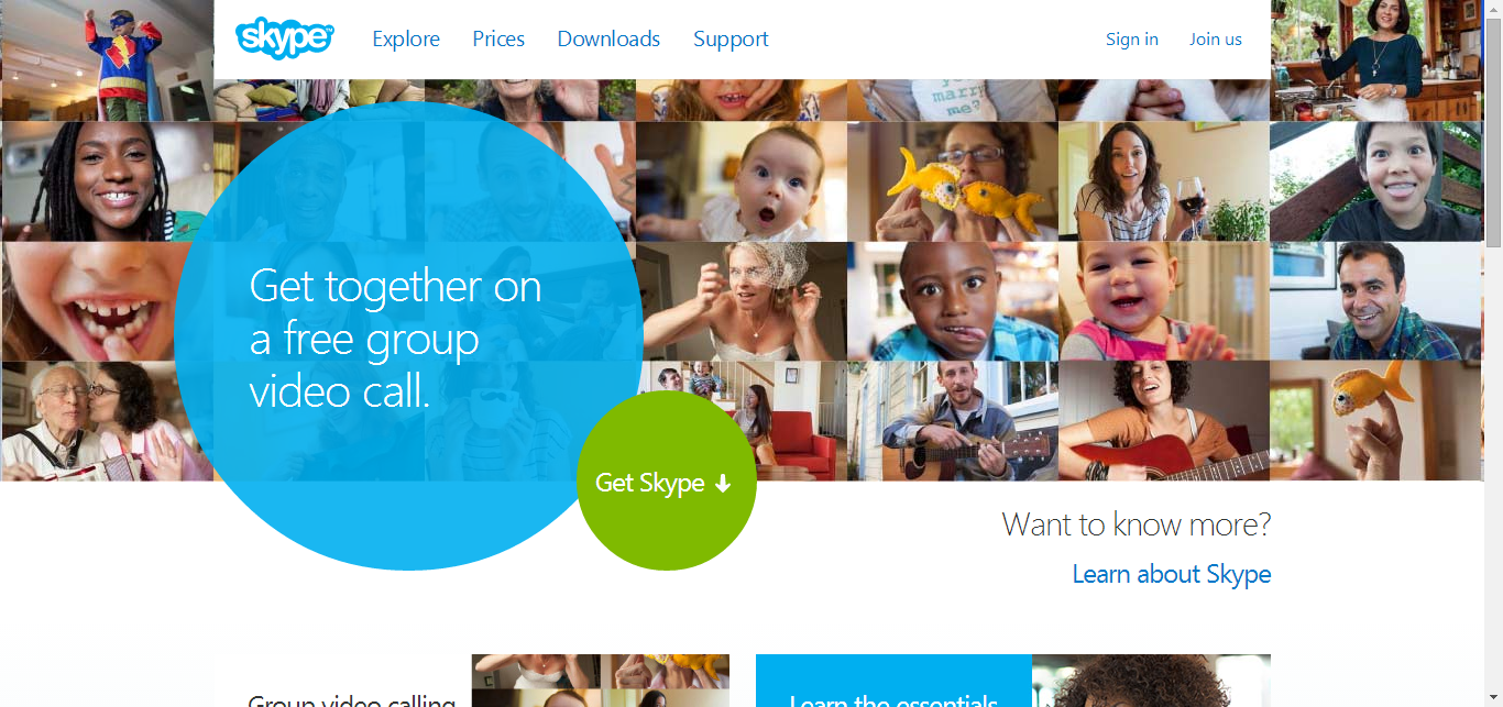
Take a look at skype’s landing page:
See the difference between the “get skype” call to action and the “learn more about skype” call to action. Which do you think is more converting? (see how SKYPE could change their colors to increase conversion) + See how the call to action button is smaller than the blue element on the page..
-
Trust
A simple trust icon can increase conversion tremendously. Not all sites choose to show trust icons, simply because they don’t understand the emotional impact such icons can have on us (more about the emotional triggers trust icons create). Social proof in the form of testimonials or reviews work the same way by providing proof of the legitimacy of your site.
Adobe have one priceless advantage as far as trust – their brand. Not all brands are as well known as Adobe, and even their logo can be a very useful trust icon for other companies.
They are also well known for their Flash Player logo, and its distinct presence in the page helps to make it more trustable. Also, the Mcafee trust icons is always a good icon to have on your page.
-
Choice of colors
Generally, it’s a good idea to have no more than 2-3 colors in your landing page. Adobe’s choice of colors is interesting. The dominant color in Adobe’s landing page is grey. Grey as a background color is generally good for highlighting other colors in the page. The more contrast your background has with the call to action button, the better. The second color Adobe chose is red. Red is associated with increased excitement, energy, passion, action and desire (emotional color guide). Its contrast from the grey background makes it stand out even more. The color of Adobe’s call to action button is yellow. Yellow is mostly associated with optimism, friendliness and enthusiasm, which makes this choice a very wise one.
-
Load time
Did you know that 47% of consumers expect a web page to load in 2 seconds or less? As mentioned earlier, when a visitor hits your page you have less than 2 seconds to convince them to stay. This means that you need to make sure your landing page loads quickly otherwise your bounce rate will skyrocket.
On my browser Adobe’s load time is about 2.8 sec. Remember that every fraction of a second counts when we’re talking about conversion optimization. Load time depends on many factors and is different for every page, browser and operating system. Because load time isn’t the same for everyone, you should do your best to minimize it and QA before launching.
Conclusion
Adobe’s landing page is very different than others. Even the way they built of the page is different - for example they divide their landing page into 3 sections – on the left they give some info about the flash player, the middle has an optional offer and on the right they placed their terms and conditions, a section of the site which is usually hidden and unnoticeable. It would be interesting to see what would happen with a different build of a page and an AB test. From headline to the position of the CTA and colors, Adobe’s page has many variables that can be tested.
When building a new landing page, or optimizing an existing one, remember to take your time in building your conversion optimization strategy first. To improve conversion rates consider both your company’s goals, but also your target audience needs and wishes – understand what your client is trying to gain from your product emotionally.
Learn more about landing page optimization here.
It’s your chance to determine who takes the next spotlight, which brands would you like us to analyse next?
In The Spotlight: Adobe’s Landing Page 5.00/5 (100.00%) 3 votes
Related Posts


In The Spotlight: Adobe’s Landing Page
If you have ever created a landing page for your site, you probably know there are some basic guidelines to follow in order to create a truly converting landing page (some landing pages tips). The landing page is one of the first parts in the funnel in which users convert from and so it is extremely important to optimize it.
Since you want your landing page to be as converting as possible, you should build it based on your users’ needs, and the emotional triggers that will get them to convert, not based on what you think is right or they way you think you should market your product.
But how do these guidelines actually work in real life?
From theory to real life – Adobe’s landing page
You have less than 2 seconds to convince your visitors to stay on your page. After 2 seconds, up to 40% will abandon your website, which means you have to direct your efforts into keeping everything quick and simple.
Headlines
There are a number of things to remember about headlines:
Headlines should be short and persuasive
A good headline is one that makes visitors want to keep reading
Headlines should describe the benefits to the user, not the features of the product. For example, take a look at this headline in the “capital one” site.
*taken from here.
The benefit to the user is very prominent and they even use the word “you” twice to make their statement more personalized.
Adobe’s headline on the other hand is simply “Adobe flash player”. With no personal take to it, it lacks the emotional advantage other landing pages have and its vast potential for hitting a home run.
Call To Action
The call to action is one of the most important things on your landing page. It’s what your users see when they wonder whether they should make a move or not. An efficient call to action button is big, bold, contrasted in color from the other elements of the landing page, and in other words – one that users can’t ignore. The text on the button should make an offer that the users won’t be able to refuse.
Get more tips on how to improve your CTA buttons here.
On one hand, Adobe’s call to action is a bold “update now” button. Its yellow-orange color stands out in comparison to the rest of the page which is in shades of grey. On the other hand, the most dominant feature on the landing page is Adobe’s logo and not the actual call to action button.
Take a look at skype’s landing page:
See the difference between the “get skype” call to action and the “learn more about skype” call to action. Which do you think is more converting? (see how SKYPE could change their colors to increase conversion) + See how the call to action button is smaller than the blue element on the page..
Trust
A simple trust icon can increase conversion tremendously. Not all sites choose to show trust icons, simply because they don’t understand the emotional impact such icons can have on us (more about the emotional triggers trust icons create). Social proof in the form of testimonials or reviews work the same way by providing proof of the legitimacy of your site.
Adobe have one priceless advantage as far as trust – their brand. Not all brands are as well known as Adobe, and even their logo can be a very useful trust icon for other companies.
They are also well known for their Flash Player logo, and its distinct presence in the page helps to make it more trustable. Also, the Mcafee trust icons is always a good icon to have on your page.
Choice of colors
Generally, it’s a good idea to have no more than 2-3 colors in your landing page. Adobe’s choice of colors is interesting. The dominant color in Adobe’s landing page is grey. Grey as a background color is generally good for highlighting other colors in the page. The more contrast your background has with the call to action button, the better. The second color Adobe chose is red. Red is associated with increased excitement, energy, passion, action and desire (emotional color guide). Its contrast from the grey background makes it stand out even more. The color of Adobe’s call to action button is yellow. Yellow is mostly associated with optimism, friendliness and enthusiasm, which makes this choice a very wise one.
Load time
Did you know that 47% of consumers expect a web page to load in 2 seconds or less? As mentioned earlier, when a visitor hits your page you have less than 2 seconds to convince them to stay. This means that you need to make sure your landing page loads quickly otherwise your bounce rate will skyrocket.
On my browser Adobe’s load time is about 2.8 sec. Remember that every fraction of a second counts when we’re talking about conversion optimization. Load time depends on many factors and is different for every page, browser and operating system. Because load time isn’t the same for everyone, you should do your best to minimize it and QA before launching.
Conclusion
Adobe’s landing page is very different than others. Even the way they built of the page is different - for example they divide their landing page into 3 sections – on the left they give some info about the flash player, the middle has an optional offer and on the right they placed their terms and conditions, a section of the site which is usually hidden and unnoticeable. It would be interesting to see what would happen with a different build of a page and an AB test. From headline to the position of the CTA and colors, Adobe’s page has many variables that can be tested.
When building a new landing page, or optimizing an existing one, remember to take your time in building your conversion optimization strategy first. To improve conversion rates consider both your company’s goals, but also your target audience needs and wishes – understand what your client is trying to gain from your product emotionally.
Learn more about landing page optimization here.
It’s your chance to determine who takes the next spotlight, which brands would you like us to analyse next?
Related Posts
Tags: