In previous posts we discussed several cognitive biases you should know and use to increase conversion. Further more, understanding cognitive biases gives us a better understanding of our audience and what it is looking for.
What are cognitive biases?
Our brain is an amazing tool that is far more powerful than any computer currently available. However, amazing as it is it does have its limitations and obstacles. Quirks in our memory & calculation issues are 2 examples, but and another glitch our brain is subjected to is cognitive biases, those small “bugs” in our thinking patterns that cause us to make irrational decisions most of the time yet still have us believing we’re completely rational and thinking straight. To make is simple, Cognitive biases are tendencies of our brains to think in certain ways, they’re “unconscious” triggers that make different connections in our brain to help us make decisions that usually lead to systematic deviations from a standard of rationality or good judgment.
The Decoy effect
The cognitive bias we’ll be discussing today is The Decoy Effect, this cognitive bias happens when we’re presented with more than 2 options which causes us to prefer 1 option over another option simply because it looks better, even when it might be the exact same to the second option or a worst option.
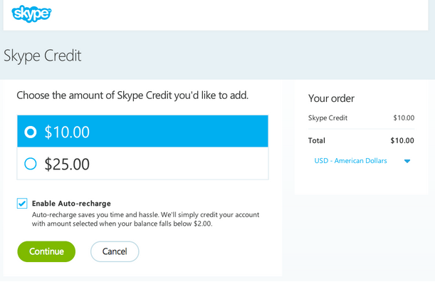
To explain the decoy effect, let’s examine Skype’s pricing page and then the Economist’s pricing page:
You’re on Skype’s site, debating how much credit to get. $10 or $25 credit. Which suits you better? What would you choose?
Reasons for choosing either can vary, from the amount of credit you currently have, your usage of the product, your current cash balance and other reasons. there wouldn’t be one distinctive offer that stands out and looks better than the other.
What if you were presented with a third option? The decoy effect states that consumers will tend to have a specific change in preference between two options when also presented with a third option.
Demonstrating the decoy effect perfectly is the Economist who differently from Skype, has 3 options. This great example of the decoy effect was found by behavioral economics professor Dan Ariely. While searching the Economist’s site he came to their pricing page and discovered the following structure:
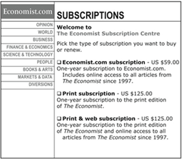
If you take a good look you’ll notice that the economist was offering 3 different pricing modules, 1 module cost $59 and consisted of the online version only, the other for $125 which was for the printed version and the last was the same price – $125 for both offline and online versions.
As we’ve pointed out in several occasions, we (humans) do not know what we want and make our decisions according to the context in front of us. Meaning, the way things are presented to us has a huge effect on our decision making. Our entire decisions in life are in relation to other things, or as professor Dan Ariely points out – we don’t even know what kind of job we want until we see, hear or know someone else who is doing something which we think we should be doing. We need lights to show us where to go and direct us in the right path.
According to the decoy effect, while presented with only 2 options (either printed or online) people need to think, and make a decision. Trying to decide whether we prefer one or the other can be an extremely hard task, and so offering the readers of the Economist a third “no-brainer” option was an easy way out and a clear solution – both print and online together seem a better solution. The majority of people today may have felt fine with getting just the online version (I know I would), and though most people would not have chosen the offline option by itself (more expensive and not immediate), when presented with the third option they prefered it – it was an easy choice to make – 2 for the price of 1.
Optimizing pricing pages using the decoy effect
Similar to landing pages which have a testing strategy, so should your pricing pages. Pricing pages optimization is an important part of the funnel, and there are many elements to take into consideration.
Considering the decoy effect, make sure you offer pricing plans or modules that don’t just stand alone, but actually compliment each other and lead the customer to purchase the plan you would like them to. Circling a preferable plan and writing “recommended” is nice, but not enough. Heloing your customers chose the right plan for them is a huge part of your conversion optimization.
Take a look at intercom’s (if you’re not using their product by now, you should be!) pricing page for example, the clear plan to be chosen is clear (marked in blue) but other than that, it makes it very hard on the user to distinguish, why the ‘standard’ plan is better than the lite.

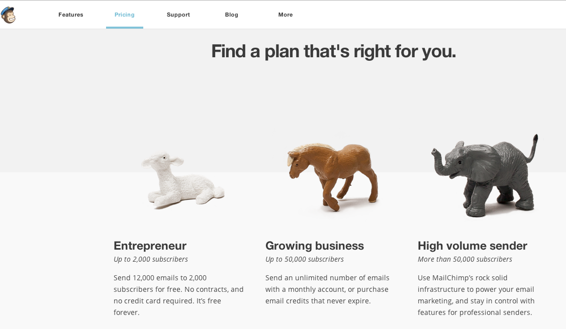
On the other hand, one of my favorite examples for pricing pages in Mailchimp. There pricing page has a great way of segmenting you and helping you decide exactly what category you’re in and what to choose. No need to guess why one is better than the other, you just know right away why one option suits you more than another.
Other elements to consider on your pricing pages are – the call to action button, Analysis Paralysis (giving too many options), the prices themselves and of course the emotional triggers the pricing pages create. You can also check out our emotional color guide which will give you an insight into what emotions your pricing page’s colors are triggering.
AB testing pricing pages
The key to optimizing and AB testing pricing pages is similar to landing page testing: testing a strategy. Small changes such as different titles or a color of a call to action button can present some interesting results but will be very hard to learn from. Once you get the results you’ll know what worked better, but you won’t know why. The “why” is extremely important as it helps you learn and understand your customers better and allows you to optimize your funnel on a larger scale.
The decoy effect can help customers complete your funnel with ease and increase your paying customers. Find out more about other cognitive biases and emotional triggers that can increase your revenue:
-
Analysis paralysis – why your features are killing your conversion
-
Emotional Targeting - Why, how and when.
-
Anchoring – The cognitive bias used by Steve Jobs to sell the iPad
-
Loss Aversion – why the world of free trials works
-
The endowment effect – the cognitive bias that attaches us to our stuff irrationally
How do your pricing pages look like? We’d love to see and hear about them!
Unlocking Pricing Page Success: The Decoy Effect 5.00/5 (100.00%) 6 votes
Related Posts


Unlocking Pricing Page Success: The Decoy Effect
In previous posts we discussed several cognitive biases you should know and use to increase conversion. Further more, understanding cognitive biases gives us a better understanding of our audience and what it is looking for.
What are cognitive biases?
Our brain is an amazing tool that is far more powerful than any computer currently available. However, amazing as it is it does have its limitations and obstacles. Quirks in our memory & calculation issues are 2 examples, but and another glitch our brain is subjected to is cognitive biases, those small “bugs” in our thinking patterns that cause us to make irrational decisions most of the time yet still have us believing we’re completely rational and thinking straight. To make is simple, Cognitive biases are tendencies of our brains to think in certain ways, they’re “unconscious” triggers that make different connections in our brain to help us make decisions that usually lead to systematic deviations from a standard of rationality or good judgment.
The Decoy effect
The cognitive bias we’ll be discussing today is The Decoy Effect, this cognitive bias happens when we’re presented with more than 2 options which causes us to prefer 1 option over another option simply because it looks better, even when it might be the exact same to the second option or a worst option.
To explain the decoy effect, let’s examine Skype’s pricing page and then the Economist’s pricing page:
You’re on Skype’s site, debating how much credit to get. $10 or $25 credit. Which suits you better? What would you choose?
Reasons for choosing either can vary, from the amount of credit you currently have, your usage of the product, your current cash balance and other reasons. there wouldn’t be one distinctive offer that stands out and looks better than the other.
What if you were presented with a third option? The decoy effect states that consumers will tend to have a specific change in preference between two options when also presented with a third option.
Demonstrating the decoy effect perfectly is the Economist who differently from Skype, has 3 options. This great example of the decoy effect was found by behavioral economics professor Dan Ariely. While searching the Economist’s site he came to their pricing page and discovered the following structure:
If you take a good look you’ll notice that the economist was offering 3 different pricing modules, 1 module cost $59 and consisted of the online version only, the other for $125 which was for the printed version and the last was the same price – $125 for both offline and online versions.
As we’ve pointed out in several occasions, we (humans) do not know what we want and make our decisions according to the context in front of us. Meaning, the way things are presented to us has a huge effect on our decision making. Our entire decisions in life are in relation to other things, or as professor Dan Ariely points out – we don’t even know what kind of job we want until we see, hear or know someone else who is doing something which we think we should be doing. We need lights to show us where to go and direct us in the right path.
According to the decoy effect, while presented with only 2 options (either printed or online) people need to think, and make a decision. Trying to decide whether we prefer one or the other can be an extremely hard task, and so offering the readers of the Economist a third “no-brainer” option was an easy way out and a clear solution – both print and online together seem a better solution. The majority of people today may have felt fine with getting just the online version (I know I would), and though most people would not have chosen the offline option by itself (more expensive and not immediate), when presented with the third option they prefered it – it was an easy choice to make – 2 for the price of 1.
Optimizing pricing pages using the decoy effect
Similar to landing pages which have a testing strategy, so should your pricing pages. Pricing pages optimization is an important part of the funnel, and there are many elements to take into consideration.
Considering the decoy effect, make sure you offer pricing plans or modules that don’t just stand alone, but actually compliment each other and lead the customer to purchase the plan you would like them to. Circling a preferable plan and writing “recommended” is nice, but not enough. Heloing your customers chose the right plan for them is a huge part of your conversion optimization.
Take a look at intercom’s (if you’re not using their product by now, you should be!) pricing page for example, the clear plan to be chosen is clear (marked in blue) but other than that, it makes it very hard on the user to distinguish, why the ‘standard’ plan is better than the lite.
On the other hand, one of my favorite examples for pricing pages in Mailchimp. There pricing page has a great way of segmenting you and helping you decide exactly what category you’re in and what to choose. No need to guess why one is better than the other, you just know right away why one option suits you more than another.
Other elements to consider on your pricing pages are – the call to action button, Analysis Paralysis (giving too many options), the prices themselves and of course the emotional triggers the pricing pages create. You can also check out our emotional color guide which will give you an insight into what emotions your pricing page’s colors are triggering.
AB testing pricing pages
The key to optimizing and AB testing pricing pages is similar to landing page testing: testing a strategy. Small changes such as different titles or a color of a call to action button can present some interesting results but will be very hard to learn from. Once you get the results you’ll know what worked better, but you won’t know why. The “why” is extremely important as it helps you learn and understand your customers better and allows you to optimize your funnel on a larger scale.
The decoy effect can help customers complete your funnel with ease and increase your paying customers. Find out more about other cognitive biases and emotional triggers that can increase your revenue:
Analysis paralysis – why your features are killing your conversion
Emotional Targeting - Why, how and when.
Anchoring – The cognitive bias used by Steve Jobs to sell the iPad
Loss Aversion – why the world of free trials works
The endowment effect – the cognitive bias that attaches us to our stuff irrationally
How do your pricing pages look like? We’d love to see and hear about them!
Related Posts
Tags: