Here’s how we improved conversion to signups by 316%

Oct 13, 2013

We’ve just completed our first round of a/b testing with emaze and are excited to share the results: by using emotional triggers on emaze’s landing pages we managed to increase sign ups by 316%.

In the past 6 years we’ve developed a unique methodology that helps us profile users emotionally and trigger these emotions into action in less than 2.8 seconds. This methodology is called emotional targeting, and using it allows us to improve ROI and conversion by hundreds of percent.

The process itself involves an in-depth research that studies market trends, opportunities, strengths and weakness of the brand and most importantly a psycho emotional study that helps us profile emaze’s (in this case) users.

Lets review the test:

Who:

Emaze is an online presentation platform that allows you to create fun, fast and easy presentations.

Goal:

emaze’s immediate goal is to increase signups and improve the quality of the leads, resulting in more people creating presentations and using the platform.
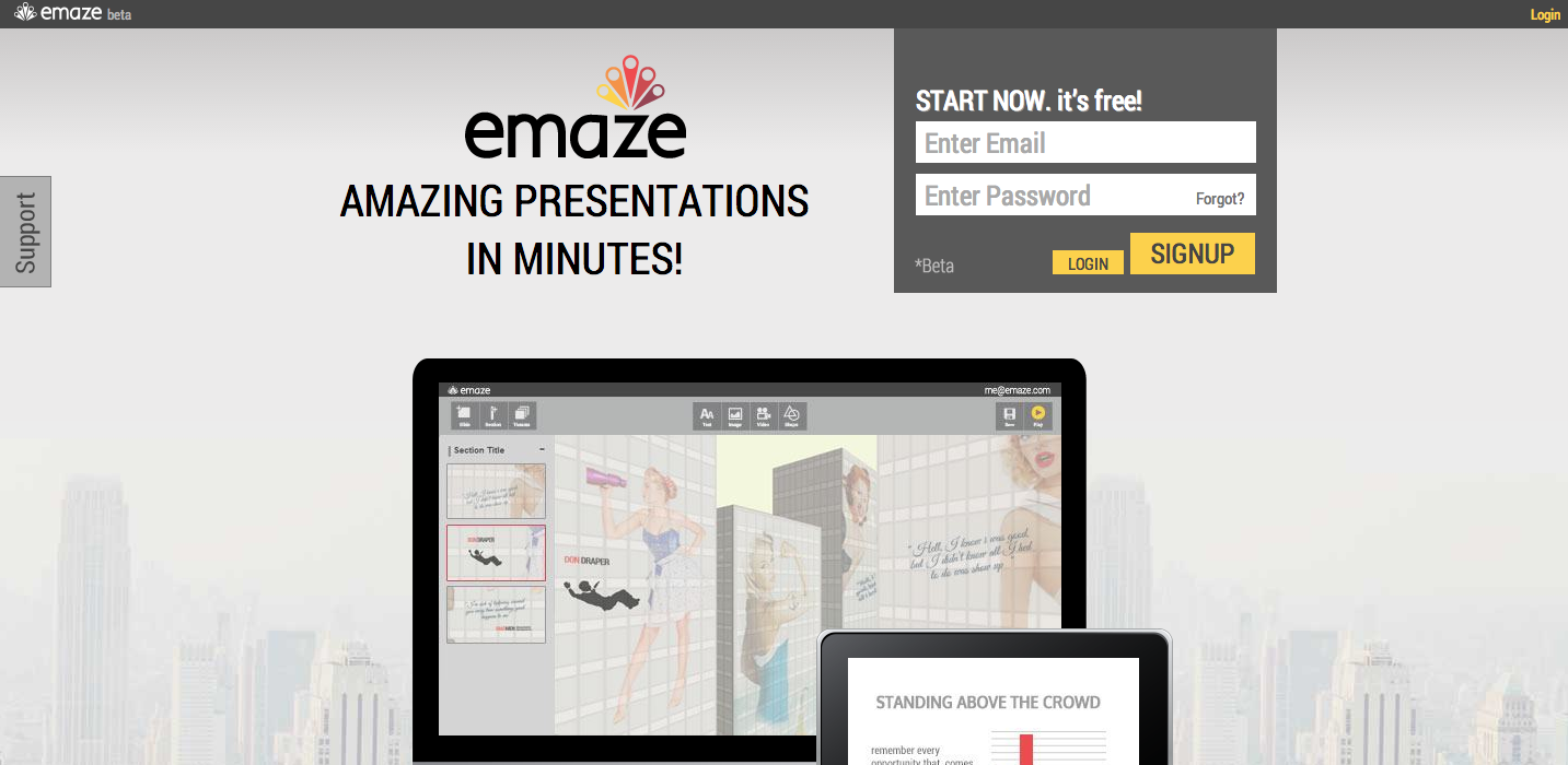
Current Situation

emaze is sending all their traffic to their homepage:

emaze homepage

The Test

Following an in-depth emotional research we established several emotional profiles of users, and created landing pages to go with.

Each landing page addresses a different type of emotional profile and uses different emotional triggers (such as copy and design) to motivate the users to sign up and use emaze.

The research also showed we should avoid using technical terms, deliver a simple and clear message regarding the product in order to minimize friction and help users relate and want to use it.

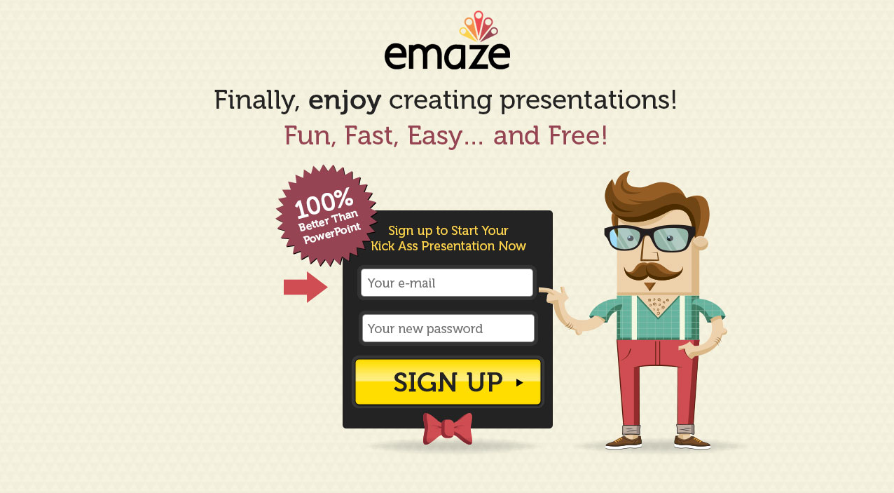
Below are screenshots of two dominant landing pages we created: “Jack” and “Jill”

Page #1: Jack

emaze landing page 1 - jack

Page #2: Jill

emaze_get_started


So far we have seen an increase of 316% in signups and an increase of 114.36% in usage of the platform.

The introduction of emotional triggers to this test boosted conversion rate by over 300%, which is only the beginning.

3 steps to improve conversion the emotional way:

  1. Decision Making: 90% of our decisions are made based on emotion. Our emotions are the ones that guide us on the daily basis and help us decide if want something or not. Understand what your product makes people feel, what emotions it triggers and then use these emotions to lead your users into action with your copy and design.
  2. True Colors: Some colors make us feel happy, sad, annoyed, excited and much more. Use colors to motivate people into feeling something towards your product.
  3. Messaging: Most people have zero patience or time for new products. Make sure your users understand the essence of your product in less than 7 words.

In the meantime, place your bets:

Which page do you think is winning, Jack or Jill? :)


Here’s how we improved conversion to signups by 316% 5.00/5 (100.00%) 4 votes
Talia helps businesses build and execute their conversion optimization strategies, using emotional targeting, consumer psychology and behavioral data to generate more revenues, leads, engagement and sales . Tweet to her at @taliagw
  • Josh

    Great post thanks for sharing!
    I don’t really think it matters who wins at the end but the actual testing.
    However, i would go with Jack :-)

  • Jonathan

    Cool post. I would be interested to understand if emotional targeting would work on all verticals or only certain ones. Also, do you continue testing on the pages that worked less well? I defiantly think that “Jack” worked better.

  • Marina

    I bet on Jill.
    Great post Talia!
    Love reading your post and applying the tips on my landing pages!
    Thank you

  • http://www.paymo.biz Jan

    Without actual numbers the 316% increase doesn’t tell us anything other than the numbers are very low. It would be much more help if you’d share the numbers. I doubt you’re able to tripple signups that are in the thousands with variations like this.

    • Talia Wolf

      Hey Jan,
      Thanks for your comment.
      This test had between 20-30,000 visits a day and had a 2.3% sign up before the test.
      Segmenting users by their behavioral and psycho-emotional triggers has proved to increase conversion on a very large scale on all verticals in the past 4 years. Working with B2B and B2C companies we have seen amazing results on all tests. When it comes to large scale companies and enterprises we work with the numbers of the improvement change from time to time but have a large impact on the client’s revenue.

  • http://talkweb.eu Bogomil Shopov

    I wll put $2 on “Jill”

    • Talia Wolf

      Well you’ve won 2$ :)

  • http://www.rocketmill.co.uk Yousaf

    I like Gill. It is very interesting how the spiral design draws one’s eyes to the main CTA. I think it is a very subtle yet clever technique.

    • Talia Wolf

      Thanks a lot Yousaf! You’re right, Jill was the winner and we are constantly optimizing this page with new copy and see that the spiral really has a huge affect on people.

  • https://gleam.io Stuart @ Gleam.io

    I reckon Jack is winning, simply because it reveals a bit more infomation than Jill. Really happy to be proved wrong though, that’s what testing is all about :)

    • Talia Wolf

      Hey Stuart!
      Thanks a lot for your comment. Sorry to say but Jill was the winner and since then we have been optimizing both pages and yet Jill keeps winning. We’ve learned a lot about emaze’s users from this test and it’s very interesting to see the results keeping up as we continue down the funnel and create additional pricing pages/mobile pages and more. :)
      My next post will be about another client of ours and I would love to get your take on that too! Thanks again.

  • Pingback: Entrepreneur Insider Series – The Secrets to Fast Growth | Ben Angel()