 There are many elements to take into account when creating a pricing page. From strategy to messaging and finally the design, each element has an active and important role in converting visitors into paying customers. Below I have divided the building of a pricing page into 2 main categories: The strategy and the design. Each part of the pricing page structure is important for increasing conversion rate. Take a look at the pricing page examples below to see what other businesses are doing, the good, the bad and how to fix it.
If you’d like to enter our monthly round of landing page critiques and get optimization tips, send us an email to contact@conversioner.com with a link to your landing page.
Building a Pricing Page Strategy
When it comes to our purchasing habits many different elements influence our decision making process. From evaluating the decision to be made, gathering the right information, identifying the options, weighing the alternatives and finally making a decision, many psychological triggers kick in and effect our final decision. There are many elements to take into consideration before the actual design.
1. Predefine customer obstacles & objections
Before starting your design, list all the objections your potential buyers are likely to have to becoming a paying customer. This list will give you an idea of what you need to tackle on your pricing page, which elements should be emphasized on the page, and which removed.
Once you’ve made a list of your potential customer’s objections your next step will be working on your pricing strategy. 2 elements that will help you define a pricing page strategy:
- Knowing how much it costs to produce your product/service – How much does your product cost? what goes into it. Check out Buffer’s pricing page example below to get an idea of how it’s done.
- Understanding your client’s willingness to pay – We tend to value our product or service at a much higher price than people are actually willing to pay for it, simply because it’s ours. How much will your customer be willing to pay? will they be willing to pay? and when?
2. The Messaging
Moving on, the next step in your pricing page strategy is defining your messaging. Remember that customers are going to be looking for the “What’s in it for me” element.
Two common mistakes I see happening all the time:
- Focusing on your product or service rather than the outcome and bottom line for the customer.
- Giving many warnings to customers before they’ve even chosen a plan. (AKA: no gimmicks! no questions asked! money-back guarantees)
These two mistakes, especially the second one, plant worries in your customers mind before they’ve even had time to think of them.
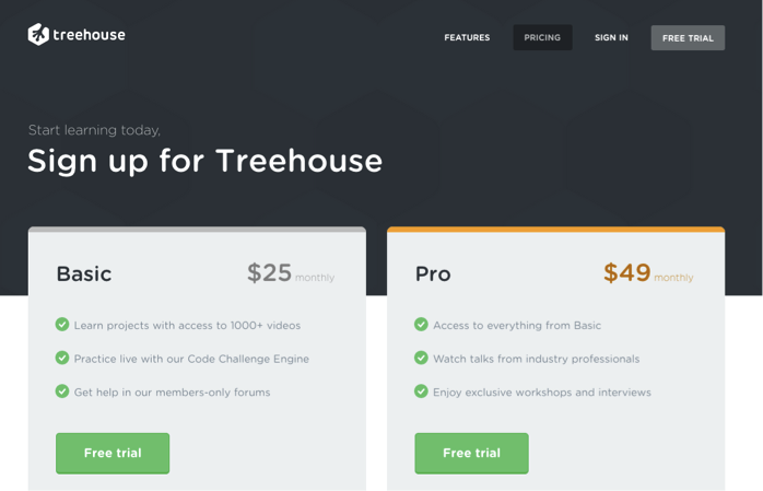
Treehouse fits in with the majority of companies who focus on the action, not the outcome – “Signup for Treehouse”. You have to read the fine print to understand what you gain.
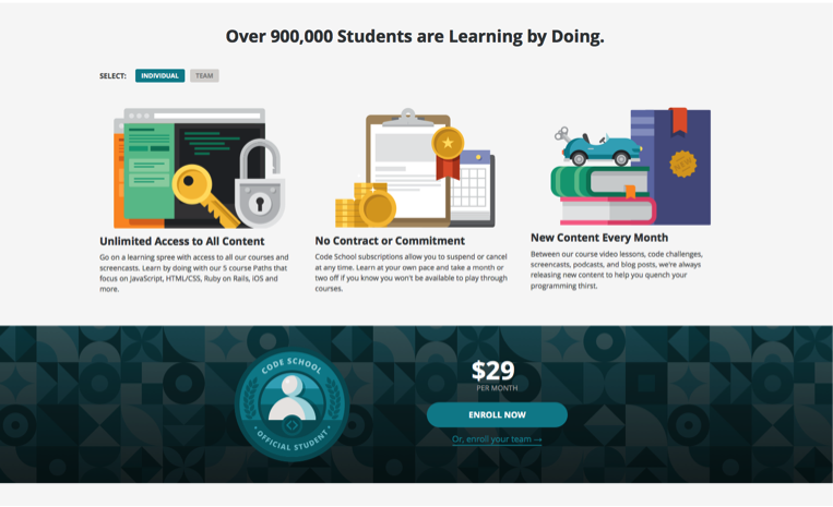
CodeSchool on the other hand focuses on the outcome: Learning by doing. They manage to emphasize that becoming a customer means you will learn to code and that 900,000 other people are doing it (which is a great way to communicate trust).
3. Pricing Plan Names
The names of your pricing plans matter, by using meaningful names you can reduce customer frustration and direct them to a particular plan that’s good for them.
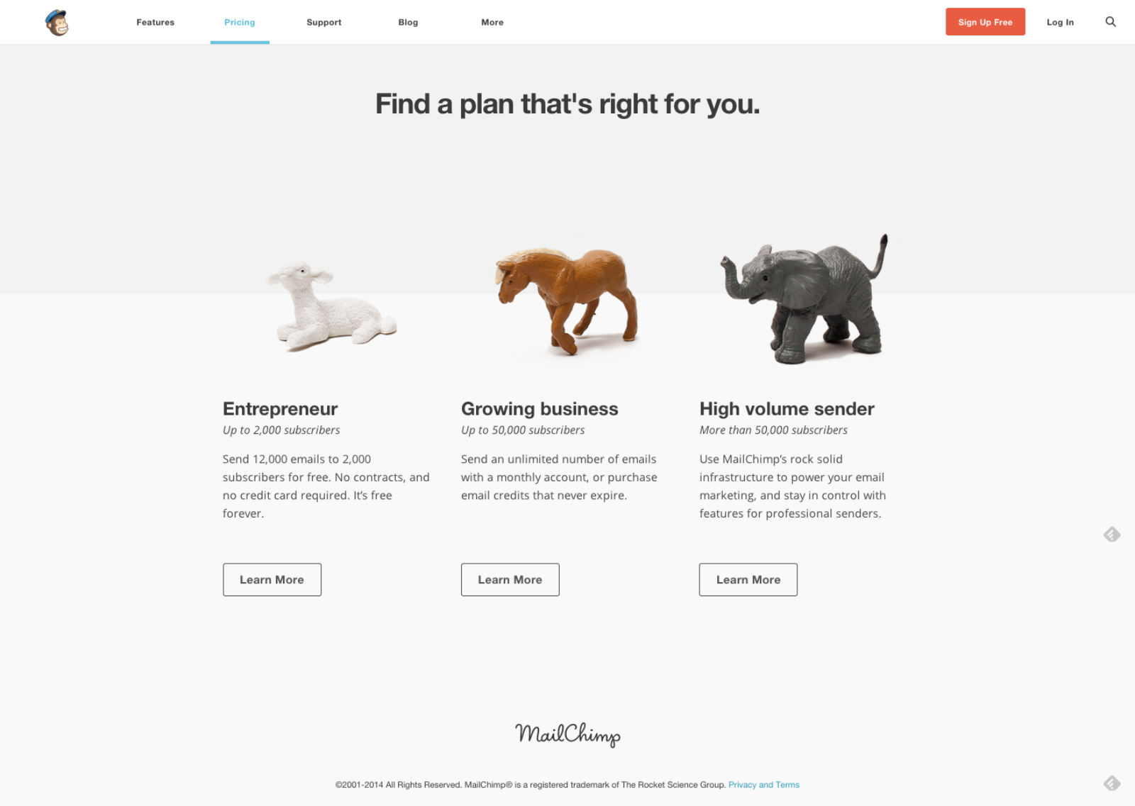
Mailchimp helps customers identify their needs and make a quicker decision. By distinguishing between entrepreneurs, growing businesses and high volume senders, customers know immediately where they fit in and can choose a plan quickly.
4. User Psychology
There are many psychological triggers that effect our purchasing decisions, like Anchoring, analysis paralysis, the endowment effect and other cognitive biases that can be used in our pricing page design.
Using techniques such as free trials, specific plan sales and premium plans can increase conversion dramatically. Using psychological triggers brings us back to the basics: Recognize your customer’s emotional triggers, what will trigger them quickly and what is the best way to convince them to purchase your plan. Check out these 10 psychological triggers you can introduce in your design.
5. Easy to Understand
The last and most important part of pricing page strategy is remembering to keep it simple and understandable. Don’t try to reinvent the wheel; don’t make it too complicated to understand. You want visitors to get the bottom line of your pricing page in a few seconds, recognize the right plan for them and choose it. Don’t over complicate it with text and new ideas.
Designing a Pricing Page
6. Reduce Copy
One thing you want to watch out for is the amount of text you use on your pricing pages. Many marketers try to add as much explanation as possible to their pricing page, essentially making it hard to read, pushing important and relevant information below the fold and making it hard for people to understand the page. Reduce the copy to a minimum, make sure to show only the most important content needed above the fold. For additional reading, add the rest of the information below the call to action button.
7. Keep it simple, clean & uncluttered
Steer away from cluttered pricing pages. Similar to reducing your copy to a minimum, make sure your pricing page is easy to comprehend and analyze. People won’t read everything; they will skim through your proposals. Remember, people want to be navigated in the right direction, they want to know where to look and what to click, maintaining a clutter free pricing page will help them do that.
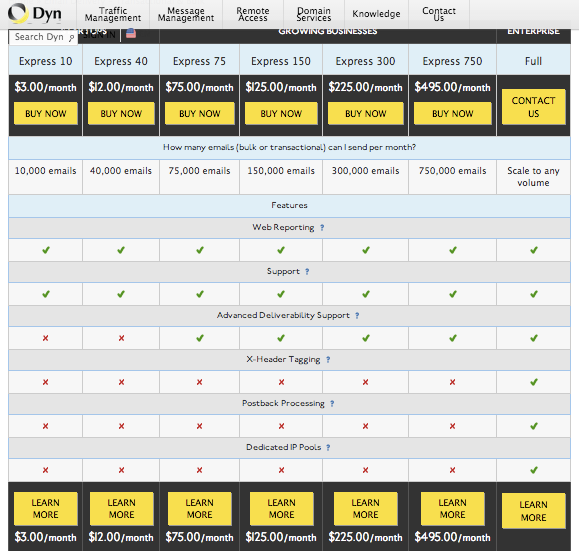
Checkout Dyn’s pricing page. What is going on here?
8. Make it Comparable
When building a pricing page you want to make sure it is easy to compare your offerings. Potential customers see dozens of offers a day and need to have an easy way to compare these offers. Creating a few optional plans and highlighting the differences between them helps not only in making it comparable but also in directing your customer towards the plan you want them to choose.
Note how 3dCart makes it easy to compare their different plans and highlights the one plan they want customers to choose. This layout allows customers to quickly see the differences between the plans and choose the most relevant one for them.
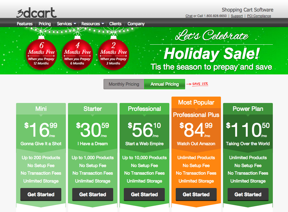
9. Tell them what to choose
Other than making pricing plans that are easy to compare, you want to help customers choose a plan. When we have too many options and aren’t sure what to choose, our default is not to choose. This is a cognitive bias known as Analysis Paralysis. To ensure this doesn’t happen to your customers, giving them a few different options isn’t enough. Use design elements, test, and direct customers the right way. Notice how 3dCart uses the orange color and a “Most Popular” banner to guide customers to choose their Professional Plus plan. There are a few ways to guide people in a certain direction, I would suggest testing the following:
- Use a color to highlight a specific plan (similar to what 3dCart does)
- Use the “anchoring” technique – show a higher price first and a more affordable one next to it. It is best to set the higher price on the left hand side.
- Calculate the best plan for your customer
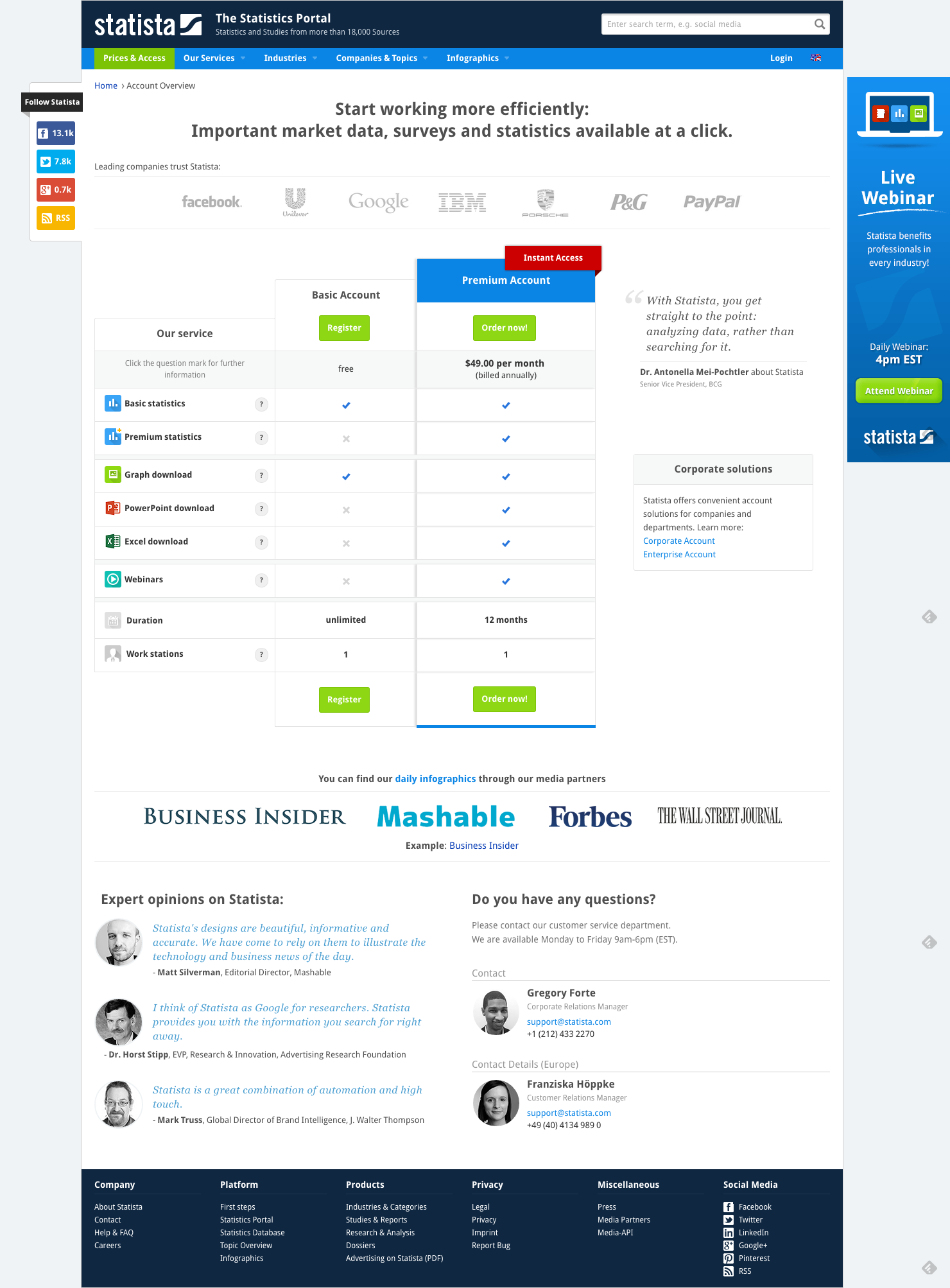
10. Show Trust & Security
It all comes down to trust and feeling safe. People want to know their information is safe, that you’re a safe business and that they can trust you. There are many ways to increase trust and safety on pricing pages, we’ll focus on the two most common ones:
- Testimonials – show potential customers that you have many other happy and satisfied customers.
- Trust icons – show off your partnerships and security methods.
Statista offers trust elements above the pricing plans in the shape of customer logos, emphasizing their many important clients and also uses additional known logos of companies who publish their data. Additionally using testimonials below and next to the pricing plans, Statista presents their many satisfied customers.
11. Convert to their Currency
A great way to increase pricing page conversion rates is to show pricing currency according to the customer’s country. By offering an option to change to their own currency, customers will be able to compare plans easily without the need to convert pricing themselves.
12. Focus on the CTA
Too many pricing pages have their call to action buttons below the fold, basically making customers scroll in order to checkout. Your call to action should be visible to a visitor immediately and should also be the first natural place a visitor looks at. Make sure your call to action button stands out, and that no other elements overshadow it.
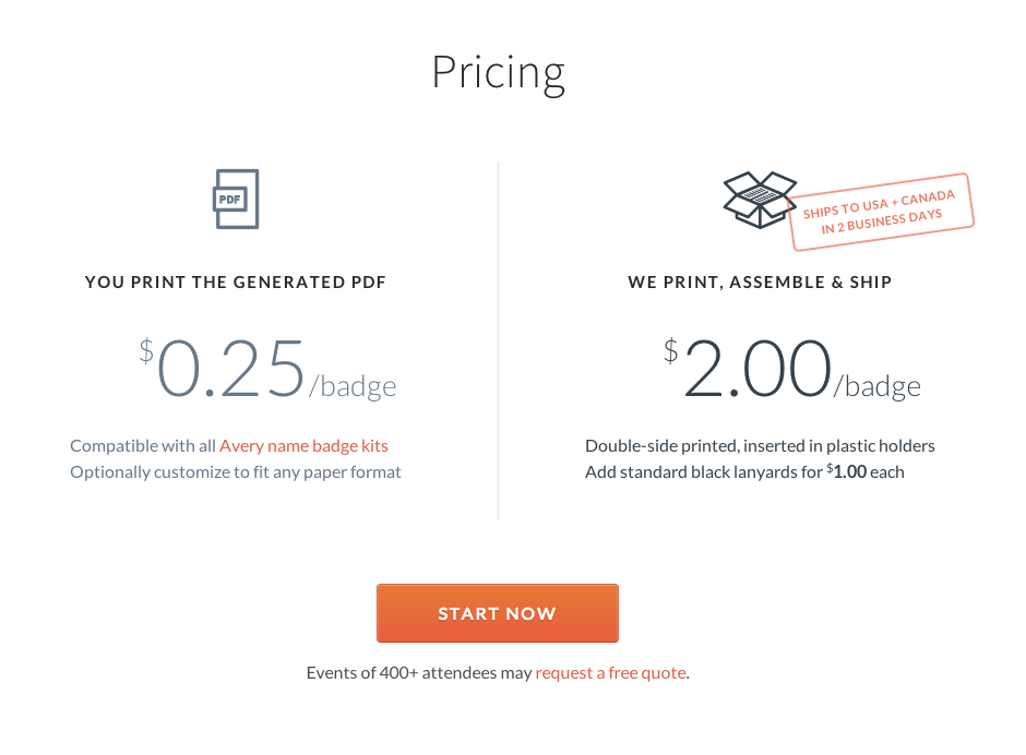
13. Limit Amount of Plans
Similar to the Dyn pricing page, remember that too many options can cause frustration and increase bounce rate. Use pricing plans so customers can compare and find the best plan for themselves but use the minimum brainpower needed. Try testing the number of plans you have.
‘Conference Badge’ uses two simple pricing plans to make it easy and quick for the customer to choose.
14. Yearly vs. Monthly Plans
“Choice supportive” is a term in psychology that recognizes our tendency to remember our choices as better than they might have actually been. When we look back on our purchase decisions we tend to rationalize the reasons we chose the way we did and feel satisfied with them. This is why a one time yearly payment is considered better than a recurring monthly payment that may make our customer reevaluate their purchase each month. Test yearly pricing plans vs. monthly pricing plans to discover what your customers prefer.
15. Introduce Chat
Chat is a great way to communicate with your customers during the checkout process. Many customers have minor issues that could be addressed immediately and increase your conversion rates. In fact Forrester Research has demonstrated that:
- 44 % of online consumers say that having questions answered by a live agent while in the middle of an online purchase is one of the most important features a website can offer.
- Chatters who engage via proactive invitation are 9.8x more likely to convert than visitors who don’t chat.
There are many quick and easy chat plugins you can use on your pricing page. Definitely test some out (our current favorite is Zopim).
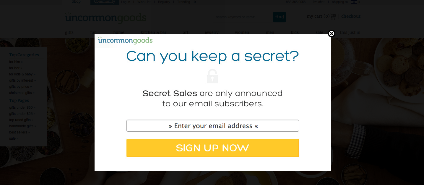
16. Introduce Exit Pops
A great way to capture people before they leave your pricing page is using a dedicated exit pop. I do not mean the automated exit pops that look like an error just happened on your browser; I mean a pop up that is designed personally for your customers. An exit pop can be used in many ways, the two most common are:
- Giving a last minute deal before leaving
- Capturing a customer’s email before leaving
‘Uncommon Goods’ uses a pop up for people navigating out of their site and pricing page by offering special sales to those who sign up:
17. Start Testing
The secret to any good pricing page or landing page is constant testing. There isn’t one best way to design a pricing page, everything needs to be tested and personalized for your customers. One thing that works for your competitor won’t necessarily work for you and vice versa, continue testing ideas and trying new modules on a monthly basis.
Pricing Page Examples
18. PlanGrid
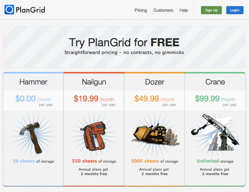
This app for construction workers uses a few elements worth mentioning.
The Good:
- Great pricing plan names that illustrate the type of plan you’re about to choose – from simple “hammering” for quick storage to the full blown “crane” offering unlimited storage.
- Their pricing plans are simple, easy to understand and are easy to compare.
Needs Optimizing:
- On the other hand, they’re missing one very important element – a Call To Action button. Though the plans are clickable, people need a call to action, a sense of direction directing them where to click.
19. Koding
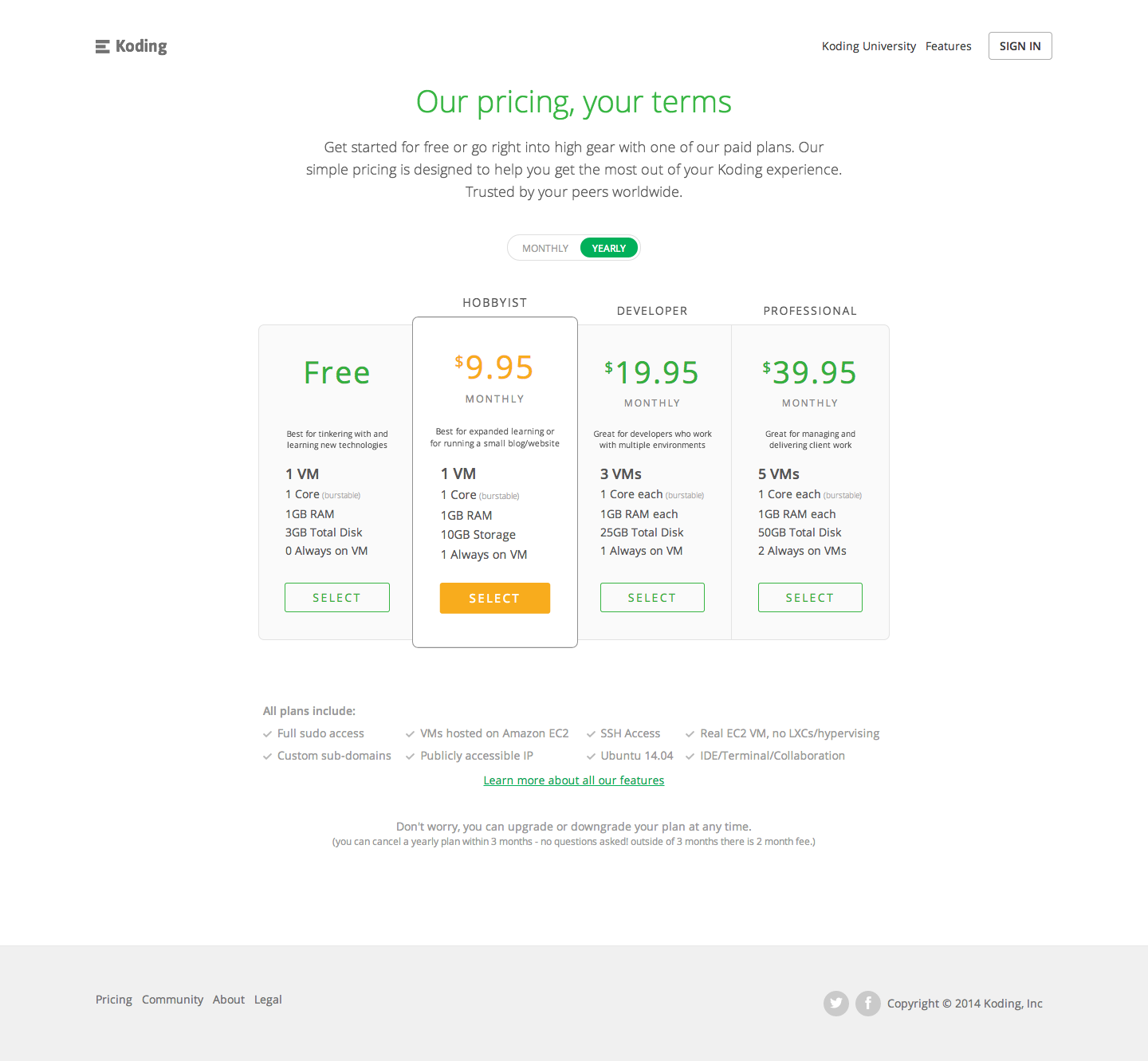
The Good:
- Koding’s pricing page is a great example of a clean and uncluttered pricing page.
- Great work on directing customers to a specific plan using the orange color.
- Another good thing to notice is their pricing is automatically set to a yearly plan.
Needs Optimizing:
- Unfortunately their call to action button is below the fold, and the plans themselves aren’t clickable so you have to scroll in order to convert. Similar to previous pricing page examples, remember that the call to action should be the first natural place a user looks to.
20. GetResponse:
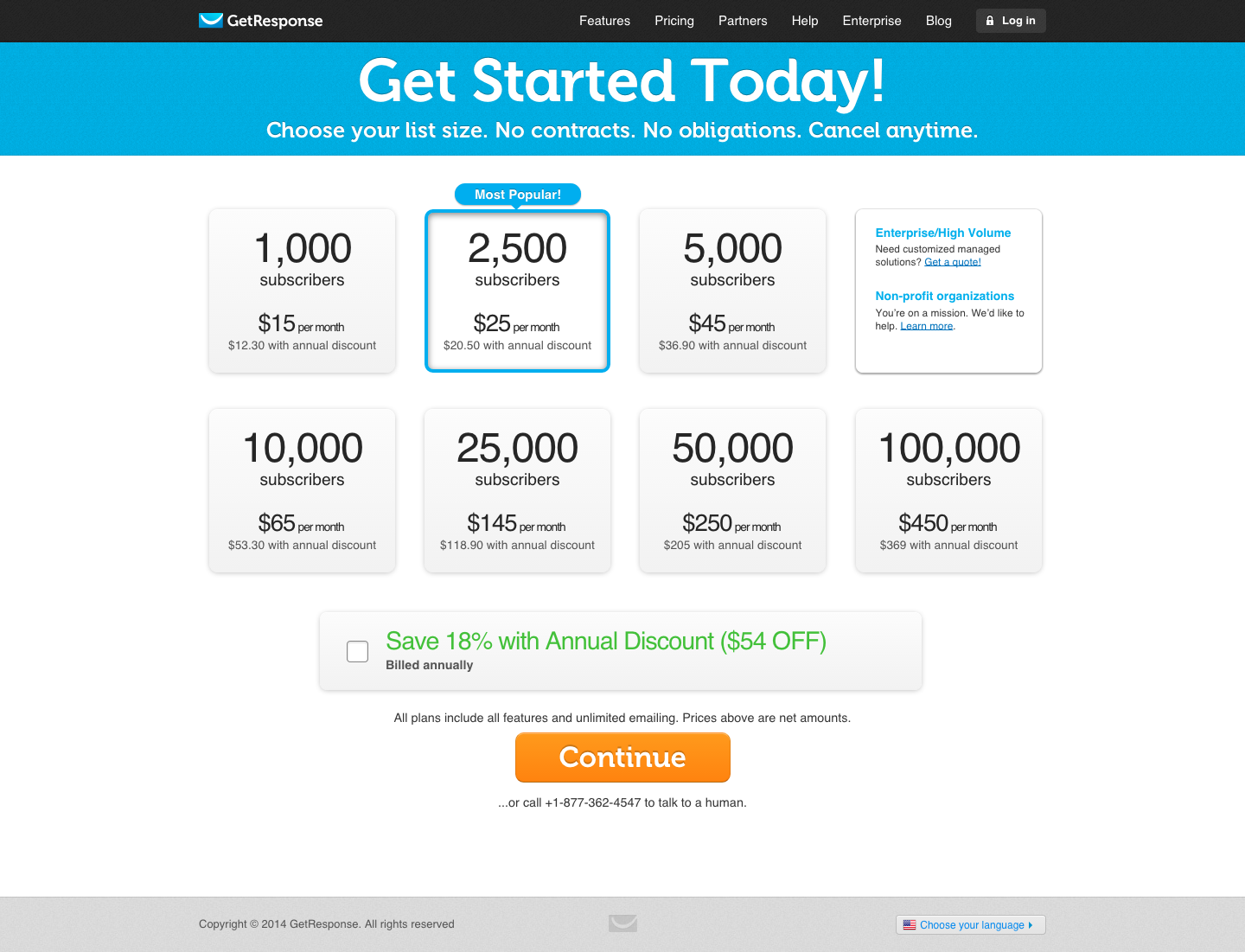
Get Response has a different structured pricing page that what we’re used to seeing.
The good:
- They’ve pre-checked their favorable plan for the customer and do a nice job on emphasizing their chosen plan.
- Great banner for the yearly plan, I would however test pre-checking the box.
Needs Optimizing:
- The first issue is that once you’ve clicked on a plan, nothing happens. People are supposed to somehow understand they need to scroll to continue.
- Nice work on the clickable plans but people need actual call to action buttons.
- Stop warning people – no contract, no obligations, cancel anytime – companies can’t resist saying this on every pricing page but by using negative words they’re just putting ideas into people’s heads.
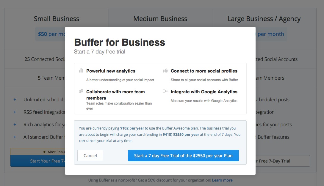
21. Buffer
Buffer is an extremely cool platform for managing your social accounts on. We’ve been using them for a few years now.

The good:
- The way their pricing page is setup shows that their emphasis is on getting people to first signup and only later convert them into paying customers. Their call to action is simple and easy to understand.
- Their pricing module is pretty simple to understand with 3 basic modules.
- The testimonials and trust icons introduced below the pricing plans are a great way to increase social proof.
- They recently added their “Transparent Pricing” which I think is a great way to explain the costs to a new customer.
Needs optimizing:
- The fist issue they have is they don’t really highlight any specific plan. Even though one plan has a dominating call to action color, there is no real emphasis on one plan or another.
- One big issue is that once you choose a plan a pop comes up summarizing the total amount you’re going to pay once the trial is over. Until now, customers were ready for a certain amount on a monthly basis and suddenly the pricing jumps to a one-time payment.
22. Spotify
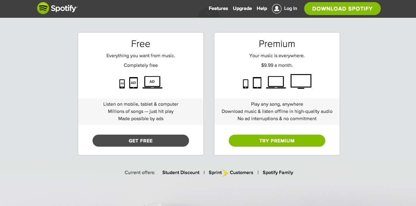
The good:
- Comparable – Spotify makes it very easy to see the difference between their two pricing plans without even reading the fine print. The image of more devices without the ads paints a clear picture of what a customer gets by choosing to pay.
- Their premium offer is highlighted in a great way and clearly directs you to a certain plan.
Needs optimizing:
- As the pricing page is on the main homepage and not on a separate page, less emphasis has been given to social proof & trust elements. I’d definitely test adding some to that part of the page.
23. Wufoo
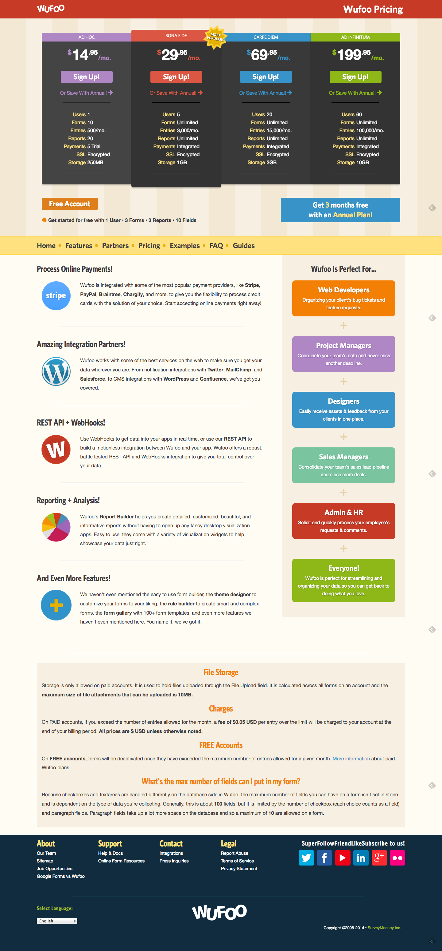
The good:
- The one thing I like about their pricing page is the naming of the plans. Assuming people understand the definitions, these names do give you an indication of what you’re getting in to. That being said, a plan that’s named Ad Infinitum (as in infinite, never ending) may scare of some people…
Needs optimizing:
- The pricing modules are extremely cluttered with a lot of text and color, it is very hard to understand which module is the right one without carefully analyzing each plan.
- Although they’ve added a “most popular” banner to one of the plans, it’s very hard to locate in the sea of information, text and color.
- The arrows indicating a “yearly” plan are alarming in the way that I have no idea what will happen if I click on them. Will I be sent to a payment page? Will everything change?
- It seems to me that the biggest difference between the plans is the amount of people who can answer your forms. In this case I would focus my pricing page on that.
24. Zendesk
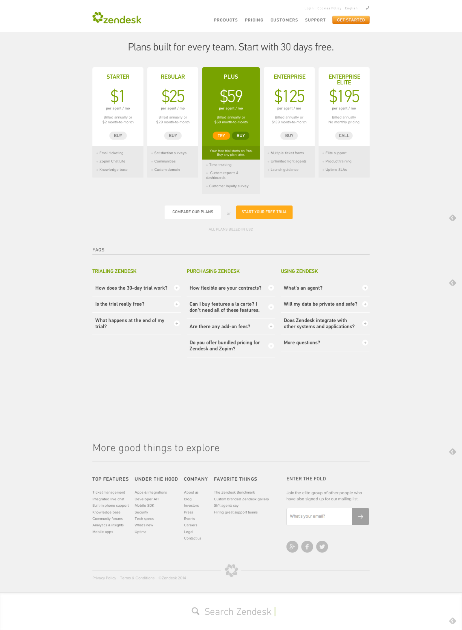
The Good:
- Zendesk has a clear and uncluttered pricing page that highlights a preferable plan.
- Their “Compare these plans” button is a great way of presenting relevant information below the fold without cluttering the main part of the pricing page.
Needs Optimizing:
- Two ‘call to action’ buttons is problematic, you either want people to try a free trial or become paying customers. Offering both options on each plan makes it confusing and will reduce conversion rates. I would definitely test this; you’d be surprised how many people would simply pay if they didn’t have the option to try.
- In addition to having two call to actions on their main plan, their call to action changes from plan to plan and isn’t consistent. Remember to give a consistent experience throughout the page so people can identify the call to action.
25.YepText
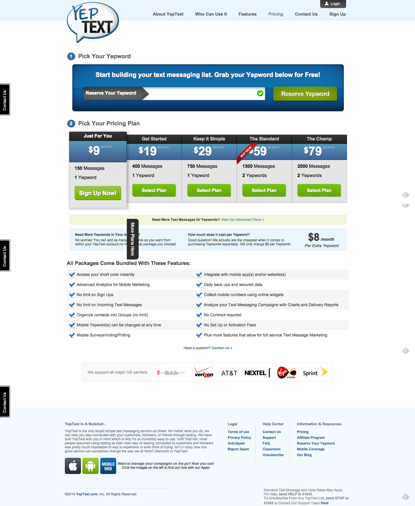
The Good:
- Besides the good use of trust icons and social proof, the way this page is built is very interesting. In fact, their way of getting you started is making you first choose a keyword and only then a plan.
Needs Optimizing:
- The biggest issue here is that they’re highlighting 2 different plans. On one hand it says “Best Value” on the $59 plan, but on the other hand the $9 plan is highlighted and pre-chosen for the customer. It’s not really clear what would be the best choice.
26. Litmus
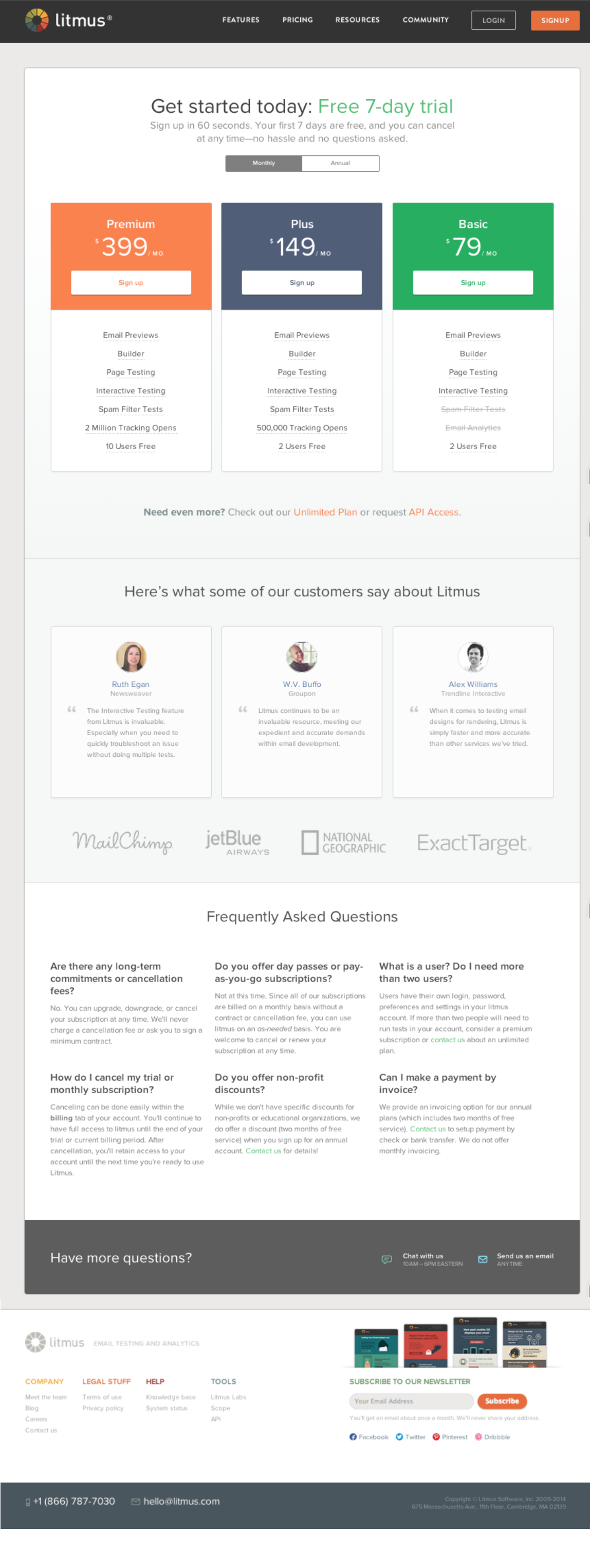
The Good:
- I’ve already mentioned these for a few of these pricing pages but as you can see they do a great job of using social proof (testimonials and trust icons) to ensure clients they’re in safe hands.
- They’re structure is good and easy to read. The fact they put their highest price on the left, ensures people will read it first and have that price set as an anchor.
Needs Optimizing:
There are two major issues with this pricing page:
- They’re not telling customers what to choose. People need direction and help in choosing the right plan. Litmus is missing a major part of their pricing page by not telling people what to choose.
- Another important element they’re missing is the use of annual plan vs. monthly. They actually have much better pricing for companies committing to a yearly plan, but don’t mention it anywhere. Unless you click on “annual” you don’t really know it’s worth it.
The Perfect Pricing Page
There is no “one size fits all” solution; each pricing page should be tailored to its audience and tested regularly.
Remember that a pricing page is the first place a customer puts their vote of confidence in you and your product or service. When designing a pricing page plan, make an experience your customer will remember and feel good about. Similar to landing pages, pricing pages should be optimized and tested on a regular basis.
26 Pricing Page Examples and Best Practices 4.12/5 (82.38%) 277 votes
Related Posts


26 Pricing Page Examples and Best Practices
If you’d like to enter our monthly round of landing page critiques and get optimization tips, send us an email to contact@conversioner.com with a link to your landing page.
Building a Pricing Page Strategy
When it comes to our purchasing habits many different elements influence our decision making process. From evaluating the decision to be made, gathering the right information, identifying the options, weighing the alternatives and finally making a decision, many psychological triggers kick in and effect our final decision. There are many elements to take into consideration before the actual design.
1. Predefine customer obstacles & objections
Before starting your design, list all the objections your potential buyers are likely to have to becoming a paying customer. This list will give you an idea of what you need to tackle on your pricing page, which elements should be emphasized on the page, and which removed.
Once you’ve made a list of your potential customer’s objections your next step will be working on your pricing strategy. 2 elements that will help you define a pricing page strategy:
2. The Messaging
Moving on, the next step in your pricing page strategy is defining your messaging. Remember that customers are going to be looking for the “What’s in it for me” element.
Two common mistakes I see happening all the time:
These two mistakes, especially the second one, plant worries in your customers mind before they’ve even had time to think of them.
Treehouse fits in with the majority of companies who focus on the action, not the outcome – “Signup for Treehouse”. You have to read the fine print to understand what you gain.
CodeSchool on the other hand focuses on the outcome: Learning by doing. They manage to emphasize that becoming a customer means you will learn to code and that 900,000 other people are doing it (which is a great way to communicate trust).
3. Pricing Plan Names
The names of your pricing plans matter, by using meaningful names you can reduce customer frustration and direct them to a particular plan that’s good for them.
Mailchimp helps customers identify their needs and make a quicker decision. By distinguishing between entrepreneurs, growing businesses and high volume senders, customers know immediately where they fit in and can choose a plan quickly.
4. User Psychology
There are many psychological triggers that effect our purchasing decisions, like Anchoring, analysis paralysis, the endowment effect and other cognitive biases that can be used in our pricing page design.
Using techniques such as free trials, specific plan sales and premium plans can increase conversion dramatically. Using psychological triggers brings us back to the basics: Recognize your customer’s emotional triggers, what will trigger them quickly and what is the best way to convince them to purchase your plan. Check out these 10 psychological triggers you can introduce in your design.
5. Easy to Understand
The last and most important part of pricing page strategy is remembering to keep it simple and understandable. Don’t try to reinvent the wheel; don’t make it too complicated to understand. You want visitors to get the bottom line of your pricing page in a few seconds, recognize the right plan for them and choose it. Don’t over complicate it with text and new ideas.
Designing a Pricing Page
6. Reduce Copy
One thing you want to watch out for is the amount of text you use on your pricing pages. Many marketers try to add as much explanation as possible to their pricing page, essentially making it hard to read, pushing important and relevant information below the fold and making it hard for people to understand the page. Reduce the copy to a minimum, make sure to show only the most important content needed above the fold. For additional reading, add the rest of the information below the call to action button.
7. Keep it simple, clean & uncluttered
Steer away from cluttered pricing pages. Similar to reducing your copy to a minimum, make sure your pricing page is easy to comprehend and analyze. People won’t read everything; they will skim through your proposals. Remember, people want to be navigated in the right direction, they want to know where to look and what to click, maintaining a clutter free pricing page will help them do that.
Checkout Dyn’s pricing page. What is going on here?
8. Make it Comparable
When building a pricing page you want to make sure it is easy to compare your offerings. Potential customers see dozens of offers a day and need to have an easy way to compare these offers. Creating a few optional plans and highlighting the differences between them helps not only in making it comparable but also in directing your customer towards the plan you want them to choose.
Note how 3dCart makes it easy to compare their different plans and highlights the one plan they want customers to choose. This layout allows customers to quickly see the differences between the plans and choose the most relevant one for them.
9. Tell them what to choose
Other than making pricing plans that are easy to compare, you want to help customers choose a plan. When we have too many options and aren’t sure what to choose, our default is not to choose. This is a cognitive bias known as Analysis Paralysis. To ensure this doesn’t happen to your customers, giving them a few different options isn’t enough. Use design elements, test, and direct customers the right way. Notice how 3dCart uses the orange color and a “Most Popular” banner to guide customers to choose their Professional Plus plan. There are a few ways to guide people in a certain direction, I would suggest testing the following:
10. Show Trust & Security
It all comes down to trust and feeling safe. People want to know their information is safe, that you’re a safe business and that they can trust you. There are many ways to increase trust and safety on pricing pages, we’ll focus on the two most common ones:
Statista offers trust elements above the pricing plans in the shape of customer logos, emphasizing their many important clients and also uses additional known logos of companies who publish their data. Additionally using testimonials below and next to the pricing plans, Statista presents their many satisfied customers.
11. Convert to their Currency
A great way to increase pricing page conversion rates is to show pricing currency according to the customer’s country. By offering an option to change to their own currency, customers will be able to compare plans easily without the need to convert pricing themselves.
12. Focus on the CTA
Too many pricing pages have their call to action buttons below the fold, basically making customers scroll in order to checkout. Your call to action should be visible to a visitor immediately and should also be the first natural place a visitor looks at. Make sure your call to action button stands out, and that no other elements overshadow it.
13. Limit Amount of Plans
Similar to the Dyn pricing page, remember that too many options can cause frustration and increase bounce rate. Use pricing plans so customers can compare and find the best plan for themselves but use the minimum brainpower needed. Try testing the number of plans you have.
‘Conference Badge’ uses two simple pricing plans to make it easy and quick for the customer to choose.
14. Yearly vs. Monthly Plans
“Choice supportive” is a term in psychology that recognizes our tendency to remember our choices as better than they might have actually been. When we look back on our purchase decisions we tend to rationalize the reasons we chose the way we did and feel satisfied with them. This is why a one time yearly payment is considered better than a recurring monthly payment that may make our customer reevaluate their purchase each month. Test yearly pricing plans vs. monthly pricing plans to discover what your customers prefer.
15. Introduce Chat
Chat is a great way to communicate with your customers during the checkout process. Many customers have minor issues that could be addressed immediately and increase your conversion rates. In fact Forrester Research has demonstrated that:
There are many quick and easy chat plugins you can use on your pricing page. Definitely test some out (our current favorite is Zopim).
16. Introduce Exit Pops
A great way to capture people before they leave your pricing page is using a dedicated exit pop. I do not mean the automated exit pops that look like an error just happened on your browser; I mean a pop up that is designed personally for your customers. An exit pop can be used in many ways, the two most common are:
‘Uncommon Goods’ uses a pop up for people navigating out of their site and pricing page by offering special sales to those who sign up:
17. Start Testing
The secret to any good pricing page or landing page is constant testing. There isn’t one best way to design a pricing page, everything needs to be tested and personalized for your customers. One thing that works for your competitor won’t necessarily work for you and vice versa, continue testing ideas and trying new modules on a monthly basis.
Pricing Page Examples
18. PlanGrid
This app for construction workers uses a few elements worth mentioning.
The Good:
Needs Optimizing:
19. Koding
The Good:
Needs Optimizing:
20. GetResponse:
Get Response has a different structured pricing page that what we’re used to seeing.
The good:
Needs Optimizing:
21. Buffer
Buffer is an extremely cool platform for managing your social accounts on. We’ve been using them for a few years now.
The good:
Needs optimizing:
22. Spotify
The good:
Needs optimizing:
23. Wufoo
The good:
Needs optimizing:
24. Zendesk
The Good:
Needs Optimizing:
25.YepText
The Good:
Needs Optimizing:
26. Litmus
The Good:
Needs Optimizing:
There are two major issues with this pricing page:
The Perfect Pricing Page
There is no “one size fits all” solution; each pricing page should be tailored to its audience and tested regularly.
Remember that a pricing page is the first place a customer puts their vote of confidence in you and your product or service. When designing a pricing page plan, make an experience your customer will remember and feel good about. Similar to landing pages, pricing pages should be optimized and tested on a regular basis.
Related Posts
Tags: