Designing a checkout process for an ecommerce store is a huge challenge. Here’s some numbers you should know:
- In 2014, 1.12 billion people worldwide are expected to buy goods & services online – tweet this
- By end of 2013, the average abandonment rate was 67.9% – tweet this
- Current ecommerce conversion rate statistics show that 40% of worldwide internet users have purchased goods or products online. – tweet this
- This amounts to more than 1 billion online buyers and is projected to continuously grow.
Although more and more people are purchasing online , most ecommerce checkout processes are extremely hard to navigate through and have very high abandonment rate. There are many websites today that can teach us about ecommerce conversion rate. For example, Amazon’s online sales dwarf the competition and continue bringing in the revenue:

To learn from the best, in this post we’ll take a look at what the companies are doing online today and also review some of conversioner’s latest case studies in ecommerce conversion optimization and best checkout processes.
Before checkout:
-
Where to Start Optimizing
Recent case studies continue to show us that in order to increase revenue and shopping cart revenue you do NOT need to start with optimizing the shopping cart. The most important impact you have on conversion is in the first 3 seconds a visitor lands on your site. The first 3 seconds of the user journey will determine if a user continues the funnel or not. In order to have the biggest impact in those 3 seconds you want to make sure you grab the user’s attention and convince them to purchase. This can be achieved by understanding your visitor’s emotional triggers, and by then using different images, colors and messaging to convey those triggers.
-
Our brains process images 60,000 time quicker than text so you want to make sure the image you use has a strong emotional say to it.
-
Colors project emotions – check out this emotional color guide to get some ideas
This ecommerce site increased their revenues by 115% by making changes on the category page, before even addressing the checkout page.
-
Call to action buttons
There’s a lot to say about call to action buttons, their color, position, size and more but most importantly on checkout process you want to make sure they are:
-
Consistent – Never changing, same color, same position throughout the site and same size.
-
Single – Make sure you have one call to action and not a few, too many ecommerce site have multiple call to actions giving users too many options and causing confusion.
-
Natural – This is important for both before the checkout page and in the checkout page – A call to action button has to stand out and be the first natural place a visitor turns to.
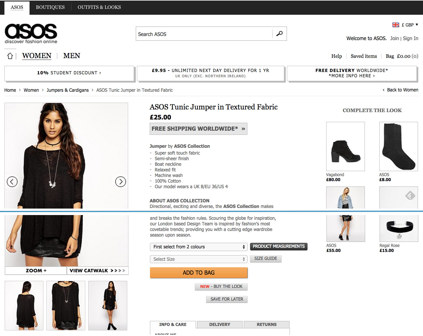
Asos’s biggest call to action on their product pages is – Free shipping. Their “add to bag” call to action appears below the fold. (The blue line below marks the fols (where people need to start scrolling). This means that the first natural people look at on Asos’s product page is the “Free shipping” and not what Asos really wants us to do: “Add to bag”.
-
Currency
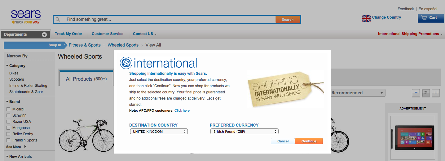
A great way to increase conversion and improve user journey is to show currency according to the visitor’s origin. Many sites do this today and allow a more personalized experience for the user.
-
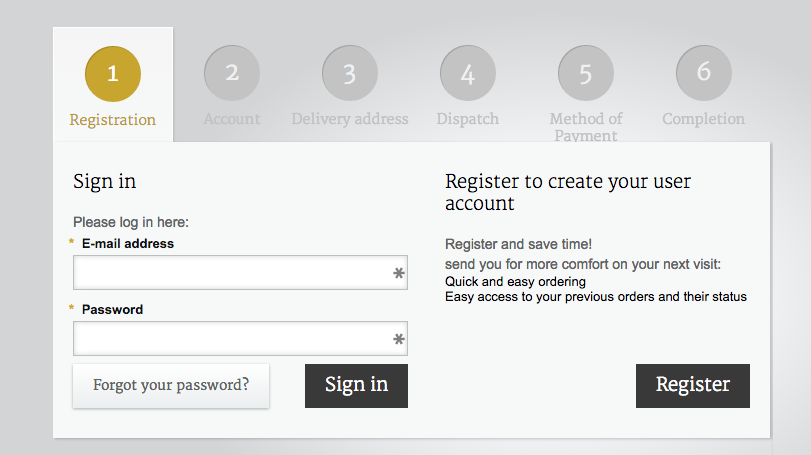
Signup to checkout
This is probably the most discussed topic of ecommerce conversion. Should I require visitors to signup before checking out? NO. The majority of case studies show that shopping cart abandonment is highest when people reach a signup form in order to checkout. There’s no need to be greedy and there are other great ways of getting people to signup without requiring it:
-
Offering a promo code with a discount for those who sign up – Once people are getting closer to checkout, you can offer a discount for those who signup.
-
Having them sign up after the purchase
That being said if you will not relinquish the idea of getting people to sign up, ask for only one field – email. The rest can be received later and with email you will be able to quickly follow up later.
H&M requires registration before checking out. There are only 2 options, either you’re a returning user, or you need to register. 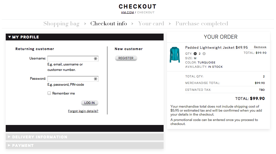
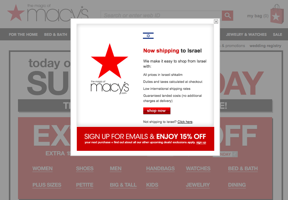
Macy’s uses a popup once a user arrives on their site to sign people up, show international shipping and personalize currency – personalization in one stop. By offering 15% off, Macy’s gets additional people to sign up to their site and newsletter without ever asking them to sign up for checkout.
-
Trust Elements
Other than conveying trust, showing the amount of people who have already purchased an item increases its importance and popularity. We used the amount of people who have already used the product below to give a sense of a large and much used platform. 
-
Testimonials
Testimonials are a great way to get people buying. Confirmation bias is another cognitive bias we experience while shopping. It means is we tend to search and interpret information in a way that confirms our beliefs and preconception. Basically we like seeing other people agree with us. Whistle is a great example of using emotional testimonials to support the purchase of their product. 
An even better way:
Etsy shows testimonials in a quick way with easy navigation from the item details to testimonials and shipping details 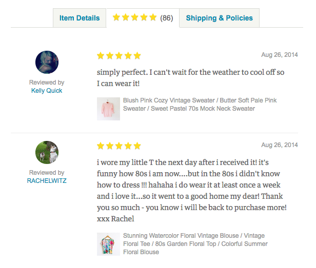
-
Countdown
Researches have shown that rather than only highlighting the “why” a person should buy a product, showing people they’re about to miss out on a special offer increases conversion dramatically. This to do with Loss Aversion – a cognitive bias which demonstrates that the pain from losing is higher than the joy of winning.
The checkout:
-
Isolating the Checkout
Isolating the checkout is crucial for ecommerce conversion rate. Once a visitor arrives on the checkout page they should be only in the checkout page and all other attention grabbers should be removed. All exit links should be removed, making sure that visitors cannot be distracted, all remaining links should always appear in a pop up and not send the visitor to another page and experience.
-
You May Also Like…
Once the user has decided to purchase an item you can offer additional items to go with the chosen product. Seconds before the checkout itself, Office Depot shows the shopper a preview of their cart and offers additional products that may interest them. 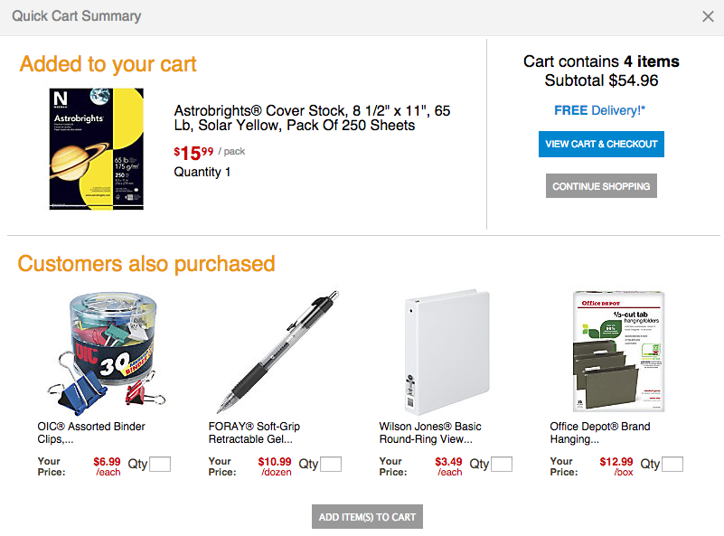
-
Shipping
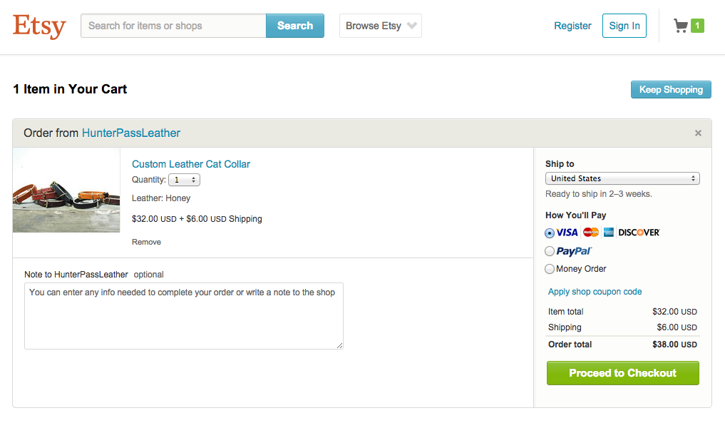
Shipping has a huge impact on ecommerce conversion rate (Find some really cool numbers on free shipping below). Make sure that all pricing is visible at first glance, do NOT surprise your shoppers with shipping costs. Also, help users understand their own shipping costs. Etsy allows you to change your shipping destination (leading to change in cost) with a simple drop down menu that leaves no place for imagination:
-
Clutter Free
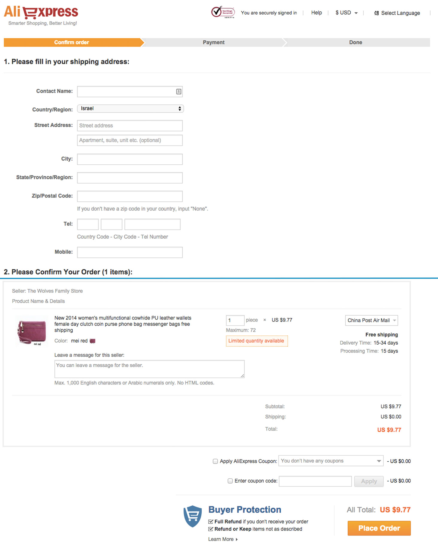
Clutter is a shopping cart’s worst enemy. Make it easy and simple on shoppers to see what they’re buying and how much it costs. Aliexpress asks people for their entire information at the top of the shopping cart completely hiding the purchase details below the form. The blue line marks where the fold ends and people need to start scrolling:
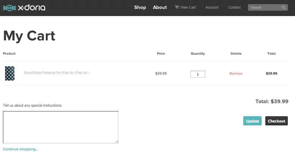
X-doria on the other hand introduces a clutter free shopping bag presenting all the relevant information.
-
Editable
Another thing that H&M and other brands do successfully is make it easy on the shopper to make changes within the checkout page. This means that within the shopping cart you can edit the amount of products you by, change the size or even remove some of the products, all in one place making sure shoppers are not being sent out of the shopping cart. If you’re selling fashion items it’s also a good idea to have the size chart in the checkout page.
-
Trust
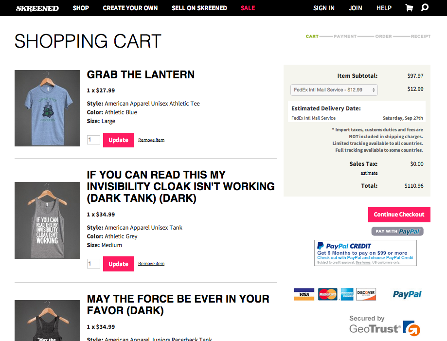
One of the most important parts of a checkout process is making shoppers feel comfortable and safe. Introducing trust elements to your cart is key for higher ecommerce conversion rate. The most common way of doing this is adding logos of known and trusted companies or brand that will show users you can be trusted.
One of my favorite brands: Skreened does it fantastically. As you can see (from my actual updated cart), just below the “continue checkout” call to action there are many trust icons such as paypal, credit card companies and even a “secured by GEOtrust” logo.
-
Cookies
One other thing love about Skreened is the fact they have very long lasting cookies on their site. As you can see in the screenshot above – I’m not logged in and I actually haven’t visited the site in over a month and yet they still have my shopping cart items saved with all my preferences. Awesome job.
-
Payment Methods
This one is a no brainer, don’t ask people to choose the type of credit card they’re going to use, just populate it yourself once the shopper begins to type. The idea is to save shoppers the time and hassle, there’s no need to make your users fill in an unnecessary field.
-
Mobile
If we’ve already started talking about payment and fields shoppers need to submit, on mobile everyone should be doing the same as uber and offer to screenshot your credit card. No need to fill in any numbers, as simple as that – you take a picture of your credit card and it’s in. As easy as that! 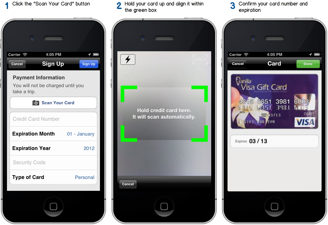
-
Localization
Stop asking for people’s full address before the zip code. It is so easy to have people fill in the zip code first and the populate most of the address details.Again we’re talking about making it easy on the customer. Populating a shoppers address according to their zipcode is a must.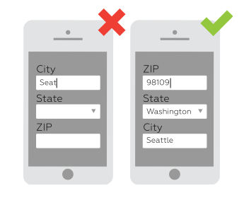
-
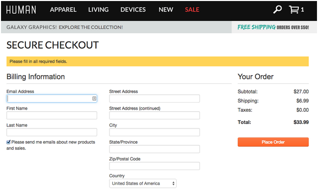
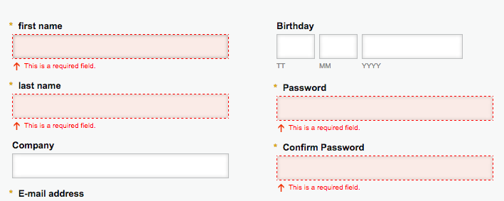
Error fields & validation
The one thing about errors and validation in shopping carts is that they have to be inline. Inline validation makes it very clear for users whether they’ve correctly filled in the field or not and will ensure they fill them out correctly. Yoast has a nice article on how to do this well.
Look Human has validation and errors show up above the form (the yellow line):
But when you show inline validation like MyOwnBike you basically ensure that the attention is immediately turned towards what needs to be fixed.
-
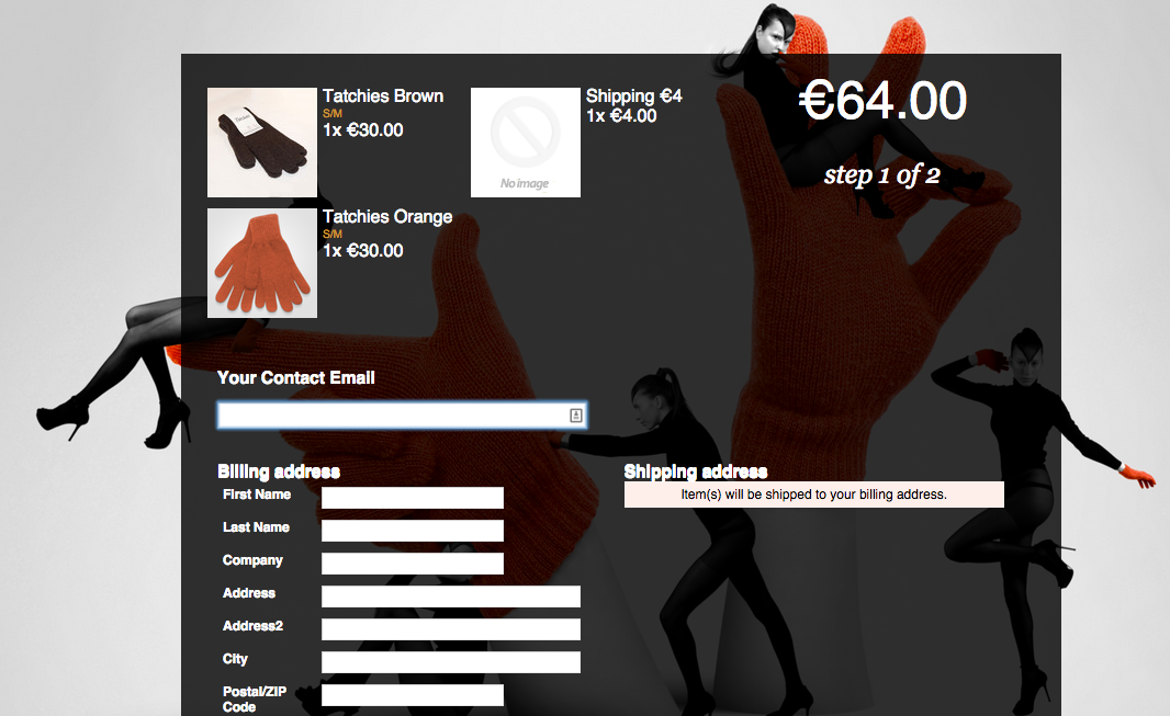
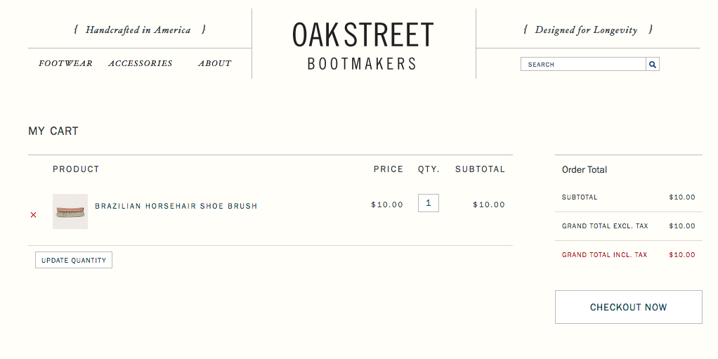
Product photos
Remind people what they’re purchasing and what’s in their shopping cart. Many companies miss this important step of ensuring shoppers that everything is clear, simple and according to their decisions.
Tatchies (although not a good example for clutter free) keeps the items being purchased on top with a small product photo to remind people of their choices.
An even better example: OakStreet. Clutter free and better hierarchy – showing the product image inline with other information and not above.
-
Progress bar
Tell people where they are in the funnel. We’re restless creatures and we want to know how long this process is going to take us. A great example by MyOwnBike on how to preview a checkout process can be seen in the example below, note how each step highlights the number above on gold and indicates the amount of steps left for purchase.
-
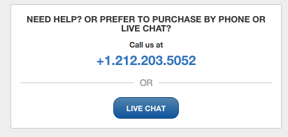
Real-time Support
Real-time support is key to higher ecommerce conversion rate. According to a research by boldchat, Chatters who engage via proactive invitation are 9.8x more likely to convert than visitors who don’t chat. More importantly, according to a recent Forrester research “44 % of online consumers say that having questions answered by a live agent while in the middle of an online purchase is one of the most important features a website can offer.” Missesdressy offers a quick call for support or a 24-hour chat service to answer all your questions:
-
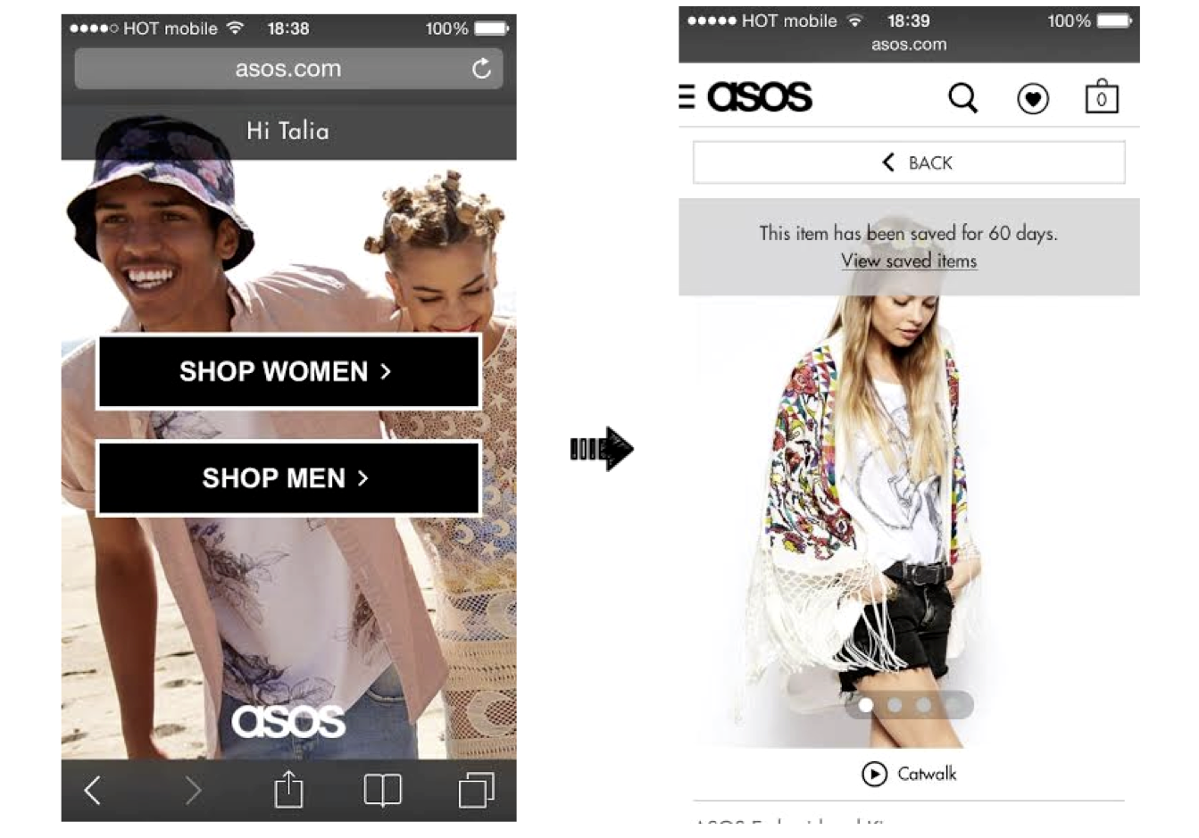
Save for later
The option for saving later has proven in countless times to increase conversion rates – mainly on mobile. 80% of mobile users say they feel uncomfortable paying on their mobile device. By introducing the save for later button, shoppers are able to then come back to their shopping cart and purchase the item on a desktop computer.
-
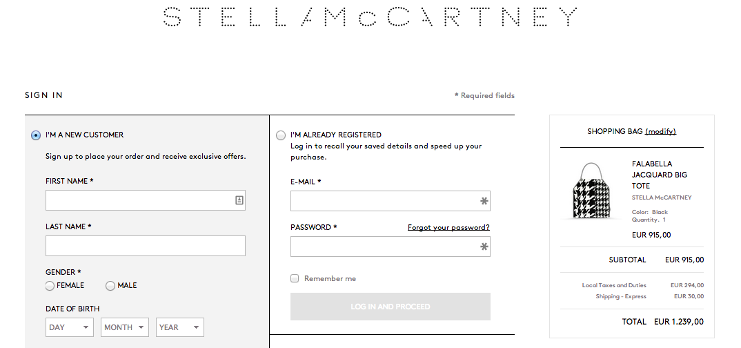
Order summary
Similar to showing product images on the final checkout page you also want to ensure shoppers throughout checkout and remind them which products they’ve already added to their bag and are currently in the midst of buying. Note that although we haven’t reached checkout yet, we can still see the product while signing up.
-
Shopping Cart Hierarchy
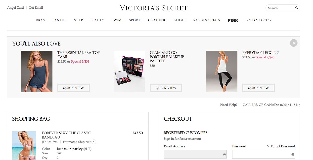
The term “above the fold” refers to the section of the screen visitors see without needing to scroll. Needless to say, you want all important information above the fold so people do not need to search for the “add to cart” button or search for their chosen items. When arriving on Victoria Secret’s checkout page, the first thing you see is a recommendations for other items you may like and only then are you able to see what you’re actually purchasing. This can cause confusion and distract customers from completing their purchase. Make sure the hierarchy of your shopping cart makes sense: first show the call to action, then present the items with their info and only then additional items they may be interested in.
-
Catch them before they leave
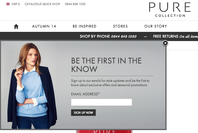
Exit popups are becoming more and more popular. I’m not referring to the system exit popups that appear as a warning if a visitor tries to leave the site but to well designed and thought exit popups that offer your shoppers a reason to complete their purchase. Use exit popups the right way, don’t harass users, don’t threaten them and offer genuine value. Many sites use exit popups to collect emails:
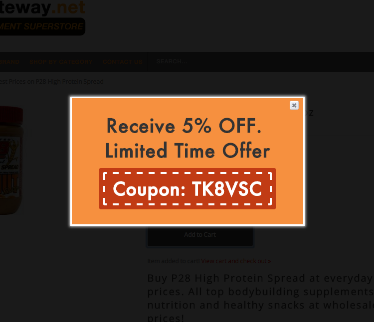
Others use it to offer one last sale before visitors leave:
-
Catch them after they leave
As of the fourth quarter of 2013, the average abandonment rate was 67.9% in the US. The majority of shoppers leave their shopping cart and do not complete their purchase. There are many reasons for shopping cart abandonment and there are two main ways to get them back:
-
Email Marketing: if you capture your shoppers email at the right time you can send them email marketing messages to bring them back to the funnel. The types of email I’ve received vary from discounts, free shipping, sales on my items and sometimes just a reminder that my shopping cart still exists.
-
Remarketing: “Stalk” your customer and offer them a personalized offer. Retargeting allows you to plant a cookie on your user and show them a personalized offer throughout the web. Easyjet did it me last year while I was looking for flights.

-
The power of free shipping
When I was 22 (so really not long ago…) I worked at a call center that sold $400 service over the phone. Once I’d make the sale I’d offer customers to purchase a book for only $25. People would always say no at first, but once I threw in the shipping it was a done deal. People like free shipping, it just works.
So far in 2014, 63% of amazon customers have joined amazon because of free shipping:
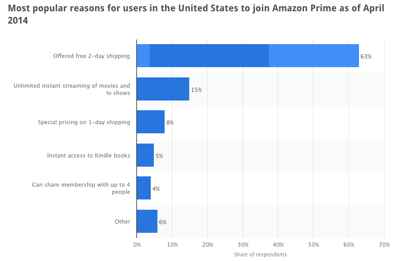
Really.
After checkout:
Now that you’ve made the sale it’s time to hit the iron while it’s hot. Many people neglect the power of retention (you can increase your profits by 95% with user retention) and after sale. There are two main points you should work on:
-
Thank you pages
Now’s the time to sign them up. Get more out of the users once they’ve purchased by asking them to write a testimonial, by getting them to share their purchase on social media for different incentives, add them to your mailing list and much more. There are endless possibilities instead of just saying: Thanks your invoice is in the mail.
-
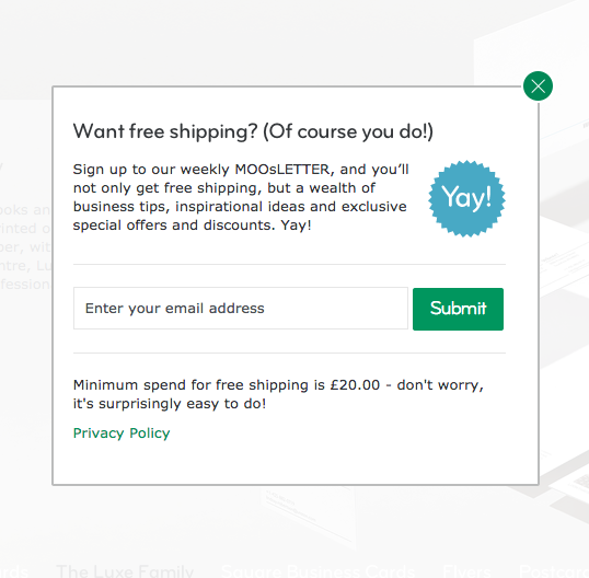
Email marketing
Thank you Moo.com for being so enthusiastic and doing it right. Start sending newsletters to your clients, sign them up to your mailing list and personalize offers for them.
-
Don’t forget
You know what to do. Test, test, test. Don’t go blindly into stuff, check stuff out, change things around and follow your metrics. Things make look nice on your site, but that doesn’t mean they work. Don’t make changes for the sake of changes, and don’t do everything at the same time.
We’ll be posting a new ecommerce use case next week that has just been amazing to test. We’ll show you heatmaps and some of the changes we’ve made and give you some insights on using both emotional and behavioral targeting.
Boost ecommerce conversion rate: 30 Best Practices and Tips 4.80/5 (96.00%) 15 votes
Related Posts


Boost ecommerce conversion rate: 30 Best Practices and Tips
Designing a checkout process for an ecommerce store is a huge challenge. Here’s some numbers you should know:
Although more and more people are purchasing online , most ecommerce checkout processes are extremely hard to navigate through and have very high abandonment rate. There are many websites today that can teach us about ecommerce conversion rate. For example, Amazon’s online sales dwarf the competition and continue bringing in the revenue:
To learn from the best, in this post we’ll take a look at what the companies are doing online today and also review some of conversioner’s latest case studies in ecommerce conversion optimization and best checkout processes.
Before checkout:
Where to Start Optimizing
Recent case studies continue to show us that in order to increase revenue and shopping cart revenue you do NOT need to start with optimizing the shopping cart. The most important impact you have on conversion is in the first 3 seconds a visitor lands on your site. The first 3 seconds of the user journey will determine if a user continues the funnel or not. In order to have the biggest impact in those 3 seconds you want to make sure you grab the user’s attention and convince them to purchase. This can be achieved by understanding your visitor’s emotional triggers, and by then using different images, colors and messaging to convey those triggers.
Our brains process images 60,000 time quicker than text so you want to make sure the image you use has a strong emotional say to it.
Colors project emotions – check out this emotional color guide to get some ideas
This ecommerce site increased their revenues by 115% by making changes on the category page, before even addressing the checkout page.
Call to action buttons
There’s a lot to say about call to action buttons, their color, position, size and more but most importantly on checkout process you want to make sure they are:
Consistent – Never changing, same color, same position throughout the site and same size.
Single – Make sure you have one call to action and not a few, too many ecommerce site have multiple call to actions giving users too many options and causing confusion.
Natural – This is important for both before the checkout page and in the checkout page – A call to action button has to stand out and be the first natural place a visitor turns to.
Asos’s biggest call to action on their product pages is – Free shipping. Their “add to bag” call to action appears below the fold. (The blue line below marks the fols (where people need to start scrolling). This means that the first natural people look at on Asos’s product page is the “Free shipping” and not what Asos really wants us to do: “Add to bag”.
Currency
A great way to increase conversion and improve user journey is to show currency according to the visitor’s origin. Many sites do this today and allow a more personalized experience for the user.
Signup to checkout
This is probably the most discussed topic of ecommerce conversion. Should I require visitors to signup before checking out? NO. The majority of case studies show that shopping cart abandonment is highest when people reach a signup form in order to checkout. There’s no need to be greedy and there are other great ways of getting people to signup without requiring it:
Offering a promo code with a discount for those who sign up – Once people are getting closer to checkout, you can offer a discount for those who signup.
Having them sign up after the purchase
That being said if you will not relinquish the idea of getting people to sign up, ask for only one field – email. The rest can be received later and with email you will be able to quickly follow up later.
H&M requires registration before checking out. There are only 2 options, either you’re a returning user, or you need to register.
Macy’s uses a popup once a user arrives on their site to sign people up, show international shipping and personalize currency – personalization in one stop. By offering 15% off, Macy’s gets additional people to sign up to their site and newsletter without ever asking them to sign up for checkout.
Trust Elements
Other than conveying trust, showing the amount of people who have already purchased an item increases its importance and popularity. We used the amount of people who have already used the product below to give a sense of a large and much used platform.
Testimonials
Testimonials are a great way to get people buying. Confirmation bias is another cognitive bias we experience while shopping. It means is we tend to search and interpret information in a way that confirms our beliefs and preconception. Basically we like seeing other people agree with us. Whistle is a great example of using emotional testimonials to support the purchase of their product.
An even better way:
Etsy shows testimonials in a quick way with easy navigation from the item details to testimonials and shipping details
Countdown
Researches have shown that rather than only highlighting the “why” a person should buy a product, showing people they’re about to miss out on a special offer increases conversion dramatically. This to do with Loss Aversion – a cognitive bias which demonstrates that the pain from losing is higher than the joy of winning.
The checkout:
Isolating the Checkout
Isolating the checkout is crucial for ecommerce conversion rate. Once a visitor arrives on the checkout page they should be only in the checkout page and all other attention grabbers should be removed. All exit links should be removed, making sure that visitors cannot be distracted, all remaining links should always appear in a pop up and not send the visitor to another page and experience.
You May Also Like…
Once the user has decided to purchase an item you can offer additional items to go with the chosen product. Seconds before the checkout itself, Office Depot shows the shopper a preview of their cart and offers additional products that may interest them.
Shipping
Shipping has a huge impact on ecommerce conversion rate (Find some really cool numbers on free shipping below). Make sure that all pricing is visible at first glance, do NOT surprise your shoppers with shipping costs. Also, help users understand their own shipping costs. Etsy allows you to change your shipping destination (leading to change in cost) with a simple drop down menu that leaves no place for imagination:
Clutter Free
Clutter is a shopping cart’s worst enemy. Make it easy and simple on shoppers to see what they’re buying and how much it costs. Aliexpress asks people for their entire information at the top of the shopping cart completely hiding the purchase details below the form. The blue line marks where the fold ends and people need to start scrolling:
X-doria on the other hand introduces a clutter free shopping bag presenting all the relevant information.
Editable
Another thing that H&M and other brands do successfully is make it easy on the shopper to make changes within the checkout page. This means that within the shopping cart you can edit the amount of products you by, change the size or even remove some of the products, all in one place making sure shoppers are not being sent out of the shopping cart. If you’re selling fashion items it’s also a good idea to have the size chart in the checkout page.
Trust
One of the most important parts of a checkout process is making shoppers feel comfortable and safe. Introducing trust elements to your cart is key for higher ecommerce conversion rate. The most common way of doing this is adding logos of known and trusted companies or brand that will show users you can be trusted.
One of my favorite brands: Skreened does it fantastically. As you can see (from my actual updated cart), just below the “continue checkout” call to action there are many trust icons such as paypal, credit card companies and even a “secured by GEOtrust” logo.
Cookies
One other thing love about Skreened is the fact they have very long lasting cookies on their site. As you can see in the screenshot above – I’m not logged in and I actually haven’t visited the site in over a month and yet they still have my shopping cart items saved with all my preferences. Awesome job.
Payment Methods
This one is a no brainer, don’t ask people to choose the type of credit card they’re going to use, just populate it yourself once the shopper begins to type. The idea is to save shoppers the time and hassle, there’s no need to make your users fill in an unnecessary field.
Mobile
If we’ve already started talking about payment and fields shoppers need to submit, on mobile everyone should be doing the same as uber and offer to screenshot your credit card. No need to fill in any numbers, as simple as that – you take a picture of your credit card and it’s in. As easy as that!
Localization
Stop asking for people’s full address before the zip code. It is so easy to have people fill in the zip code first and the populate most of the address details.Again we’re talking about making it easy on the customer. Populating a shoppers address according to their zipcode is a must.
Error fields & validation
The one thing about errors and validation in shopping carts is that they have to be inline. Inline validation makes it very clear for users whether they’ve correctly filled in the field or not and will ensure they fill them out correctly. Yoast has a nice article on how to do this well.
Look Human has validation and errors show up above the form (the yellow line):
But when you show inline validation like MyOwnBike you basically ensure that the attention is immediately turned towards what needs to be fixed.
Product photos
Remind people what they’re purchasing and what’s in their shopping cart. Many companies miss this important step of ensuring shoppers that everything is clear, simple and according to their decisions.
Tatchies (although not a good example for clutter free) keeps the items being purchased on top with a small product photo to remind people of their choices.
An even better example: OakStreet. Clutter free and better hierarchy – showing the product image inline with other information and not above.
Progress bar
Tell people where they are in the funnel. We’re restless creatures and we want to know how long this process is going to take us. A great example by MyOwnBike on how to preview a checkout process can be seen in the example below, note how each step highlights the number above on gold and indicates the amount of steps left for purchase.
Real-time Support
Real-time support is key to higher ecommerce conversion rate. According to a research by boldchat, Chatters who engage via proactive invitation are 9.8x more likely to convert than visitors who don’t chat. More importantly, according to a recent Forrester research “44 % of online consumers say that having questions answered by a live agent while in the middle of an online purchase is one of the most important features a website can offer.” Missesdressy offers a quick call for support or a 24-hour chat service to answer all your questions:
Save for later
The option for saving later has proven in countless times to increase conversion rates – mainly on mobile. 80% of mobile users say they feel uncomfortable paying on their mobile device. By introducing the save for later button, shoppers are able to then come back to their shopping cart and purchase the item on a desktop computer.
Order summary
Similar to showing product images on the final checkout page you also want to ensure shoppers throughout checkout and remind them which products they’ve already added to their bag and are currently in the midst of buying. Note that although we haven’t reached checkout yet, we can still see the product while signing up.
Shopping Cart Hierarchy
The term “above the fold” refers to the section of the screen visitors see without needing to scroll. Needless to say, you want all important information above the fold so people do not need to search for the “add to cart” button or search for their chosen items. When arriving on Victoria Secret’s checkout page, the first thing you see is a recommendations for other items you may like and only then are you able to see what you’re actually purchasing. This can cause confusion and distract customers from completing their purchase. Make sure the hierarchy of your shopping cart makes sense: first show the call to action, then present the items with their info and only then additional items they may be interested in.
Catch them before they leave
Exit popups are becoming more and more popular. I’m not referring to the system exit popups that appear as a warning if a visitor tries to leave the site but to well designed and thought exit popups that offer your shoppers a reason to complete their purchase. Use exit popups the right way, don’t harass users, don’t threaten them and offer genuine value. Many sites use exit popups to collect emails:
Others use it to offer one last sale before visitors leave:
Catch them after they leave
As of the fourth quarter of 2013, the average abandonment rate was 67.9% in the US. The majority of shoppers leave their shopping cart and do not complete their purchase. There are many reasons for shopping cart abandonment and there are two main ways to get them back:
Email Marketing: if you capture your shoppers email at the right time you can send them email marketing messages to bring them back to the funnel. The types of email I’ve received vary from discounts, free shipping, sales on my items and sometimes just a reminder that my shopping cart still exists.
Remarketing: “Stalk” your customer and offer them a personalized offer. Retargeting allows you to plant a cookie on your user and show them a personalized offer throughout the web. Easyjet did it me last year while I was looking for flights.
The power of free shipping
When I was 22 (so really not long ago…) I worked at a call center that sold $400 service over the phone. Once I’d make the sale I’d offer customers to purchase a book for only $25. People would always say no at first, but once I threw in the shipping it was a done deal. People like free shipping, it just works.
So far in 2014, 63% of amazon customers have joined amazon because of free shipping:
Really.
After checkout:
Now that you’ve made the sale it’s time to hit the iron while it’s hot. Many people neglect the power of retention (you can increase your profits by 95% with user retention) and after sale. There are two main points you should work on:
Thank you pages
Now’s the time to sign them up. Get more out of the users once they’ve purchased by asking them to write a testimonial, by getting them to share their purchase on social media for different incentives, add them to your mailing list and much more. There are endless possibilities instead of just saying: Thanks your invoice is in the mail.
Email marketing
Thank you Moo.com for being so enthusiastic and doing it right. Start sending newsletters to your clients, sign them up to your mailing list and personalize offers for them.
Don’t forget
You know what to do. Test, test, test. Don’t go blindly into stuff, check stuff out, change things around and follow your metrics. Things make look nice on your site, but that doesn’t mean they work. Don’t make changes for the sake of changes, and don’t do everything at the same time.
We’ll be posting a new ecommerce use case next week that has just been amazing to test. We’ll show you heatmaps and some of the changes we’ve made and give you some insights on using both emotional and behavioral targeting.
Related Posts
Tags: