Did you notice anything unusual about the title of this post? Did you notice the word “THAN” repeats itself? If you didn’t, you’re not alone. Many people miss this repetition thanks to the law of experience – a principle in gestalt psychology that suggests that people use prior knowledge in order to understand certain elements, and look at sentences as a whole and not at each individual word.
Gestalt psychology or gestaltism aims to understand how people perceive and make sense of visual information. According to gestaltism, perceptions are merely the products of complex interactions among various external stimuli. Gestaltism states that objects are considered globally, as a whole before, or in parallel with, perception of their individual elements.
Gestalt psychology claims that wholes are structured and organized using grouping laws. If you learn the grouping laws well enough you will see great change in your conversion metrics and be able to help users complete your funnels quicker and simpler. These laws help design better user interfaces for your site.
Below I have listed the important laws of gestalt:
Law of similarity
This law is often applied in form building.
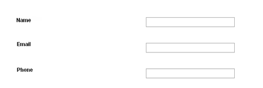
What do you think, which of the following forms is better?
A:
B:
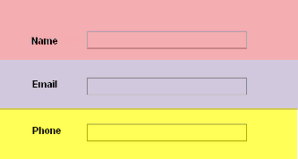
Because of the distance between the labels and the fields in example A, we perceive them as two different columns, making them seem like two different and unrelated groups. By placing them closer together, like in form B, they are emphasized as horizontal pairs. Make it easier for your users to fill in forms in your website by placing labels and fields closer together, and separating each field with a different background color.
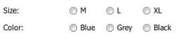
The law of proximity
This law can, for example, be used when placing radio buttons. Radio buttons are used when the user must select only one choice out of several options. To signal this association to the user, simply place your radio buttons as a horizontal row so that they are closer to each other.
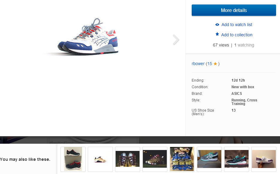
The same principle of proximity is what makes navbars, and related items in checkouts so useful, it is the idea of placing related objects close together. This is applied in the following example from ebay.com, where they offer other items you may also like, and they place them close together in the same area of the page.
The Law of closure
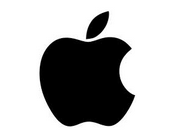
Think of the Apple logo. Our minds fill in the missing gap and therefore understand this shape as an eaten apple. If our minds didn’t make this completion, we would not understand what it is.
There are plenty of other logos that use the law of closure, here are some examples.


The fact we are able to make these completions and understand simple shapes as a concept is very useful when coming up with ideas for logos. The advantage of designing your logo with the help of gestalt principles, is that you can create a very simple logo but convey a complex idea. Try to think of some other logos you know. You will find that usually, memorable logos are the most simple logos.
The Law of continuity
Here , the principle is that lines that are continuations of each other are perceived as the same line, even in the case of multiple line segments.
For example, when you see the Chanel logo

you see it as a regular C and a mirrored C joined together.

you don’t see it like this

This is another great principle to follow when designing a logo. Very similar to the previous law, this also gives you the option to create a very simple yet unique logo, which will be memorable not despite, but because of its simplicity.
The Law of ”Figure-Ground”
This principle describes our ability to identify a figure from the background. This law applies for example in Disqus, notice how there are many things happening on the page, like different colors, shapes, images and texts. However it is still easy for you to tell the figures from the background.
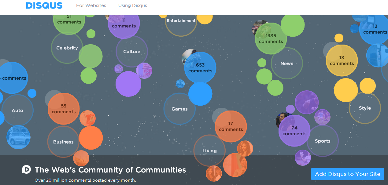
Figure-ground lets us know what we should be focusing on the page. This law can also be applied in call to action buttons. For example take a look at this button.

Its got rounded corners, well defined borders, gradient color and resulting illusion of 3D depth. All of these elements combined differentiate the button from its surroundings. Since your call to action button is the most important element in your page, you want it to be pronounce. Use the above elements to make it easier for the user to notice and identify the button as something that can be activated.
Conclusions
Using gestalt principles in user interface design helps us gain functionality and aesthetic appeal and increase the likelihood that your message is communicated to your audience. Perceiving objects as a whole is what makes us recognize objects even if they don’t appear as we are used to seeing them, for example when they are animated.
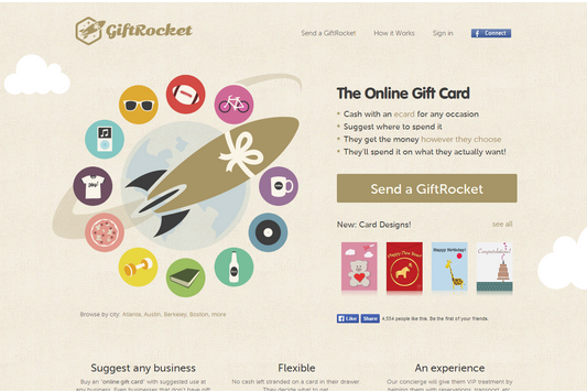
If we didn’t have this ability, we would not be able to recognize any of the objects you see in this landing page from giftrocket for example.
Gestalt laws have proven to be very useful in conversion optimization. Do you use any gestalt psychology tricks on your site? Tell us how.
conversion optimization: is the whole really greater than than the sum of its parts? 5.00/5 (100.00%) 9 votes
Related Posts


conversion optimization: is the whole really greater than than the sum of its parts?
Did you notice anything unusual about the title of this post? Did you notice the word “THAN” repeats itself? If you didn’t, you’re not alone. Many people miss this repetition thanks to the law of experience – a principle in gestalt psychology that suggests that people use prior knowledge in order to understand certain elements, and look at sentences as a whole and not at each individual word.
Gestalt psychology or gestaltism aims to understand how people perceive and make sense of visual information. According to gestaltism, perceptions are merely the products of complex interactions among various external stimuli. Gestaltism states that objects are considered globally, as a whole before, or in parallel with, perception of their individual elements.
Gestalt psychology claims that wholes are structured and organized using grouping laws. If you learn the grouping laws well enough you will see great change in your conversion metrics and be able to help users complete your funnels quicker and simpler. These laws help design better user interfaces for your site.
Below I have listed the important laws of gestalt:
Law of similarity
This law is often applied in form building.
What do you think, which of the following forms is better?
A:
B:
Because of the distance between the labels and the fields in example A, we perceive them as two different columns, making them seem like two different and unrelated groups. By placing them closer together, like in form B, they are emphasized as horizontal pairs. Make it easier for your users to fill in forms in your website by placing labels and fields closer together, and separating each field with a different background color.
The law of proximity
This law can, for example, be used when placing radio buttons. Radio buttons are used when the user must select only one choice out of several options. To signal this association to the user, simply place your radio buttons as a horizontal row so that they are closer to each other.
The same principle of proximity is what makes navbars, and related items in checkouts so useful, it is the idea of placing related objects close together. This is applied in the following example from ebay.com, where they offer other items you may also like, and they place them close together in the same area of the page.
The Law of closure
Think of the Apple logo. Our minds fill in the missing gap and therefore understand this shape as an eaten apple. If our minds didn’t make this completion, we would not understand what it is.
There are plenty of other logos that use the law of closure, here are some examples.
The fact we are able to make these completions and understand simple shapes as a concept is very useful when coming up with ideas for logos. The advantage of designing your logo with the help of gestalt principles, is that you can create a very simple logo but convey a complex idea. Try to think of some other logos you know. You will find that usually, memorable logos are the most simple logos.
The Law of continuity
Here , the principle is that lines that are continuations of each other are perceived as the same line, even in the case of multiple line segments.
For example, when you see the Chanel logo
you see it as a regular C and a mirrored C joined together.
you don’t see it like this
This is another great principle to follow when designing a logo. Very similar to the previous law, this also gives you the option to create a very simple yet unique logo, which will be memorable not despite, but because of its simplicity.
The Law of ”Figure-Ground”
This principle describes our ability to identify a figure from the background. This law applies for example in Disqus, notice how there are many things happening on the page, like different colors, shapes, images and texts. However it is still easy for you to tell the figures from the background.
Figure-ground lets us know what we should be focusing on the page. This law can also be applied in call to action buttons. For example take a look at this button.
Its got rounded corners, well defined borders, gradient color and resulting illusion of 3D depth. All of these elements combined differentiate the button from its surroundings. Since your call to action button is the most important element in your page, you want it to be pronounce. Use the above elements to make it easier for the user to notice and identify the button as something that can be activated.
Conclusions
Using gestalt principles in user interface design helps us gain functionality and aesthetic appeal and increase the likelihood that your message is communicated to your audience. Perceiving objects as a whole is what makes us recognize objects even if they don’t appear as we are used to seeing them, for example when they are animated.
If we didn’t have this ability, we would not be able to recognize any of the objects you see in this landing page from giftrocket for example.
Gestalt laws have proven to be very useful in conversion optimization. Do you use any gestalt psychology tricks on your site? Tell us how.
Related Posts
Tags: