A typical conversation I have with clients on a weekly basis:
Me: “These are your landing pages (checkout pages or pricing pages or mobile pages etc.), the emotional triggers we used are…”
Client: “Hold on, where are all our features? Why don’t you have all our propositions and options showing? How will the customer know everything we have to offer?”
They won’t, and that’s a good thing. In fact endless features on your landing page can be a conversion killer.
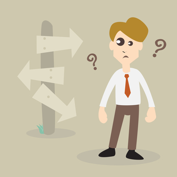 The reason: ‘Analysis Paralysis’ – a psychological trigger (one of many) that helps us in making decisions, or in this case, the exact opposite.
Analysis Paralysis is the state of over-analyzing (or over-thinking) a situation so that a decision or action is never taken, and actually paralyzing the outcome. This basically means that when we’re presented with too many options, we prefer not to make a choice.
Similar to loss aversion, the “pain” of making a decision with multiple options exceeds the gain and benefits of making a decision. So for example if your pricing page has too many offers, the majority of the customers would choose not to pay.
Have you ever sat at a restaurant with a huge menu that goes on and on with dozens of amazing choices and had no idea what to order? This is how analysis paralysis works. It’s the same with cable TV, so many channels to watch and nothing interesting? A new study by Nielsen shows that although we have over 190 channels to choose form, the majority of Americans watch 17 on average (apparently Americans like to zap through channels, I for one stick to about 5).
Sometimes an overload of information can only paralyze us or just disturb us.
Giving users information about your product or service is important, but the trick is knowing where to place it. When you want a user to perform an action, you want to give them a simple, clear & cut option to do so without paralyzing them. Those who are interested in additional information will scroll for it.
The majority of our landing pages hold a lot of information, but they’re placed in the right area. Long landing pages don’t mean lots of copy or distracting options. Use the length of your landing page to save your customer’s time and present the data easily with images (why images?).
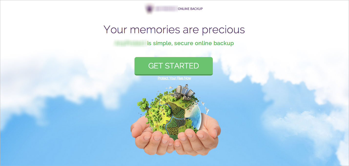
The example below is of a landing page we designed for a cloud storage company. As you can see the top part of the page (also known as the ‘above the fold’ area) has no features or long explanations. A simple call to action that allows you to download the product and get started quickly (A case study on the psychological trigger used on this page will be published soon).
The top part of the page:
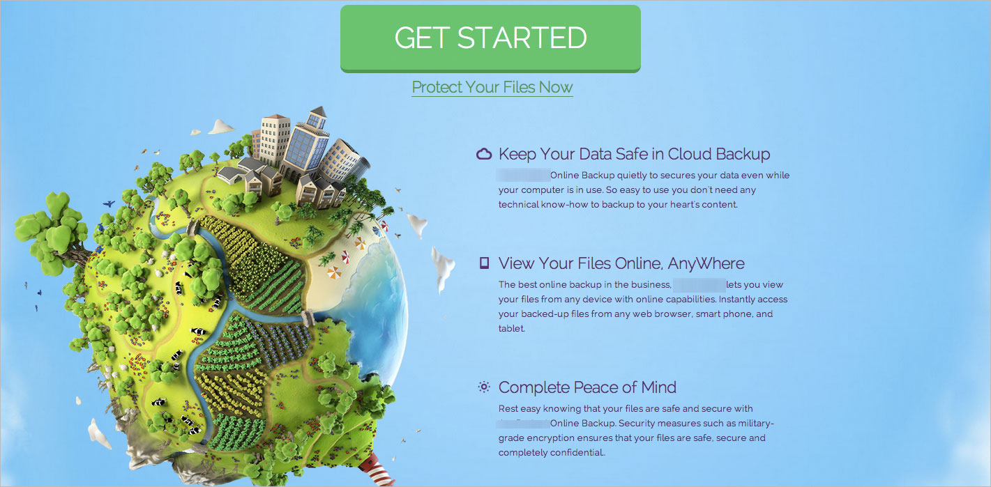
The bottom part of the page offers additional information and has a loud call to action button. Giving just the amount of info people may need and still directing them to the download area (this in only part of the landing page).
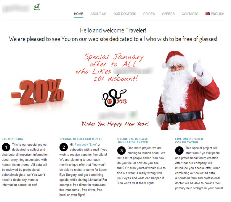
Apart from having no actual call to action button, the amount of information on the page below makes it hard to decide what to choose and know what to do on the site. There are many links leading out of the page, a lot of text and no actual way to redeem your 20% discount.
Avoiding Analysis Paralysis:
Get people to make one easy choice first, to get them in the funnel. Once they’re in allow users to change their mind or explore.
- Not sure which step to start with? This is a great time to start an AB test. Test out what your customers are looking for and what information they need to make it to the next part of the funnel.
- Don’t forget to be honest, don’t try and hide important information. Place it in the right place.
- Usually we’re too invested in our own products and find it hard to see which part is harder or problematic than the rest, a cool way to change this is to sit down with someone who hasn’t tried your funnel out yet and see what they go through while completing the funnel.
A great example is the email I received from Booking.com the other day asking me about my stay in Berlin. Getting people to fill out forms is extremely hard and by allowing me to start the process with one click within the email I was much more eager to complete the funnel.
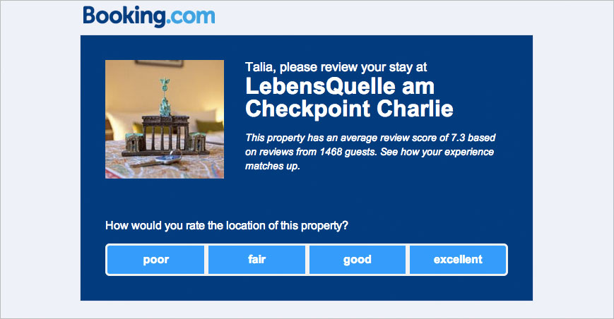
Remember, helping your customers complete your funnel is an important part of your conversion optimization. There are many different psychological triggers that have an impact on our customers decisions and the more we know & learn about our clients the better we can help them choose our product.
Follow us to get more updates and posts here.
Increase your revenue by applying 1 psychological trigger 5.00/5 (100.00%) 3 votes
Related Posts


Increase your revenue by applying 1 psychological trigger
A typical conversation I have with clients on a weekly basis:
Me: “These are your landing pages (checkout pages or pricing pages or mobile pages etc.), the emotional triggers we used are…”
Client: “Hold on, where are all our features? Why don’t you have all our propositions and options showing? How will the customer know everything we have to offer?”
They won’t, and that’s a good thing. In fact endless features on your landing page can be a conversion killer.
Analysis Paralysis is the state of over-analyzing (or over-thinking) a situation so that a decision or action is never taken, and actually paralyzing the outcome. This basically means that when we’re presented with too many options, we prefer not to make a choice.
Similar to loss aversion, the “pain” of making a decision with multiple options exceeds the gain and benefits of making a decision. So for example if your pricing page has too many offers, the majority of the customers would choose not to pay.
Have you ever sat at a restaurant with a huge menu that goes on and on with dozens of amazing choices and had no idea what to order? This is how analysis paralysis works. It’s the same with cable TV, so many channels to watch and nothing interesting? A new study by Nielsen shows that although we have over 190 channels to choose form, the majority of Americans watch 17 on average (apparently Americans like to zap through channels, I for one stick to about 5).
Sometimes an overload of information can only paralyze us or just disturb us.
Giving users information about your product or service is important, but the trick is knowing where to place it. When you want a user to perform an action, you want to give them a simple, clear & cut option to do so without paralyzing them. Those who are interested in additional information will scroll for it.
The majority of our landing pages hold a lot of information, but they’re placed in the right area. Long landing pages don’t mean lots of copy or distracting options. Use the length of your landing page to save your customer’s time and present the data easily with images (why images?).
The example below is of a landing page we designed for a cloud storage company. As you can see the top part of the page (also known as the ‘above the fold’ area) has no features or long explanations. A simple call to action that allows you to download the product and get started quickly (A case study on the psychological trigger used on this page will be published soon).
The top part of the page:
The bottom part of the page offers additional information and has a loud call to action button. Giving just the amount of info people may need and still directing them to the download area (this in only part of the landing page).
Apart from having no actual call to action button, the amount of information on the page below makes it hard to decide what to choose and know what to do on the site. There are many links leading out of the page, a lot of text and no actual way to redeem your 20% discount.
Avoiding Analysis Paralysis:
Get people to make one easy choice first, to get them in the funnel. Once they’re in allow users to change their mind or explore.
A great example is the email I received from Booking.com the other day asking me about my stay in Berlin. Getting people to fill out forms is extremely hard and by allowing me to start the process with one click within the email I was much more eager to complete the funnel.
Remember, helping your customers complete your funnel is an important part of your conversion optimization. There are many different psychological triggers that have an impact on our customers decisions and the more we know & learn about our clients the better we can help them choose our product.
Follow us to get more updates and posts here.
Related Posts
Tags: