Ecommerce optimization is a constant challenge of finding the right starting point, tracking and understanding the results. That is why when we set out to work with WallMonkeys we had a clear path in mind: identifying the consumer, optimizing user experience, designing a flow that suited our consumer and ultimately increasing revenues.
Ecommerce Optimization – Where to Start
One of our previous articles, 30 best practices and tips for boosting ecommerce sales, focuses on actionable tips and changes for increasing ecommerce conversion rate. But how do you know where to start and what changes to make first?
A common place people typically start optimizing ecommerce sites is at the checkout page. Assuming this is where people have the most issues, marketers run many tests on the checkout page trying to ensure that as many peoples as possible complete their purchases. However, in our experience, we’ve seen time and time again that this is seldom the right way to go.
Constant testing has shown us that the best place to start is at the top of the funnel, where the majority of visitors arrive and the greatest impact can be achieved. The first message and visual a visitor experiences has the greatest impact on ecommerce conversion rate and revenues.
The Research Process
During our research period for Wallmonkeys we studied the funnel closely using heatmaps, analytics and other tools that helped us identify and analyze visitor behavior. In addition to the behavioral analysis we dug deep into the consumer psychology and profiled the different types of customers WallMonkeys has.
The behavioral research:
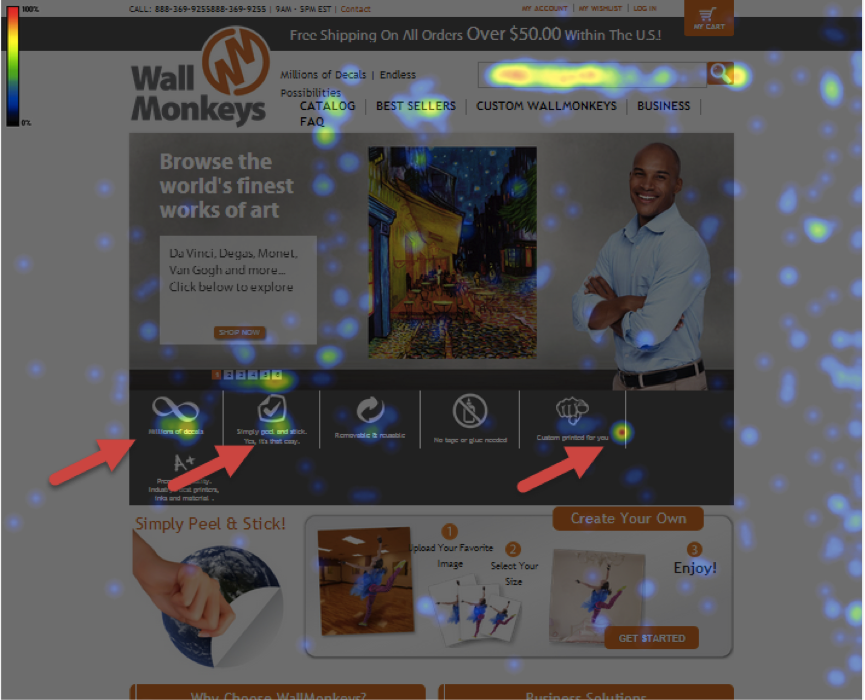
Analyzing the heatmap showed us that 97% of visitors don’t scroll and see the bottom part of the homepage, which led us to focus on the top part of homepage.
The original homepage had 5 rotating images featuring living rooms and offices decorated with wall decals.
Using the heatmap we set on the homepage, there were two big elements we wanted to address:
- Many people were clicking on the bullets thinking they’re clickable, but they weren’t.
- The majority of people were using the search bar to start their shopping experience.
The Emotional Research:
In addition to our behavioral research we focused on our emotional targeting methodology.
- Analyzing and understanding the emotional reason for customer purchasing.
- Identifying how a customer should feel during the shopping experience.
- Defining the messaging, colors and images that should be used to create a better, conversion oriented experience.
Initial results:
- The emotional added value for customers was missing on the page
- The messaging focused on products and not on the consumer – e.g. “Browse the world’s finest art”.
- The experience of purchasing a decal or the end result of a purchase wasn’t communicated well.
Once we completed our research, we decided to focus our initial strategy on our main target audience – parents, mainly mothers purchasing decals for themselves and their children’s bedrooms. Using design, messaging and different images we wanted to communicate the change a decal can make not just to your wall but to your entire home. We wanted to instill a feeling in Wallmonkey’s customers that buying a decal is a fun, fresh and a cool experience that can transform everyday life.
Optimization Round 1:
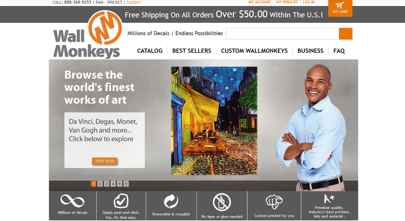
Originally the look and feel of the site was a business one that included rotating slider images of men and women standing in an office or an empty room.
Rotating Image #1:
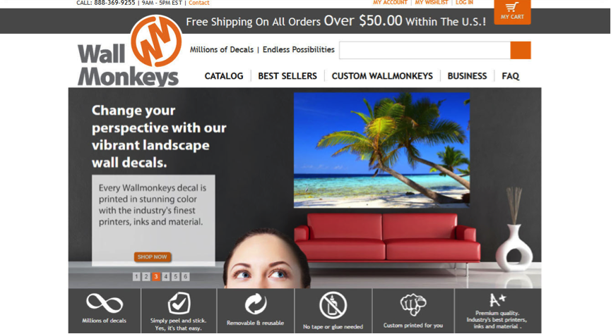
Slider Image #2
The Changes:
To focus our messaging on our main audience, women purchasing decals for their home or their children, our changes included UI & UX and psychological strategic changes:
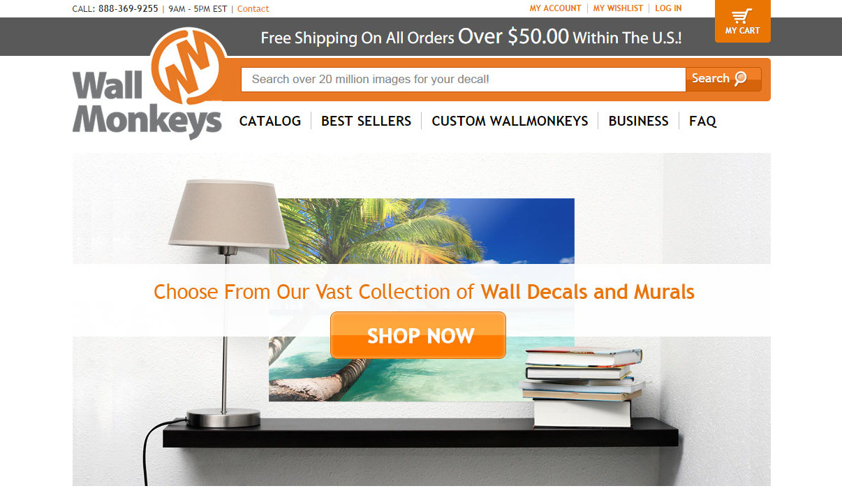
- The slider: It was completely removed to increase conversions and page functionality (e.g. load time). Similar tests we ran in the past demonstrated that one main image works far better than rotating images.
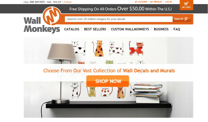
- Images: To create a more fun, vibrant and lively feeling, we tested two main images. One was a more fun and easygoing image (cats), and the other combined the original business look and feel with new surroundings.
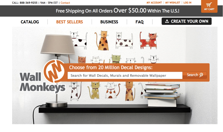
- Search: Our heatmap and analytics research highlighted the fact that the majority of people search on the site, so we gave it an entirely new look by enhancing it and making it the main focal point for visitors. As you can see below, we used brighter colors from the brand and connected it to the logo. The call to action for search was made more prominent and lively.
- The bullets: They were removed completely as the heatmap clearly showed that people were clicking on these bullets even though they weren’t clickable.
- Color Theme: Moving away from the dark background we used a more clean and white background to give the site a lighter and easygoing feeling. The colors of the decals we used were more vibrant and lively in order to communicate a more fun experience.
- Call to Action: At last we added a call to action button: “Shop Now”. This was a great way for us to test usability and intent of visitors – would they prefer to search or choose from a vast collection?
Variation #1
Variation #2
The Results:
Round one results showed a 27% increase in direct revenue for the second variation.
The more personal, fun and festive variation won by a large margin. The images of the cats, the colors and the new flow of the homepage provided a better experience for our customers. Adding a direct call to action on the homepage helped navigate visitors in the site to the next step.
Ecommerce Optimization Round 2:
In round two we took the winning variation and made another change in the experience: moving the search bar from the top navigation header to the center of page, essentially making it stand out.
Now that we’d already supplied the visitors with a “shop now” call to action, we hypothesized that centering the search bar for visitors would increase revenues even more.
The results:
At the end of a 30-day testing period there was a 550% increase in revenues. The combination of both enhancing the search bar in this test and the change in strategy in the previous one gave visitors a more meaningful shopping experience.
Taking the next step
While the majority of marketers focus on A/B testing user behavior and technical changes, a more meaningful impact can be achieved when both the behavior and the emotional profile of our customers are taken into account. Remember, it is most important to think of how the product ultimately makes the customer feel rather on the function of the product itself.
Have you made any meaningful strategic changes on your site lately?
7 Tactics That Increased Ecommerce Conversion Rate by 550% 4.38/5 (87.50%) 16 votes
Related Posts


7 Tactics That Increased Ecommerce Conversion Rate by 550%
Ecommerce optimization is a constant challenge of finding the right starting point, tracking and understanding the results. That is why when we set out to work with WallMonkeys we had a clear path in mind: identifying the consumer, optimizing user experience, designing a flow that suited our consumer and ultimately increasing revenues.
Ecommerce Optimization – Where to Start
One of our previous articles, 30 best practices and tips for boosting ecommerce sales, focuses on actionable tips and changes for increasing ecommerce conversion rate. But how do you know where to start and what changes to make first?
A common place people typically start optimizing ecommerce sites is at the checkout page. Assuming this is where people have the most issues, marketers run many tests on the checkout page trying to ensure that as many peoples as possible complete their purchases. However, in our experience, we’ve seen time and time again that this is seldom the right way to go.
Constant testing has shown us that the best place to start is at the top of the funnel, where the majority of visitors arrive and the greatest impact can be achieved. The first message and visual a visitor experiences has the greatest impact on ecommerce conversion rate and revenues.
The Research Process
During our research period for Wallmonkeys we studied the funnel closely using heatmaps, analytics and other tools that helped us identify and analyze visitor behavior. In addition to the behavioral analysis we dug deep into the consumer psychology and profiled the different types of customers WallMonkeys has.
The behavioral research:
Analyzing the heatmap showed us that 97% of visitors don’t scroll and see the bottom part of the homepage, which led us to focus on the top part of homepage.
The original homepage had 5 rotating images featuring living rooms and offices decorated with wall decals.
Using the heatmap we set on the homepage, there were two big elements we wanted to address:
The Emotional Research:
In addition to our behavioral research we focused on our emotional targeting methodology.
Initial results:
Once we completed our research, we decided to focus our initial strategy on our main target audience – parents, mainly mothers purchasing decals for themselves and their children’s bedrooms. Using design, messaging and different images we wanted to communicate the change a decal can make not just to your wall but to your entire home. We wanted to instill a feeling in Wallmonkey’s customers that buying a decal is a fun, fresh and a cool experience that can transform everyday life.
Optimization Round 1:
Originally the look and feel of the site was a business one that included rotating slider images of men and women standing in an office or an empty room.
Rotating Image #1:
Slider Image #2
The Changes:
To focus our messaging on our main audience, women purchasing decals for their home or their children, our changes included UI & UX and psychological strategic changes:
Variation #1
Variation #2
The Results:
Round one results showed a 27% increase in direct revenue for the second variation.
The more personal, fun and festive variation won by a large margin. The images of the cats, the colors and the new flow of the homepage provided a better experience for our customers. Adding a direct call to action on the homepage helped navigate visitors in the site to the next step.
Ecommerce Optimization Round 2:
In round two we took the winning variation and made another change in the experience: moving the search bar from the top navigation header to the center of page, essentially making it stand out.
Now that we’d already supplied the visitors with a “shop now” call to action, we hypothesized that centering the search bar for visitors would increase revenues even more.
The results:
At the end of a 30-day testing period there was a 550% increase in revenues. The combination of both enhancing the search bar in this test and the change in strategy in the previous one gave visitors a more meaningful shopping experience.
Taking the next step
While the majority of marketers focus on A/B testing user behavior and technical changes, a more meaningful impact can be achieved when both the behavior and the emotional profile of our customers are taken into account. Remember, it is most important to think of how the product ultimately makes the customer feel rather on the function of the product itself.
Have you made any meaningful strategic changes on your site lately?
Related Posts
Tags: