Registration Form Optimization: 9 Best Practices for Increasing Signups
There are so many reasons you would want someone to register for your site. Whether you have an e-commerce site and want to get users’ emails for your abandoned cart and email marketing blasts or you planned a webinar and want people to sign up through your landing page - you want those users to register! It’s a great way to increase returning users and you can use it as a tool to increase purchases or other conversions you have for your site!
”The probability of selling to an existing customer is 60 – 70%. The probability of selling to a new prospect is 5-20%” -Marketing Metrics
Here are 9 Best Practices for registration form optimization- and at the end of this post you’ll get an update on our latest case study results for the Registration Page Test we ran with Piktochart!
1. Short Is Sweet
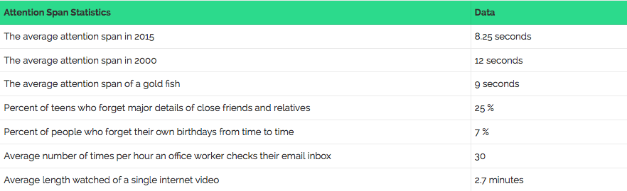
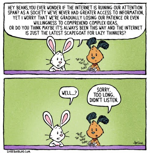
If you can reduce the amount of required fields you need in order for users to sign up, try it in a test. The thing about people these days is that we have a lower attention span than a goldfish (As of 2015 research, we have 8.25 seconds attention span, and a goldfish has a full 9 seconds).
In that same research, statistics show that only about 28% of words are read on a page with over 593 words, but 49% of words are read on a page of 111 words. Just to put this into perspective, 593 words is longer than the amount of words in Taylor Swift’s song, Shake It Off, and 111 words is the first verse and chorus of that song.
This means we want to keep our registration page with a minimal amount of words, and a low amount of fields because we want people to:
a. Stay attentive for long enough to register.
b. Feel assured it will end quickly and easily!
This is important to test and not just change on your registration page as it is dependent on your target audience. There have been businesses who have found that when you actually increase the amount of fields you get less registrations, but those who do sign up are more likely to become paying customers. So test and see how your audience responds, checking both registrations and final conversions.
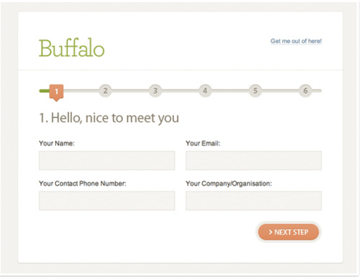
If you find that you need to add more fields, and you cannot make it short and sweet – consider splitting your registration page into easy, simple steps over a few pages and keeping a progress bar so that users always know where they are in the process and how close they are to the finish line! (aka completing the purchase you oh-so-want them to make). If you do decide to test this, we recommend you set up event tracking on each button to track the progress of users through the steps. If there is a drop on a certain step – work on optimizing that page!
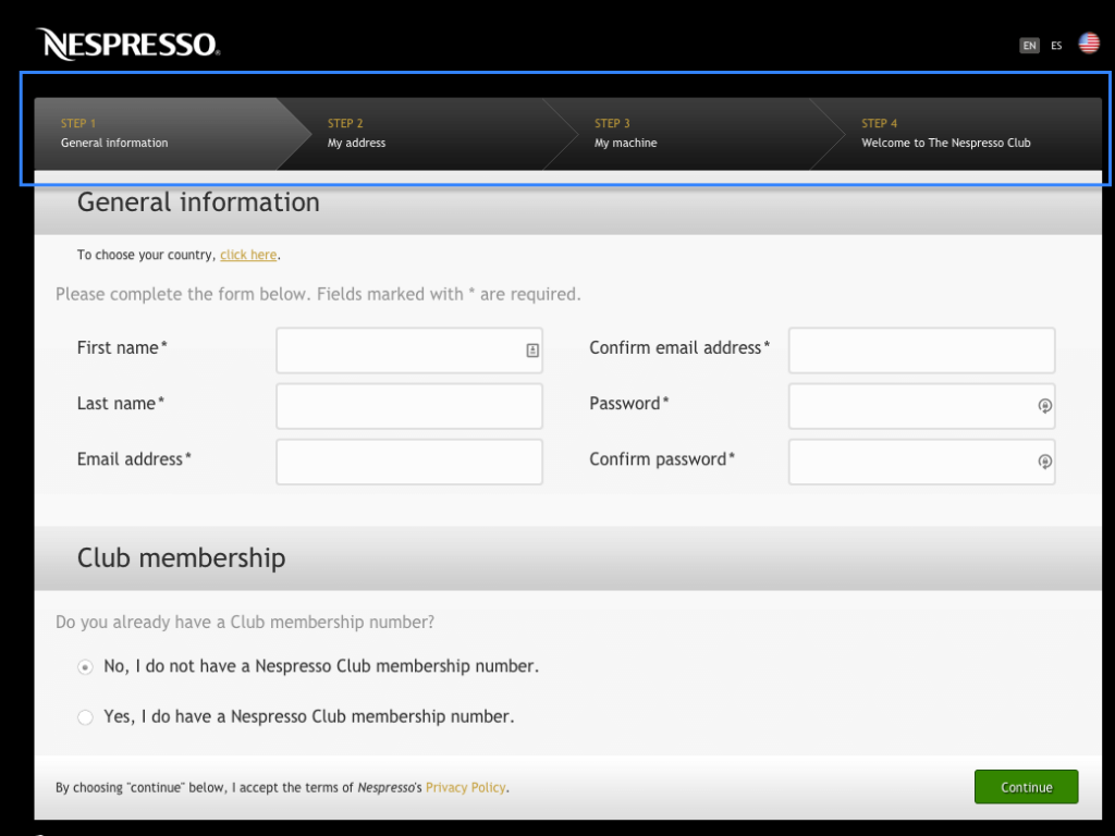
Nespresso wants a lot of information when you sign up, but they have a sleek progress bar at the top to tell you how far along you are!
2. Keep It Clean
When you want someone to do something on your page, you want to make sure they do only that and have no distractions. You want to make it clear that this is what you want them to do. It’s a simple website optimization technique – take away all distractors. As we saw before, data shows that many internet users do not have a strong attention span. That not only relates to time but also- oh look! A cute puppy and baby youtube video!….You get my point. Therefore, you want the least amount of distractors on your page so that people focus on doing what you want them to do: register.
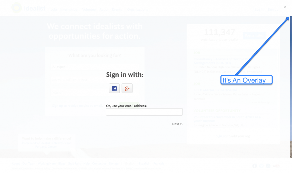
Idealist.org does this by – when you hit “Sign Up” they bring up a light box that shades the entire page, leaving you with simple directions
Another tip to help focus your user is using an image that directs attention to the Call to Action you want them to click on or form you want them to fill out.
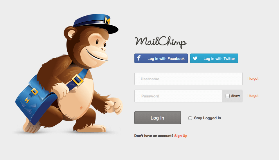
Mailchimp uses their mascot to help point you to exactly where they want you – registration!
3. Personalize It
Part of registering for your site involves trust. The user needs to trust that:
-
You will not give out their private information.
-
You will not bombard them with emails that are not interesting to them.
-
Signing up will give them value.
-
You are a trustworthy and honest person and they want to join your community.
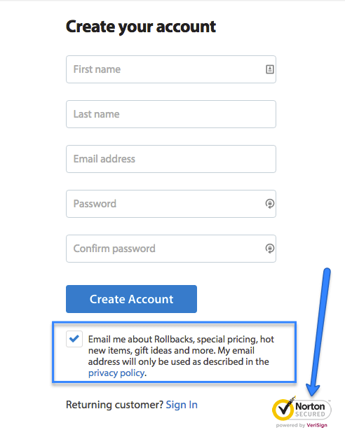
You can use geo-location to personalize a site, meaning you show the user that you know where they are. This can appear in many ways. You can make a site in their language. You can put the currency of a product to their local currency. You can give a local phone number for support, or offer free shipping! All of these will help users want to register more!
When a company sees your IP and sees you’re international, letting you know they ship to you can really help!
4. Make It Easy
If you can spare your users the time to fill out the form, do so. For example, if you need an address, perhaps ask for a Zip Code – and then City and State are all filled out! Or use a drop down menu that guesses the completed outcome, so that people can stop typing early.
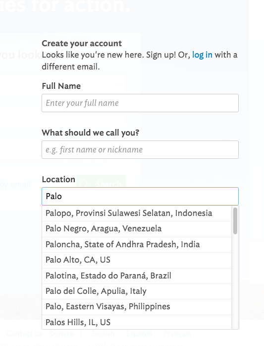
Idealist.org provides a drop down menu that completes city, state, and country, making entering your location extra easy!
5. Guide Your Audience
Nothing is more annoying than being told you are wrong about something when you didn’t have all the facts in the first place. You should be clear about what you want your user to do. If you write just “Username” and “Password” within the fields but the Password needs to be 7 characters long and include numbers and a capital letter, you’re going to need to tell the users about it, before they get that error message. There are different ways to do this. You can write it into the form field (showing them what you want them to do) or with small text or a question mark by the field.
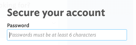
Here you see the example of writing the guidelines into the form field
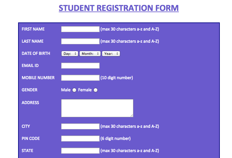
This Student Registration form writes their guidelines outside the fields in small text.
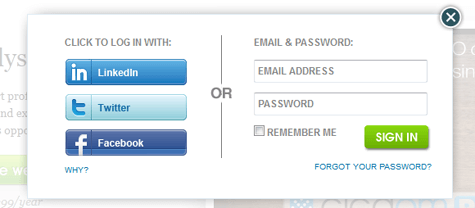
6. Social Sign Ups
The Big Dilemma. We discuss in our articles on CTAs and conversion optimization and how important it is to have just one call to action. But then there are Social Sign Ups, and if you offer the Facebook login, do you offer a Google +Login? and then you have two Calls to Action! But if someone doesn’t have a social login, or they prefer not to connect to their social profiles, do you also provide an email login as well?
Well, in this case we would start with considering your product. What information would be most useful for you? Are you providing a newsletter, in which case you’ll want an email? Or are you capable of providing notifications, etc on social profiles?
Next, if you found that you prefer collecting data and connecting with users via their social profiles, we would recommend researching your target audience. If your target audience is young and tends to connect with social media, consider putting only one social login option. If you have a range of audiences, consider placing on large call to action, and other options as text links below. Or if you want to put all three, which we considered doing, you can do so but give them equal priority so people can choose what they are interested in most.
7. Something Special For Mobile
Statistics from 2015 research show that Mobile Internet Surfing time is now passed desktop and other mediums, mobile at 51% compared to desktop at 42%. This shows you how crucial it is to be able to access your site from mobile. But the mobile experience is very different from the laptop experience. It is touch screen, the screen is smaller, and the loading time can differ. Therefore, you should make sure you have a separate registration form specifically fit for mobile.
Mobile Registration with Email Login
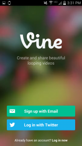
Vine chose to break it down into two steps – giving you the option to sign up with email or social login, but giving them equal importance
8. Use Helpful Validation
Validation means when you make sure that your user has filled something out correctly, and if not, they get an error message. Error messages show up when someone forgets to fill something out, or they didn’t follow the directions correctly, or their phone number was entered in the wrong format and they get a message saying “Hey! Correct this!” This is the aspect of the registration process that a lot of us don’t think through but there are good ways to validate and there are not as good of ways. You can also have your registration page validate while an individual types it in to the box, or when the person hits the “submit” button. We recommend you think this out and match it to your page – whether you have a pop up alert, or small red letters near the appropriate field.
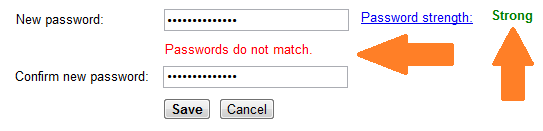
They tell you exactly what is wrong and where.
My favorite registration process is by Prezi and I’ll tell you why.
First of all, when you put in information, Prezi have these exclamations in green that interact with you and cheer you on. I wanted to fill out more info just so I could see what was waiting for me! They also use conversational language like “So what do you do?” which feels like they are really just trying to get to know you. Lastly, they give options to connect with LinkedIn or Facebook in case you are interested, but use text links so as not to give more than one call to action.
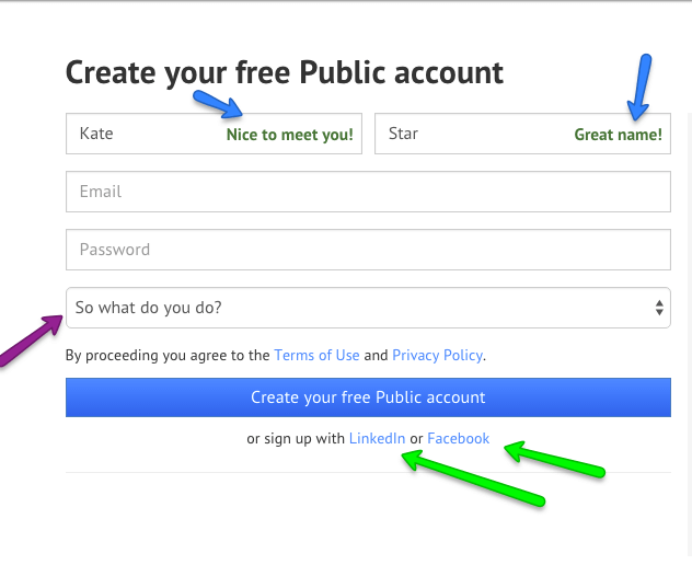
They use humor in their little exclamations, like “You’re on a roll!” which made me smile while going through the process as well – I won’t tell you all the text so that if you ever go through it, you’ll enjoy the surprises. But that’s not all – they have very clear Validation messages as well:
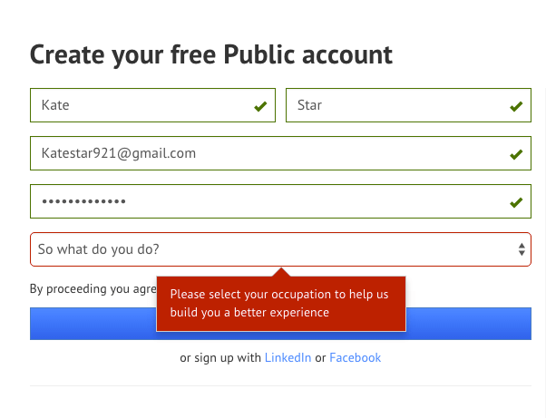
They show you what you got right with the green arrows and the green outline, and they show you what you’re missing with both a red line and an explanation. They keep true to their straightforward style by explaining to you why they want you to fill out that field – to give you a better experience! It feels personal and motivating.
The Registration page is that page in the process where a user decides whether they are sticking with you and want to get that added value, or not. So make sure that, from the homepage, your users know what they’re getting. Use these tips to make the registration easy, straightforward, and filled with the energy you want your users to feel!
And now, the moment you’ve all been waiting for…(*drumroll please*)… The Piktochart Registration Test results!
Original:
Variation:
We designed a page that had less text above the fold, emphasized email more so than social log ins by moving them under the email registration, and kept the energy going from the previous page through the registration process with the bright colors, the fun mascots, and the big bright button. We kept the social proof (testimonials and relevant numbers) on the page below the fold for the information seekers who still weren’t sure.
We tried two different variations actually – one with the social logins below the email sign in, and one with the social logins beside the email registration – for equal focus.
Variation 3
Overall, these pages increased registration conversions by 14%!
What does your registration page look like and do you have your own registration best practices?


Pingback: Weekly roundup: best CRO posts of the week - ChangeAgain - A/B experiments simple like a web-surfing()
Pingback: This Week in Internet Marketing 2015 10 27 | Rise to the Top Blog()
Pingback: Weekly roundup: don't miss these posts about CRO()
Pingback: 6 Ways to Opitmize Your Online Registration Process | SaaS.Community()