Mobile Checkout Optimization: 12 Steps to Success
Earlier this year we discussed the importance of creating a mobile optimization strategy rather than just going responsive. Though responsive design is better than having your visitors pinch and zoom, assuming that consumers use desktop devices the same way they use mobile devices is fundamentally wrong. Consumers use their mobile devices for connectivity and quick content. In fact, 60% of local searches now originate from smartphones (Bizreport).
The bottom line: People use devices differently which means we HAVE to build different user journeys.
People need a better way to consume and experience mobile content, but many mobile experiences are still lagging far behind. Check out these 42 mobile landing page optimization tips to create better landing pages for your mobile visitors and continue reading this article to create better checkout flows for your mobile shoppers.
Mobile Checkout Metrics to Follow
To optimize your mobile checkout flow first identify your mobile visitor’s behavior.
- How much mobile traffic do you actually have? Start by identifying the amount of traffic you have on each device. How much percentage does mobile account for?

-
What devices do they use?
-
Which pages to they visit? Another important element is identifying the most viewed pages. This will help in both identifying the path mobile visitors take and most importantly saving you money. Instead of optimizing the entire funnel and spending a lot of money, you can optimize specific pages within the funnel that require your attention.
-
Where is the biggest drop in the funnel? Many times you’ll find that mobile visitors actually dropout much earlier in the process than the checkout. Once you’ve identified those tricky pages you’ll be able to optimize those before you reach the checkout funnel.
-
How many visitors complete a purchase on mobile? The most important number – what percentage of mobile visitors actually complete a purchase? This number will help us define goals and monitor our success.
12 Mobile Checkout Elements you Should Optimize
The most important elements of the mobile checkout optimization process aren’t just about the look and feel, but also the development and the emotional triggers. Below is a list of 14 mobile checkout optimization tips you can follow to optimize your mobile revenues:
1. Pinch & Zoom – More than 73% of consumers won’t return to a website if it doesn’t load properly on their mobile devices. Pinch and zoom is obviously off the table. Make sure your visitors do not see this type of checkout.
** Pro tip: Creating a mobile site from scratch can be expensive, and a responsive design probably won’t increase conversions. Use Banana-Splash to trigger personalized messages for mobile visitors and convert them in one touch.
2. Simplicity – Though 60% of local searches now originate from smartphones and tablets, this is not the case for checkouts (bizreport). People still fear mobile checkouts and do not feel safe using them which is why creating a simple, easy to use mobile checkout is crucial for higher conversion rates:
- Remove distractions
- Make your call to action buttons stand out
- Create a shorter checkout flow
3. Speed – Another crucial part of conversion optimization in general and definitely in mobile. Here are few numbers to give you an idea of the importance in reducing page load time and increasing site speed:
- In 2006 Amazon was already reporting a 1% loss in revenue per 100ms site load delay.
- 1 second delay in page load time leads to: 11% fewer page views, 16% decrease in customer satisfaction, 7% loss in conversions (aberdeen)
- 60% of web users say they expect a site to load on their mobile phone in 3 seconds or less. (Compuware)
Paste your website link in here and get some valuable tips on how to speed up your desktop and mobile site.
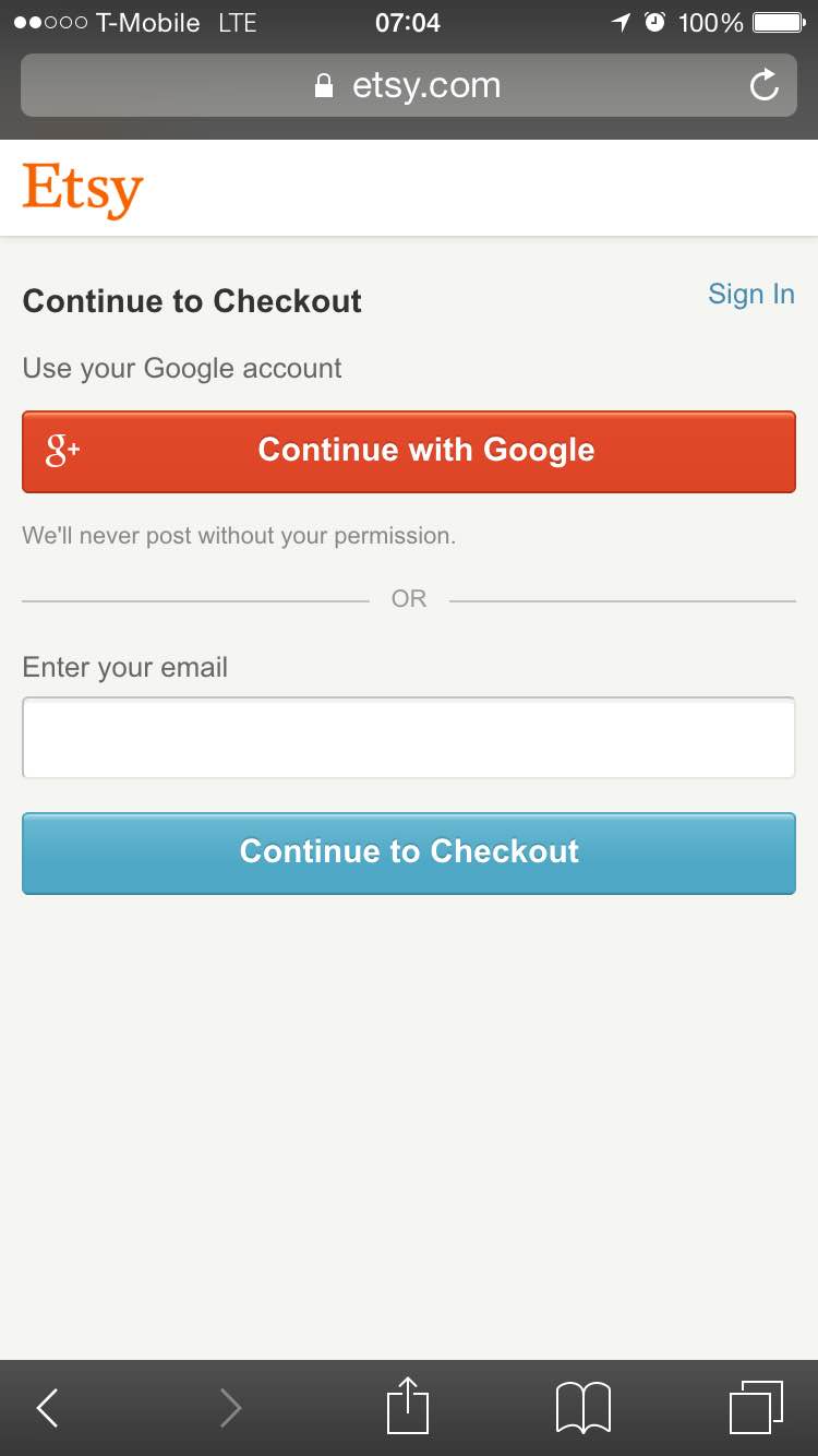
4. Registration – Probably the most debated question on desktop and mobile, requiring registration before a purchase, has it’s advantages and disadvantages. On one hand, by capturing your customer’s information you’ll be able to retarget them, create a better shopping experience and increase revenues in the long run (if you’re good at retention). On the other hand, registration creates a longer funnel that slows your customers down on the way to payment. Though you really want to register people before they checkout it could cause a large drop in your conversion rates. So, give users the opportunity to checkout without creating an account. If you simply cannot go without, try registering people with their facebook or Google accounts (Etsy example below), allowing them to click on one button and swiftly continue with their purchase.
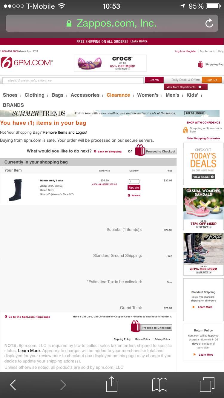
5. Form fields and registration- During your checkout and registration process make sure you add vital fields only. As opposed to desktop in which most websites have both vital and non-vital fields showing, on mobile have only the most imperative fields to reduce noise and clutter. Don’t forget to disable autocorrect on certain fields (like addresses) and make sure your keyboards are field sensitive, for example when visitors are required to fill in their number they should get a numeric keyboard. The less information people need to fill in on mobile the more likely they are to convert. You can also break the process into a few short steps allowing it feel cleaner and easier. Essentially, it’s this:


6. Trust – Unfortunately most shoppers do not feel safe shopping on mobile web yet which is why your checkout page should include some social proof. The most common social proof techniques use trust icons, testimonials or reviews. In the example below the company made use of trust icons to ensure shoppers they can safely checkout on this site.

Dribble
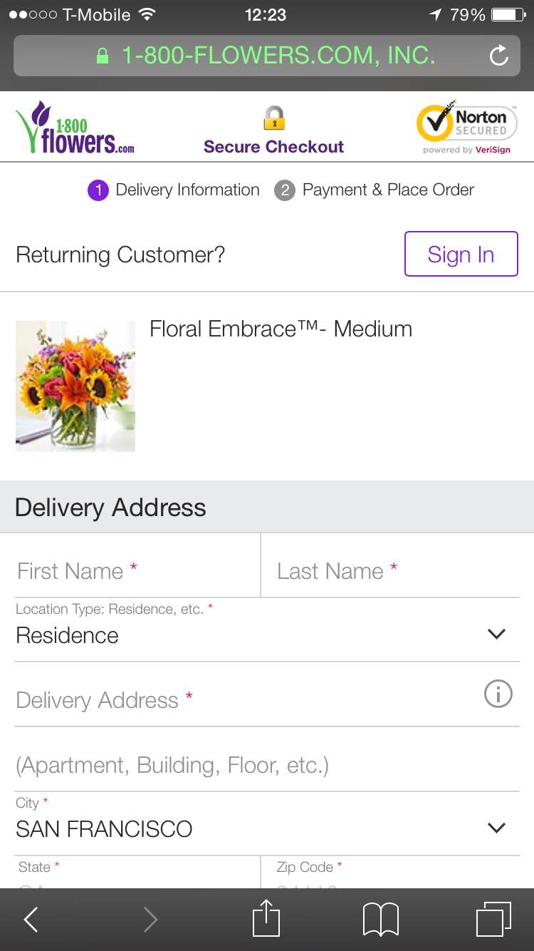
1800Flowers also uses the Norton Secured and Secure Checkout trust icons on the top of the checkout page:
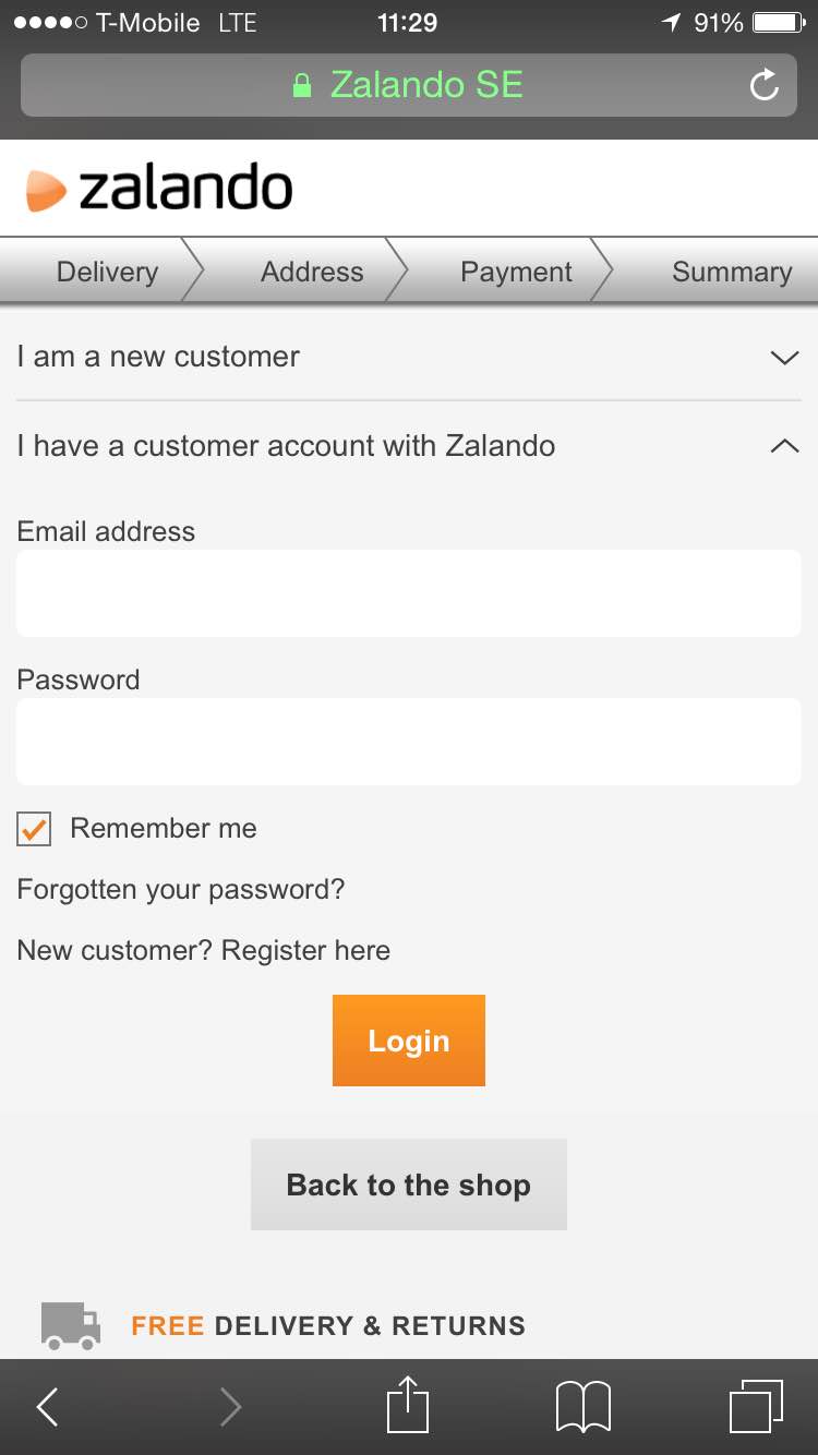
7. Showing Progress – Similar to the web experience, people like to feel their progress and know their journey upfront. Most visitors do not have the patience to complete a long checkout process and need an indication within the funnel showing them how far they have to go. Zalando uses a progress bar to show the user there are 4 steps within the checkout funnel.
8. Remove distractions – Online shoppers have a low attention span and get distracted easily. To reduce distractions and keep our customers shopping you must reduce the amount of links, banners and any other data that isn’t relevant in the shopping experience. All links such as help, shipping information and sales should open in a new window, and all information should be easily displayed above the fold so shoppers do not need to scroll in order to complete an action.
9. Checkout Access – Make sure people can enter their shopping bag and the checkout area easily from any page to complete their purchase quickly. While visitors browse items and add them to their cart, a good way to help them complete their purchase is by triggering a pop up that directs them to immediate checkout or ask them if they want to continue shopping.
10. Auto detect data – 62% of US online adults expect a mobile-friendly website and 23% expect their mobile experience to change based on location, according to Forrester’s US Mobile Mind Shift Online Survey. Prepopulate data into your forms and reduce the amount of action visitors must take to convert. Information such as the visitor’s state and city can be populated by simply getting visitors to fill in the zipcode field first.

11. Payment options – Giving customers the option to checkout in a few different ways will increase your conversion rates and social proof. By displaying logos such as checkout with Paypal or Amazon you increase trust as you are partnering with these well known brands and also allow your customers to checkout in their preferred way.
12. Quick Contact – During the mobile purchase customer may have questions or uncertainties. Fortunately one of the best features you can make use of within mobile is “Click to call” – allowing customers to instantly call you and ask their questions. If you have someone who can answer the phones and help your customers out, don’t miss out on this feature. If you do not have a person who can stand by the phones, a simple chat plugin can go a long way. In fact, 44% of respondents said that having a live person answer their questions while they were in the middle of an online purchase was one of the most important features a website could offer. Apple also offers a chat solution for its shoppers:

Taking the next step
There are many quick and simple tips for mobile checkout optimization. The most important element of mobile optimization is to constantly measure and test your results. As mobile traffic and search continues to grow, it is imperative to have a conversion optimization strategy that will allow you to grow and expand your mobile revenues.
More on mobile optimization:


Pingback: Newsletter #127 - The Net Promoter Score Edition - ShivarWeb()
Pingback: How Your E-Commerce Business Can Succeed This Holiday Season()
Pingback: 9 Tips for Optimizing your Mobile Landing Page | SessionCam()