Conversations on whether to build a responsive site or create dedicated landing pages are everywhere right now. Mobile traffic is rising and while marketers are trying to figure out which is the best way to address and test mobile visitors there are a few interesting statistics that can help path the way to higher mobile conversion.
One of our clients has been running a million dollar mobile campaign for over 2 years with a 0.79% conversion rate to purchase. The client was doing the same as the majority of companies are doing today – Using a responsive site to convert mobile Visitors into Customers.
Next week we will be publishing our complete guide to mobile conversion optimization. The guide will contain all the basics of conversion optimization, extremely important statistics on mobile purchase and a step-by-step plan to mobile conversion optimization.
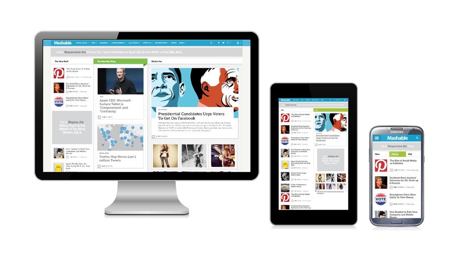
Until then, in this post I want to focus on mobile optimization strategies and their content. The common discussion around mobile web optimization is whether to create a responsive site or dedicated landing pages. The majority of sites today build their websites to be responsive, meaning they adapt their existing desktop version to a mobile and tablet version as you can see in the Mashable example below. A responsive design means your website basically recognizes the device your visitors are using and adapts itself to the right screen size so people can view the exact same content in a better resolution.
By far this is the most common way websites deal with mobile traffic today and it is problematic (to say the least) if you’re trying to convert people with it.
Understanding Mobile Visitors
 On average consumers use 2.6 devices to convert online (millwardbrown). This means that each device, whether desktop, tablet or mobile is used for a different purpose and we use at least 2 of them before actually converting. This statistic shows us that we use difference devices for different purposes and that we need to create different journeys for each device and design them to suit the user’s purpose. We don’t use desktop the same way we use a mobile device and more importantly, we use each device for a different reason. The key to mobile conversion is understanding what your users are looking for on each device, what your visitors need from your mobile site and what they need on your desktop site – it’s not the same.
Late last year we covered 7 important mobile statistics you should know about to increase mobile conversion. One of the most interesting numbers presented there was the fact that 40% of your audience will leave your site if it isn’t mobile compatible. In order to address this threat, you don’t have to turn your entire site into a mobile one, you need to find the specific pages your mobile visitors get to and optimize them.
Having a responsive site can be interesting for news sites and others that don’t have an actual call to action, but if you want to convert your mobile traffic and get them to complete a funnel, a responsive design will not help.
Case Study
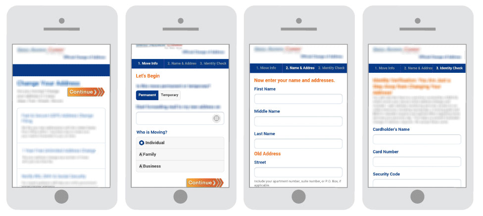
About a month ago we finished the first round of tests on the mobile website I mentioned earlier. While their main desktop landing page was converting very well, the mobile site was doing poorly. The purpose of the mobile site was to get people to sign up for the client’s service and pay online for it. Their desktop homepage was responsive and although they removed the main image from the mobile landing page, their mobile version had the exact same form as their desktop version.
Following our research we understood that as opposed to the desktop site in which people spent much longer time getting to know the service and checking out different pages, on mobile, the visitors who were converting did so on the first try and did not visit many pages. The majority of people were “leaking” in the form part and didn’t make it to the second stage. We needed to create a quick and easier experience for mobile visitors.
The original mobile site contained a 5 step process, requesting ongoing information from the users. Each completed step sent the user to the next page with additional form filling requirements.
Mobile optimization process
Once we understood the clients mobile visitors better we took a longer look at a few important metrics:
-
Bounce rate
-
Mobile device report
-
Funnel visualization
-
Site speed report
-
Keyword report
Each one of these metrics gave us a clearer insight to user behavior, leaks in the funnel and technical issues we can address that will increase conversion immediately. By understanding which pages visitors were using, what devices they are using, the load time and what people are actually looking for when they arrive on the site we were able to personalize the entire process.
7 mobile optimization steps:
-
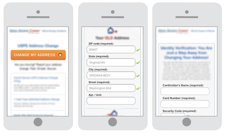
Call to action – The call to action button was moved to a more prominent area, highlighted and was made more dominant as oppose to the original which was placed around a lot of text and said “continue”.
-
Reducing amount of pages – From a 5 page process we moved to a 3 page process with easier navigation. The field validation was simpler making it easier on users to complete the form.
-
Reducing form requirements – Reducing the amount of form requirements and keeping it at a minimum. The majority of visitors worldwide leave a website when they’re asked to fill out a form, by reducing the amount of fields more people completed the form.
-
Localization – By moving the zip code field to a higher place in the form, we were able to automatically fill in their address and reduce the amount of input visitors needed to fill in. Once a client entered their zip code, the rest of the address information was filled quickly enough.
-
Content – The content itself was optimized, offering the most valuable information on top and rearranging it according to its importance.
-
Expandable form – The form itself was redesigned so that only once you completed the first field would the next open up. This helped reduce friction and get people to complete the funnel quicker.
-
Technical fixes – The site required a few technical fixes that helped increase their conversion rate dramatically. After fixing the Google Analytics goals and locating the technical issues, such as specific browser compatibility issues, load time and others additional people were completing the funnel.
The results
The test ran for 2 weeks and had 100,000 experiment sessions. Divided between the original mobile page and the new variation,the original variation had a 0.79% conversion rate to purchase, while the new variation increased conversion rate to 4.62%. This meant that the company was now making 6 times the revenue it was making a month before.
So what’s better?
Every site is different. Each website has its own goals and audience and needs to adapt their mobile landing pages to suit their customers goals.
42% of marketers say that analyzing test results is the hardest part of conversion optimization. This statistic emphasizes the importance of testing strategies and not elements. Understanding why a test worked and having a clear goal for each test is crucial for being able to scale and continue testing. Testing elements leaves you with small incremental changes that are hard to learn from, while strategies giving your greater understanding of your audience and what they’re looking for. Remember, you have less than 2.6 seconds to convince people to convert. Understanding what your visitors need and want emotionally will help you create the right experience for your audience and increase your conversion rate dramatically.
What is your mobile strategy?
Is your site responsive, or do you have stand alone designs for your mobile traffic?
Responsive Design is NOT a Mobile Optimization Strategy 4.35/5 (87.00%) 20 votes
Related Posts


Responsive Design is NOT a Mobile Optimization Strategy
Conversations on whether to build a responsive site or create dedicated landing pages are everywhere right now. Mobile traffic is rising and while marketers are trying to figure out which is the best way to address and test mobile visitors there are a few interesting statistics that can help path the way to higher mobile conversion.
One of our clients has been running a million dollar mobile campaign for over 2 years with a 0.79% conversion rate to purchase. The client was doing the same as the majority of companies are doing today – Using a responsive site to convert mobile Visitors into Customers.
Next week we will be publishing our complete guide to mobile conversion optimization. The guide will contain all the basics of conversion optimization, extremely important statistics on mobile purchase and a step-by-step plan to mobile conversion optimization.
Until then, in this post I want to focus on mobile optimization strategies and their content. The common discussion around mobile web optimization is whether to create a responsive site or dedicated landing pages. The majority of sites today build their websites to be responsive, meaning they adapt their existing desktop version to a mobile and tablet version as you can see in the Mashable example below. A responsive design means your website basically recognizes the device your visitors are using and adapts itself to the right screen size so people can view the exact same content in a better resolution.
By far this is the most common way websites deal with mobile traffic today and it is problematic (to say the least) if you’re trying to convert people with it.
Understanding Mobile Visitors
Late last year we covered 7 important mobile statistics you should know about to increase mobile conversion. One of the most interesting numbers presented there was the fact that 40% of your audience will leave your site if it isn’t mobile compatible. In order to address this threat, you don’t have to turn your entire site into a mobile one, you need to find the specific pages your mobile visitors get to and optimize them.
Having a responsive site can be interesting for news sites and others that don’t have an actual call to action, but if you want to convert your mobile traffic and get them to complete a funnel, a responsive design will not help.
Case Study
About a month ago we finished the first round of tests on the mobile website I mentioned earlier. While their main desktop landing page was converting very well, the mobile site was doing poorly. The purpose of the mobile site was to get people to sign up for the client’s service and pay online for it. Their desktop homepage was responsive and although they removed the main image from the mobile landing page, their mobile version had the exact same form as their desktop version.
Following our research we understood that as opposed to the desktop site in which people spent much longer time getting to know the service and checking out different pages, on mobile, the visitors who were converting did so on the first try and did not visit many pages. The majority of people were “leaking” in the form part and didn’t make it to the second stage. We needed to create a quick and easier experience for mobile visitors.
The original mobile site contained a 5 step process, requesting ongoing information from the users. Each completed step sent the user to the next page with additional form filling requirements.
Mobile optimization process
Once we understood the clients mobile visitors better we took a longer look at a few important metrics:
Bounce rate
Mobile device report
Funnel visualization
Site speed report
Keyword report
Each one of these metrics gave us a clearer insight to user behavior, leaks in the funnel and technical issues we can address that will increase conversion immediately. By understanding which pages visitors were using, what devices they are using, the load time and what people are actually looking for when they arrive on the site we were able to personalize the entire process.
7 mobile optimization steps:
Call to action – The call to action button was moved to a more prominent area, highlighted and was made more dominant as oppose to the original which was placed around a lot of text and said “continue”.
Reducing amount of pages – From a 5 page process we moved to a 3 page process with easier navigation. The field validation was simpler making it easier on users to complete the form.
Reducing form requirements – Reducing the amount of form requirements and keeping it at a minimum. The majority of visitors worldwide leave a website when they’re asked to fill out a form, by reducing the amount of fields more people completed the form.
Localization – By moving the zip code field to a higher place in the form, we were able to automatically fill in their address and reduce the amount of input visitors needed to fill in. Once a client entered their zip code, the rest of the address information was filled quickly enough.
Content – The content itself was optimized, offering the most valuable information on top and rearranging it according to its importance.
Expandable form – The form itself was redesigned so that only once you completed the first field would the next open up. This helped reduce friction and get people to complete the funnel quicker.
Technical fixes – The site required a few technical fixes that helped increase their conversion rate dramatically. After fixing the Google Analytics goals and locating the technical issues, such as specific browser compatibility issues, load time and others additional people were completing the funnel.
The results
The test ran for 2 weeks and had 100,000 experiment sessions. Divided between the original mobile page and the new variation,the original variation had a 0.79% conversion rate to purchase, while the new variation increased conversion rate to 4.62%. This meant that the company was now making 6 times the revenue it was making a month before.
So what’s better?
Every site is different. Each website has its own goals and audience and needs to adapt their mobile landing pages to suit their customers goals.
42% of marketers say that analyzing test results is the hardest part of conversion optimization. This statistic emphasizes the importance of testing strategies and not elements. Understanding why a test worked and having a clear goal for each test is crucial for being able to scale and continue testing. Testing elements leaves you with small incremental changes that are hard to learn from, while strategies giving your greater understanding of your audience and what they’re looking for. Remember, you have less than 2.6 seconds to convince people to convert. Understanding what your visitors need and want emotionally will help you create the right experience for your audience and increase your conversion rate dramatically.
What is your mobile strategy?
Is your site responsive, or do you have stand alone designs for your mobile traffic?
Related Posts
Tags: