10 Landing Page Examples to Increase Sales
10 Instructive Landing Page Examples – What to do and What not to do

After positive feedback from our prior critiques, we took submissions from our readers on Inbound, Reddit, and Growthackers to be featured here.
There were a lot of submissions, but we went with the posts that cover the broadest spectrum of landing page learning. You’ll find that some of the pages critiqued below are really excellent, and we want to show that! On the other hand, we’ve had to put on our Simon Cowell hat for some other pages, as a few really need our help.
1. Orobind
Orobind helps Indian clients discover and engage with personal trainers in their area.
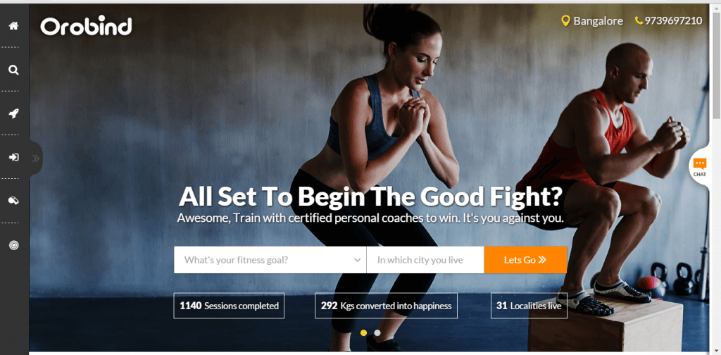
Show them their best selves
People want to know “what’s in it for me” when they arrive at your site. Orobind does a great job here. It doesn’t simply offer a list of the features of the product, but it shows the users how the product will impact his life.
Looking at the image, the user is impacted. She sees what could happen to her in a few days or weeks if she decides to sign up. The target audience is comprised of affluent Indians and this message really lets them see themselves as their best selves with this product.
There’s no better way to reach a customer than allowing him to see who he wants to be, and then showing him the path to get there.
Eliminate friction, don’t create it
Things naturally flow in the path of least resistance. If you make your funnel easy to navigate through, more people will flow. If there’s excess friction, fewer people will flow through.
The call to action here is to input a fitness goal. However, this might be a lot of excess friction without a good enough reason. A lot of people might not even know their goals. People often respond better when they have more direction. It’s worth testing taking this part of the call to action out the landing page to see if they’ll be more likely to continue. Another test possibility would be for this part to be a simple drop-down menu that they need to choose from.
Don’t make your users make hard decisions before they become customers. Show them how easy your product is to use.
Social and trust icons
People like to know that they’re getting a trustworthy product. The place they’ve addressed this concern in the page is below the call to action where it says the number of sessions completed, etc.
One often-successful alternative or addition is social icons. Having social icons and shares means other people really like the product. People can visit Orobind’s facebook page and hear from people in their area that it’s a good service.
Another great alternative worth testing is trust icons. Oftentimes people think these are reserved for securing financial information, but that’s not true! Are the personal trainers certified in anything? Probably. Then why not slap the logos of their certifications on the homepage. It will give a lot of legitimacy to the product.
2. TweetDis
TweetDis is a plugin that makes in-line text easily tweetable by a website’s readers.
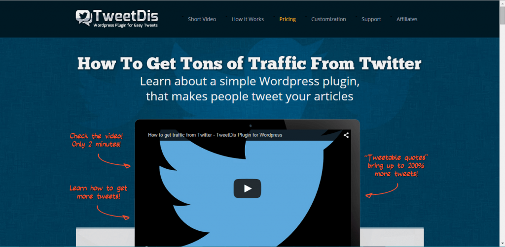
So what do you want them to really do?
When making a landing page, you have to make it crystal clear to the user what you want her to do. Even if all of the words were suddenly blurred out on the page, it should still be obvious that he needs to click here or there. (Here’s a cool app that lets you see pages as if you are under the influence…)
This page does an incredible job at that. If the words were blurred out, I’d know that this page had something to do with a Twitter service and that I should watch the video. Notice how the colors aren’t too crowded, the video is huge and right in the center of the screen, and there are literally arrows pointing right at it.
However, the goal of this landing page (as told to us by the owner) is not to watch the video, but to install the plugin. The user has to scroll down to be able to see the real call to action, which is something we rarely advise. The only reason you should do this is you have rigorously tested this hypothesis and it is successful.
If that’s the case, this is fine. Maybe people are more likely to download the plugin after they’ve watched the video. Then this setup definitely makes sense.
I don’t know which way is better, and the only way to find out is to test. It’s easy to set up event tracking to know if downloads usually follow video views, or if they are more unrelated. If this were our page, we’d run this test with the Google Tag Manager.
Length – they’re looking for a product, not you
Text on a landing page is different from text elsewhere. It needs to be easily digestible – that means short, to the point, organized, and visually pleasing.
Depending on the page, people have arrived from a variety of different types of marketing campaigns, and aren’t necessarily looking for YOUR website. They’re looking for a product or service.
It’s important that you recognize what they’re here for, and show them quickly that you can provide just that. Otherwise, they might go off to one of the other tabs they’ve opened.
It’s difficult to see below the fold, but this page has a lot of text. A lot of text isn’t necessarily a bad thing, but it’s probably worth A/B testing this page vs. a shorter version with only the key points.
3. WPD
WPD helps WordPress users find the right plugin for their sites.
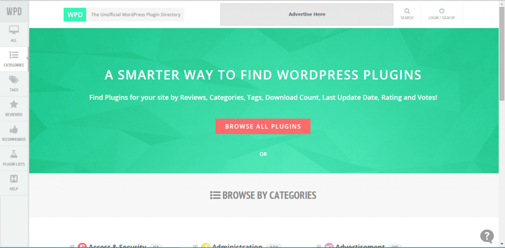
Be Clear
As someone who uses a host of WordPress plugins, I’ve been sold on this website by doing this landing page critique. For me, it was just so obvious from the start that this product is one that I want to personally use.
Oftentimes I have to find solutions to problems on my clients’ WordPress sites. I find myself scouring different websites, reviews, and the WordPress plugin search for what I need. And three quarters of the time I don’t even find what I’m looking for.
Enter WPD. This is a company that understands its target audience and speaks its language. It tells me exactly what it does (helps users find plugins). Read the headline – maybe the strongest part is how it hints at what they’ve been doing wrong without being too explicit. Notice how it encourages them to be “smarter” instead of saying they’ve have been dumb all along.
The call to action is also very clear. Not only that, but it is right in the center of the screen and the color contrasts well with the rest of the page to make it stand out more than anything else on the screen.
Forget your opinions
Even though I like it personally, it’s important to realize that all of our ideas about our websites are just opinions until proven true. As optimizers we want to be sure that the option we use is the best one. One option for improvement is to put a search bar here to see if users prefer to search right off the bat as opposed to clicking the button. This would save the users a click by letting them start the process immediately, and it’s the first thing I would test if this was my site.
Another thing I would test is changing the structure of the buttons on the left. For me, it goes against the grain of simplicity on the rest of the page. One idea for testing is to make these buttons only show when the user’s mouse scrolls to that area.
The final item I would test is the size and fit of background. Now it doesn’t cover the whole screen, making room for the “categories” header below. On one hand, it’s nice to show that users can browse by categories – this is along the same lines as my suggestion to test a search bar. But on the other hand, the page would have a smoother field if the green reached all the way to the bottom of the screen. Which would get more conversions? There’s only one way to find out.
4. Natura Petz
Natura Petz makes organic pet supplements.
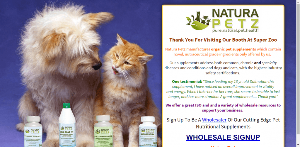
Every Page has a purpose
This is a unique landing page in that it is targeting a very specific group – wholesalers who have visited the company’s booth at Super Zoo. As a result, the page needs to be extra targeted in its messaging, but still true to the principles of conversion optimization.
“Thank you for visiting our booth…” is a powerful title. It immediately establishes the connection to the user and brings him back to the day at Super Zoo when he was at peak interest in the product. Thinking about in what setting the user might have been most interested in your product, and then playing towards that setting can be an important tool.
That said, the overall messaging might want to be geared more towards wholesalers. Look at the testimonial – it appears like it’s for pet owners. The wholesalers might have different goals and concerns from the pet owners.
The first test I would run here would be to gear the text much more in this direction. Many of them might just want to make money, and not really care about the pets themselves. Maybe a quote like “becoming a wholesaler of Natura Petz is the best thing that happened to my business in years” would sell better than the current one, but maybe not. I’d be interested in finding out via an AB test.
A little design goes a long way
Clearly the site owners used a professional designer to make this landing page. The animals, bottles, and colors all look great.
However, the calls to action are merely text with a hyperlink. One that would really capture the eye would be a true button. A testing idea for button placement is right below the animals heads, since the cat is already looking in that direction, drawing attention there.
Don’t let your designers off easy. Have them design everything in a visually appealing way. If it looks like you could have typed out the words yourself, that’s not enough!
Related to this, there’s a lot of text in that white box and most users probably don’t have the time or attention span to read it all. There are a few ways to remedy this. Here are two to test out and see if they work:
-
First, the box could be better organized with titles and design like I mention above. A professional look implies a professional product.
-
Second, the testimonial could be moved out of that box to below the fold. It would open up a lot of space and make the rest of the words more clear.
5. AdSpike
Odoo has an algorithm that helps the user optimize her AdWords budget.
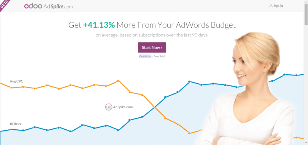
Imaging
This is a fantastic image. There’s plenty to highlight here, so listen up!
The most powerful part here is the woman looking directly at the call to action. All the attention is focused right on that button. Oftentimes when we have an image of one person, it’s good to have her focused on the call to action. Otherwise, it can be distracting. Here it’s so obvious what the user is supposed to do. Check out our post on landing pages for more details on imagery and placement.
Besides the woman, the rest of the background has a very clean look. There’s only one call to action, and even though there’s a lot of white space the page doesn’t appear to be empty. The first item I would test is getting rid of the orange line. Without reading the fine print, it’s tough for me to tell which line corresponds to what.
The next thing I would test is the size of the button. While we already established that it’s great, that doesn’t mean it can’t be optimized. With all that white space, I’d be curious to see what would happen if that button were doubled in size. This would be a really easy item to test with one of various tools online.
Highlighting statistics through color
I’m trying to be like Simon Cowell here, so it’s not easy for me to give all these compliments. That said, what nice use of coloring!
We’ve already covered topics such as the color of the button, and the use of fewer colors on the page rather than too many. So, by now you should be able to tell us how they’ve done a good job with these attributes here. Now I want to talk about the color of statistics.
It’s always a good idea to highlight positive statistics, mainly when you’re displaying one or two at a time, in stand-out bold colors. This creates a sense of anticipation in the user and, if done properly, lets him have a taste of the results to come.
This product is strictly an ROI oriented one; It is aimed to maximize the results from AdWords spending. As a result, the target audience is very money oriented. Adspike recognizes this and makes the statistic green, the color of money. Good work.
6. Odoo
Odoo also lets the user build a website from their online platform without the use of developers.
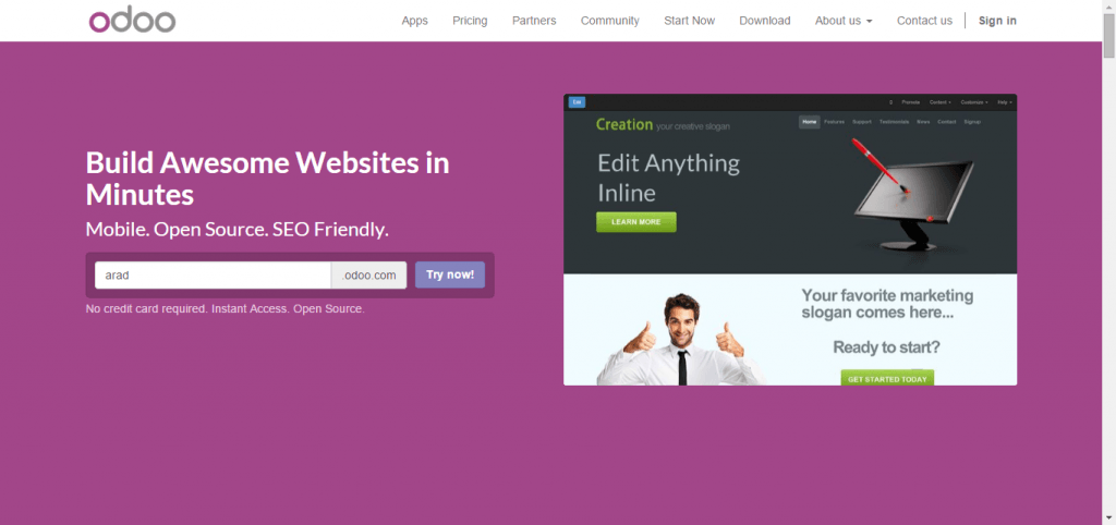
Continuing on color
This product is by the same company, Odoo. Clearly they have their color down. Purple signals creativity and that’s kept consistent throughout the page.
A website to fit the product
If you’re going to hire a content marketing company to help you with your content, wouldn’t you expect them to have stellar content marketing themselves? Of course you would. If you’re going to hire graphic designers to do some freelance work for you, wouldn’t you expect the designs on their page to be spectacular? Of course!
This is no different than buying website building software; you would expect the company you bought it from to have a really good website. To us, this website seems hastily put together, void of stand-out, convincing reasons to use the product.
First, the image is more of a placeholder than a reason to buy the product. Technically speaking it could better focus attention to the call to action. As illustrated in the AdSpike example above, there could be someone looking at the call to action, or as in the TweetDis example there could be arrows pointing to the call to action. There are lots of way to change the focus.
Also, this image needs to be inspiring. It’s a big project and commitment to build a website. It takes a lot of energy and inspiration. The image needs to fit this mold – it has to instill a sense of confidence and wonder in the user. Take a look at competitors Wix and Squarespace which have dramatic images.
Keywords
When choosing the copy for your title and subtitle, be very specific in your approach. One word can make or break your conversion. Oftentimes, there’s no way to know which copy works best until you test several different options.
On one hand, the title is powerful. It says what the user will do with this product – build websites in minutes. “Minutes” takes the users headaches and sets them at ease. Even if it’s a hassle to make your site, it will only be for a few minutes! Still, it couldn’t hurt to test different messaging. How about something that differentiates the product from competitors’? What’s the unique selling proposition?
Moving on, the subtitles can use some work. Does “mobile” mean that the user can only use this on mobile? Does “open source” mean he needs to be a developer to use this? One of the worst things one can do on a page like this is use developer keywords in a page meant for non-developers. How about testing subtitles like “No developers needed,” “drag and drop,” or “24/7 Support.”
While many keywords could describe a product, it’s important that you choose the ones that resonate with your target audience.
7. UP
UP is a crowdfunding platform that lets the user access different parts of the vast crowdfunding world.
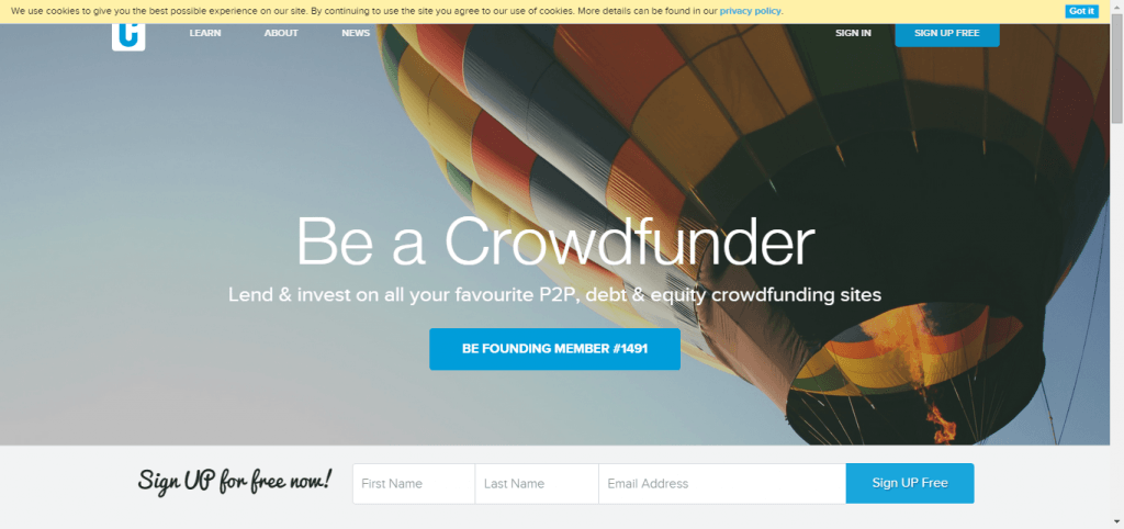
Click here
The landing page has one of the of the most powerful copies for a button that I’ve seen in a while. “Be founding member #1491” is personalized and lets people know that they’re not only signing up, but they’re a part of something. By nature, investors want to be “founding members” and this button reflects a deep understanding of the target audience. Think about what motivates your users and throw it on your button.
Cookie bar
Usually, we really like cookies. But in this case, the “cookie bar” is a killer. We see this all over the internet. Sometimes the cookie bar is on the bottom, sometimes on the top, sometimes in the corner. Some of our clients tell us that they like it there for business reasons and others are required to have it depending on their line of work. If you’re going to keep it there because you think it increases conversion, you better AB Test it!
Calls to action
There are three calls to actions above the fold; this causes analysis paralysis. One idea would be to test changing the floating form at the bottom so that it will only show after users scroll down. Another idea would be testing removing the “sign up for free” and the “got it” calls to action on the top right corner. Since these are the same color as the main call to action, they cannibalize some of the emphasis on the main call to action and degrade the overall strength of the page. Look at some of the examples above where the call to action has its own color – that is oftentimes the most powerful way to do it.
USP
The unique selling proposition is a little weak here. If you scroll down, you can see that there are all kinds of benefits that make this site better than other crowdfunding sites. However, the copy here doesn’t convey this message. Maybe run a few tests offering specifics of how this site is different from all other sites.
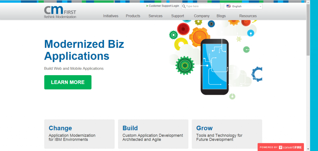
8. CM First
CM First transforms legacy business applications into modern mobile applications.
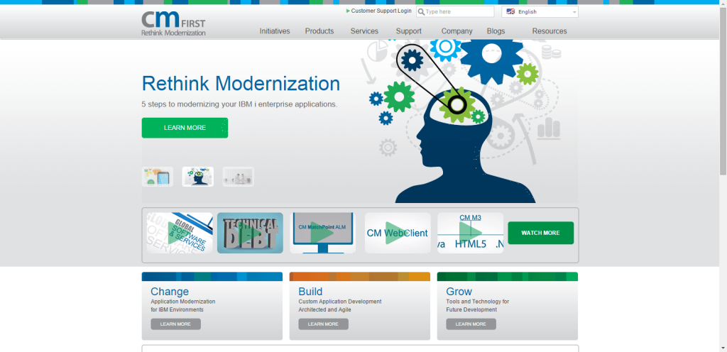
Where to begin
When I land on this page, there’s a lot going on! There’s a slider with three images, theres a nav bar at the top, there are 5 videos with an opportunity to watch more, and there are three categories of information I can look into.
Why give the user so much choice as where to start? You know your product better than anyone and you know the steps they need to take to convert into customers. The best funnels are intentional funnels.
What I would suggest is to install proper analytics and heatmap tracking within the site and check out two things.
-
Where do people click first? Where do they hover their mouse and focus their attention?
-
Which secondary pages result in the most conversions?
You can track if people wind up purchasing your product or service after viewing specific videos, links, images, etc. Learn which ones are the most convincing and place them most prominently in the page where people are focusing their attention. If there are two videos that people watch and often convert afterwards, you can test those videos against each other in the front and center of the page.
Slider – To be or not to be?
A slider is a complicated question. Oftentimes we recommend avoiding using a slider since it is distracting and known as a “conversion killer.” That said, sliders can be very successful in certain cases so it may be worth A/B Testing if you’re going to use one.
Are your customers new or returning?
You must understand who is landing on your page. Are they people who already know your product well or are there people meeting you for the first time?
If they’re some of the latter type of user, “Rethink Modernization” doesn’t really capture what they do on a basic level. Someone who wants mobile app development solutions (which is what the company does) might see this slide and not even recognize that he landed on the right page. Sometimes we are so immersed in our pages that we get lost in the details. It is important to take a step back and look at your page as if you knew nothing about the product beforehand.
This can be harder than it looks, so we usually recommend sharing it with people who actually know nothing about the product or page. When one of us at the Conversioner office is working on a new page, we’ll often show it to a colleague without saying a thing about it and see if he can figure out exactly what it’s about. If not, it’s back to the drawing board.
Our friends over at convertiFIRE decided to take our advice here. They went ahead and made the changes we suggested with their online tool. Here’s what they did, which is proof that there’s no excuse you can’t get testing right away.
9. Bottle Scout
Bottle Scout helps the good people of Colorado discover cocktail bars in their area.
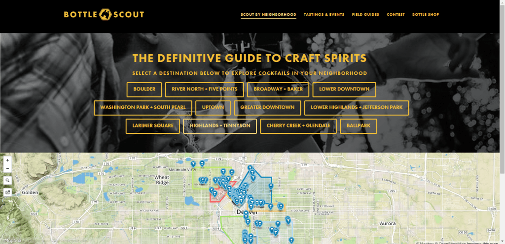
First off, we must say we love this concept and wish there were a Bottle Scout for our hometown, Tel Aviv. We’re still finding our watering holes the old fashioned way, and could use a little tech injection to this market.
But back to Conversion Optimization:
The Fold
This page is designed with very good intentions. It’s giving people two options of how to find bars in their area. It is a good thought to play to different users’ searching preferences. However, it also kind of looks like the site owners couldn’t decide which part they should put above the fold so they settled for both. Since these two parts are so visually distinct from each other, the page looks a bit awkward. I would test picking one for above the fold and the other below (of course, after testing the two options).
Word Overload
The user’s eyes are immediately drawn to the big blob of orange words in the center of the screen. It’s a great idea to list out the different areas that are served, as patrons of those areas will immediately know that this site is for them. However, there are a number of ways to better display these words. For example, they could test removing the boxes and making the font smaller, or they could test organizing them further below in a less intrusive color, or they could test only displaying them when hovering over some other text. Currently the yellow letters do such a good job at standing out. Why drown out this success?
Image to match the brand
The image here is not consistent with the messaging. Yes, it is Colorado and they’re outdoorsy people over there. And yes, these people do look like they are scouting out something. However, this is a service to find cocktails. Going with something sexier, such as good looking people enjoying a fancy drink, might be more consistent with the product. At the least, this would be a very easy test to run – just changing the background image.
10. ClipperSoft
mySimpleAds lets the user sell ad space on her website.
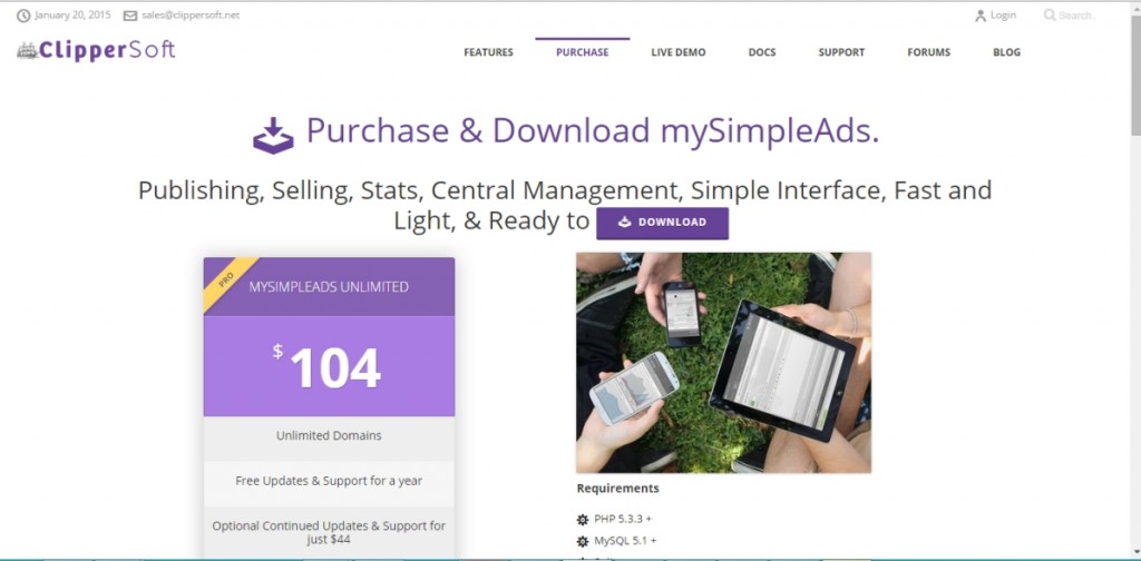
Consistency
It’s always very important to be consistent in your messaging by telling people exactly what your product is about and what you want them to do. Here are some ways that I think they could clarify their message a bit:
-
Simple vs. Complicated
At first, I see the word “simple” in the name of the product, and then the words, “simple interface, fast and light, & ready to download” in the subtitle which is awesome. All of those things sound good. However, as my gaze continues down the site, I see the requirements: PHP5.3.3+, MySQL5.1+ etc. If you want to portray the message of simplicity, don’t bring technical jargon into the mix.
-
Purchase vs. Download
It’s not clear what the user is supposed to do. It asks people to “purchase and download” but only has a download button above the fold. Also, there’s a “Buy and Download” button just below the fold. What’s the difference and how can I start using the product?
Color and Blank Space
There’s very good use of color here. The purple is simple, easy on the eyes, and consistent. For some reason we’ve covered a lot of purple for this post. As we’ve said, purple indicates creativity so maybe the more creative people seek out our help!
Lastly, it is not necessary to have information in every corner of your page, but this much white space is too much. See the AdSpike landing page above for an example of efficient use of it.
Conclusion
Well that does it for this round of landing page critiques. I tried to highlight areas of interest across the whole spectrum of landing page optimization and not to repeat the same items. If you think I missed something in this post, feel free to write in the comments. We would love to hear your take on these pages as well as suggestions for items to test.
Stay tuned for the next round.


Pingback: WTC Education's Conversion Roundup 2/13 - 2/19()
Pingback: 5 Ways to know: What can your competitors websites teach you? - Conversioner()
Pingback: Top 25 Inbound Marketing Articles from Around the Web: February 20, 2015 - SoluteMe()
Pingback: 7 Tips for Building a Better Relationship with Your Customers()