10 Tips to Optimize B2B Landing Pages
We have been getting a lot of requests to take a deeper look and map out the way to create high converting B2B landing pages. Though a landing page is a landing page, when it comes to B2B landing pages there are many different emotional triggers and nuances to take into account which is why in this post we’ll dive into those differences and try to construct a guide and checklist for you to follow when creating one.
To clarify, ‘B2B’ stands for ‘Business to Business’ and refers to businesses who’s target audience is other businesses, well-known examples would be Mailchimp, Hubspot, Kissmetrics and Conversioner of course.
B2B landing pages have a huge impact on revenues and leads. Since many B2B companies do not have a lot of traffic (as opposed to B2C companies for example), their landing pages can have a direct impact on revenues and conversions. In fact, HubSpot conducted a research and found that businesses that increased the number of landing pages from 10 to 15 (by adding just 5 more specialized landing pages), saw an increase of 55% in leads, which is why it is so important to focus on your creating high converting landing pages.
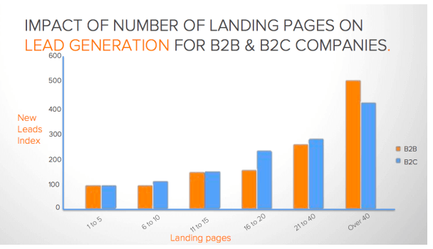
Let’s take a look at the main differences between B2B and B2C businesses and how you should consider this when optimizing your B2B landing pages.
In B2B, you are selling to a person who is buying as a product or service for company use. Your customer want to make sure that what they are buying is suitable for their professional needs and personal needs within the company. Similar to B2C customers, B2B customers do extensive market research to find the best possible solution but in this case it’s not just for them, it’s also for their company. Many times, after performing this research they will be required to present their choice to different people in the company – whether their teammates or manager which makes it a longer purchase cycle than most B2C sale cycles.
In addition to all this, once a decision is made B2B sales usually involve more complicated funnels which include invoices, contracts and accounting, which makes the whole process more complex.
Below is a table that shows these differences:
B2C : Business To Customer |
B2B: Business to Business |
|
Less Jargon in Content |
Lengthier Content |
|
Shorter Buying Cycle |
Longer Purchase Decision Process/Buying Cycle |
|
Decisions made by one person (and the person viewing is the person buying) |
Decisions Made by More Than One Person |
|
B2C Ecommerce Websites sell products directly to the user via displaying products and checkouts that accept payment |
B2B Ecommerce sites normally require accepting orders in different formats such as email, documents and electronic orders, and order capture with administrative systems such as invoicing, customers records, and accounting.
|
In order to reach and convert the target audience you are looking for you can use landing pages to target the different users, different companies, with different products or services you may have, and you can (and should) create dedicated landing pages for different ads as well.
B2B landing page optimization tips
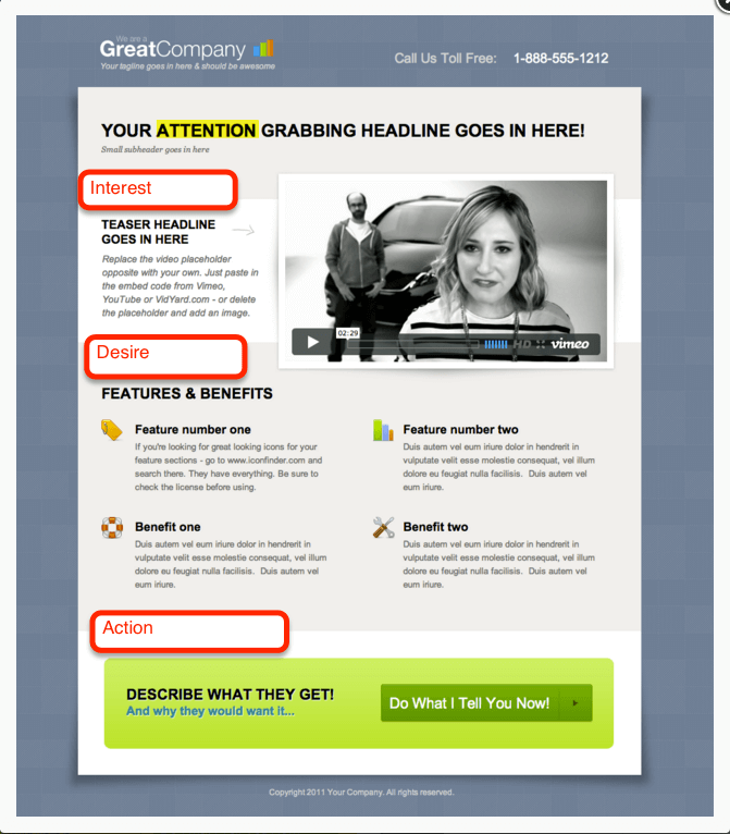
1. AIDA (like the Opera)
AIDA is a term I learned from the CopyHackers’ course I’ve been taking and I loved the way Joanna explains it:
-
Attention – Your headline should relate to the referral that brought your user in and because whatever referred them grabbed their attention, don’t lose it!
-
Interest – Explain why this is interesting to the user – facts and figures
-
Desire – Explain why this is personally good for the user (you’ll never have to worry again, you can A/B test easily with the platform, you’ll gain a better understanding of how your users interact with your site and therefore market to them better).
-
Action – Tell them what’s next – whether it’s downloading the white paper, a free ebook, buying your product or signing up for a consultation – tell your user what action to take next. Now for a B2B company, with a longer sales cycle that includes reading a lot of info, researching the market, and debating with your team/convincing the CEO that this is the right purchase, you need to consider what you are offering and what action you want your user to take.
http://unbounce.com/conversion-rate-optimization/landing-page-cta-placement/
2. Stay Consistent with the Source
You should know where your users are coming from – which ad, referral or link brought the user in – and each of those different sources should lead to different landing pages or cater to your different ad messages. In order for your landing page to have the strongest impact, it should match, in terms of copy and imagery, to the ad/link/context your user are coming from.
Why? Imagine this scenario for a moment…
Your company offers Project Management Tools along with an analysis tool and an email marketing service, but someone saw your Google Ad after searching for Project Management Tools – “The #1 Project Management Tool For Online Enterprises”. They clicked it! You want them to land on a page for your Project Management Tool specifically – to suit what they were looking for. If they land on your homepage and it says “ALL YOUR CRM AND EMAIL MARKETING NEEDS MET!”, this user, looking for a project management solution, will say – I’ve reached the wrong place! And then they will leave.
Therefore, you want them to land on a page that says “Now you’re free to focus on the important details – Project Management Tool” and they’re thinking – yes! I do need more time to focus on the important things instead of wasting my time trying to organize project data! Thank god I found this great company with such an awesome solution.
3. You Have 3 Seconds – Use Them Wisely…
You have 3 seconds to grab the attention of your user and make them stay. That means a strong headline and powerful imagery.I mentioned the headline earlier and I’ll say it again. It’s important! Your user needs to know that this is relevant to them and what they are looking for and the user needs to feel that this is also trustworthy and will solve the problems they are looking to solve. Use that emotional targeting strategy for both the imagery and the headline (short, sweet and to-the-point) to get the employee of this other company to think – “Yes. This is the right product for my company.”
4. Develop A Strategy
True or False: If you’re selling a product/service to another business, you don’t need emotional targeting.
This is… false! But I get where you’re coming from. I mean…it’s a business. It’s professional. What emotions are there?
There are many.
In B2B, your user is an individual who is responsible for finding a solution for the business you are trying to convert. They may be an Online Marketing Manager, a Project Manager, a CEO, etc. Just like you, they are a person who is sitting and searching how to improve and keep their business growing, effective, and successful. And just like you and me, they are affected by their emotions.
This person has their business’ needs – a tool, a solution, something for project management, increasing conversions, improving their email marketing, etc.
But other than the technical elements of your service, they are also affected by their own personal priorities and emotions – They might be worried about how the service is accepted and liked by their team, if it will impress their boss, or will they finally the recognition they deserve and maybe that promotion.
So before you set to designing, do some research, write up that marketing persona, and get your emotional targeting strategy down.
5. Create Landing Pages To Fit The Stages of Your Sales Cycle
- After you make them stay with these emotions, you should provide relevant information that your user is looking to hear. Keep in mind that, according to Douglas Burdett at ArtilleryMarketing, research has found that 75-98% of B2B site users are looking for information on solutions for a problem or to fulfill a need.
- Offer a livechat on your page for users to ask questions during their experience on your site! This can help you get in touch with your user and not only help them convert but also learn about their experience on your site and, based on their questions, know how to improve it. Make sure you have someone enthusiastic that knows/is passionate about your product answering the questions.
6. Pay Attention to Your Registration Form
Your registration form should fit your landing page. Depending on where your user is in the sales cycle, you want to get that lead!
- If they are early researchers, you may want to consider a simple form to receive your blog posts on relevant issues, or perhaps to get a free ebook, sign up for a webinar, or a free consultation. Offer value that isn’t straight away buying your product. Your user should have an incentive to complete this form.
- If they are more advanced in the purchase process, you may want to offer your free trial.
- It should be simple and have only the most important fields to fill in. Make this process as easy and simple as you can.
- If you’re considering using Social Logins -consider that this person is logging in as a representative of their company and not as an individual. Perhaps choose to use a LinkedIn sign in option – and test it!
- We tried it out in a case study. We didn’t even write “Login with Facebook” on the button (clicking the button brought it about). We made the page simple and changed the copy to make it more personal (check out the case study for the original) and this landing page increased signups by 35% and increased the final conversion rate by 78%.
7. Choose Your Links and Buttons With Care
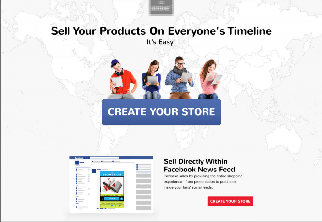
Every link and button on your landing page serves as a distraction and an exit point. The main point here is to reduce distraction. You want your user to take one action on your landing page. You can help make that happen by reducing links and buttons – focus all the attention on the most important aspect.
On your homepage you have a Navigation Bar, filled with many different options and many different pages. Your landing page should either not have a navigation bar at all, or have a limited navigation bar that provides the information your user will need in order to reach their decision, but not too many that will distract them from the goal.
Reducing distraction in order to focus on your form is crucial. Take, for example, this case study we had. This business offers a heatmap and in-depth analytics service for businesses.
This was their homepage:
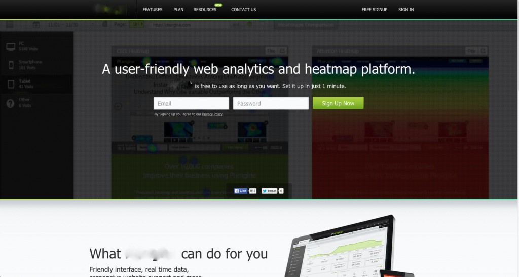
(It’s a running video in the background).
What we did is we took the main aspects, and we made the background solid, took away the share buttons, and reduced the focus to one main button.
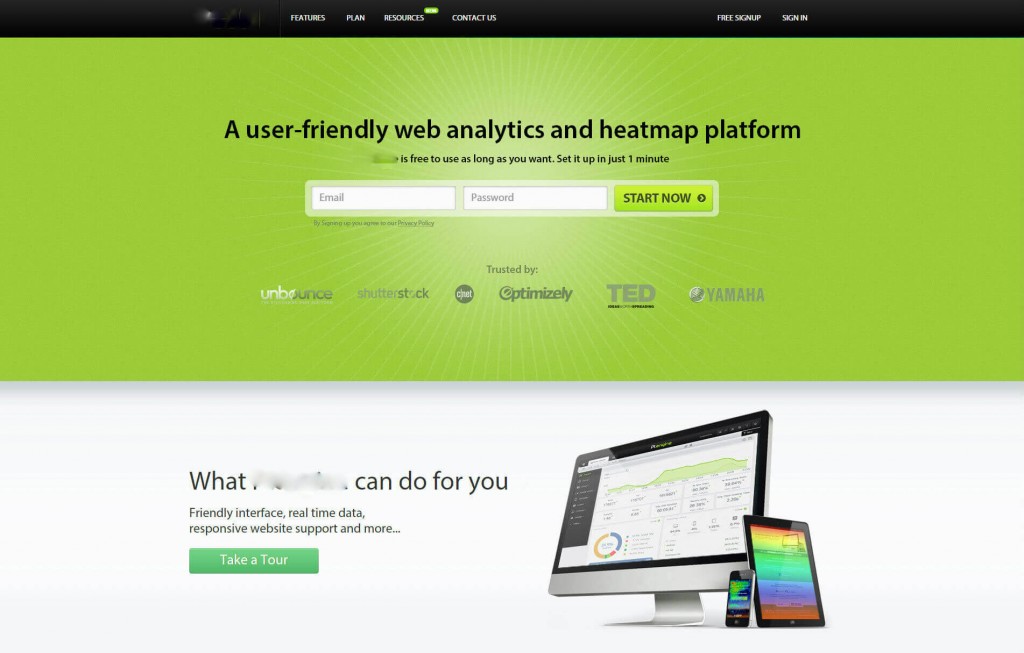
We also added social proof as you can see (which I’m about to talk about in the next step). These help increase users’ trust upon reaching this page! This landing page increased sign ups by 25%.
8. The One Time Bragging Comes In Handy
You want your user to trust that you are amazing, wonderful, and great and that everyone loves you so they will love you too. You want to prove that you work, and you work well. So BRAG!
- If you’ve been mentioned or featured in a fantastic article praising your growth, your success – or just mentioning you – let them know!
- If you have been given great testimonials – let them know!
- If your product is being used by big names – let them know!
- Example: “We are a trusted partner of Optimizely”, “We’ve Been Featured in: Buzzfeed, Huffington Post, MIT News, Forbes, and The Economist”, “BestCompanyEver has helped me manage my project team splendidly! We can communicate clearly, keep all tasks organized, and track user behavior like never before!”
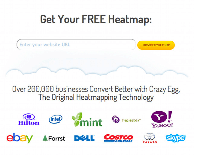
CrazyEgg used a nice array of social proof on their landing page to show who else uses their heatmap analytics so you would feel comfortable to.
9. The Only Actual Way To Optimize is to Measure
When creating your landing page, although it is separate from your site in most cases, make sure you are tracking it. You want to know how many people clicked, where, why, and whether they watched that video you included. You do all of this in order to learn more about your users and see what works and what doesn’t, and learn more about how to target your users better. You can also see where they may be leaving along the way and work on optimizing those steps too.
10. The Sales Cycle is a Journey
The landing page itself is critical and we gave tips here but it is important to note that when we discuss the landing page, there is a whole process around it that needs to flow well!
-
The Attention Grabber – whatever ad, email link, blog post link, or other referral brought them to your landing page
-
The Landing Page – the page itself is important, obviously, in order to continue the process
-
The Form – discussed above- is that clincher in the landing page where you actually get the user to take the action you want them to!
-
The Thank You Page – once they’ve filled out the form, you want to show your appreciation and that the form has been successfully completed and that they’re getting what they wanted. But a blank page with “Thank you. You have successfully registered.” is not going to leave a good impact. The thank you form is still part of this pathway – so leave a good impression and a positive feeling.
-
The Confirmation Email – This is your chance to truly, directly communicate with your user! You can make a great impact with your wording and content of this email. You can show your company’s personality, professionalism, and make that personal connection that can take the cycle to the next level!
B2B Landing Pages are crucial for the sales cycle, but a lot of it depends on your users, their needs, and how well you know your usersl. So while you work on building the optimal landing page, keep these in mind.
As we briefly mentioned last week, we worked with a B2B company on their landing page and asked you who you thought was the winner.
Here, again, is the original landing page:
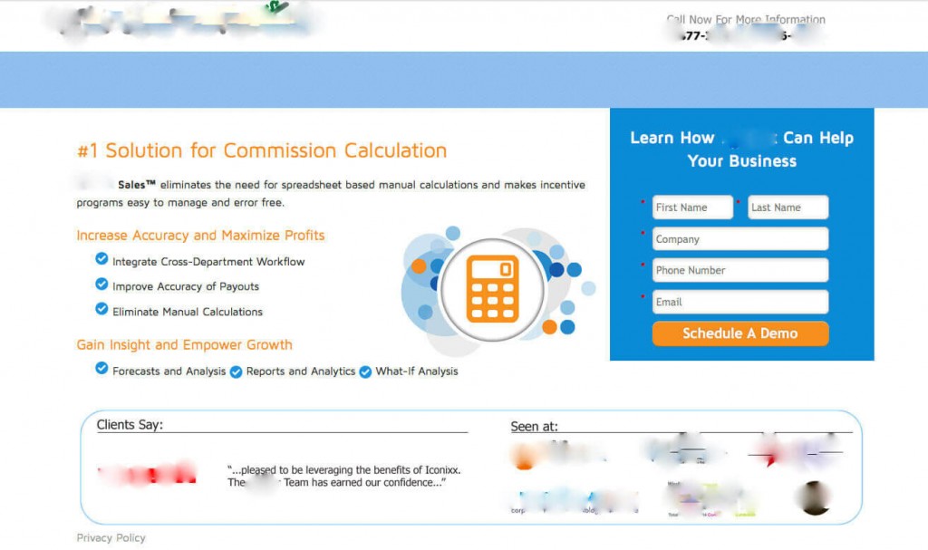
Here is Variation 1:
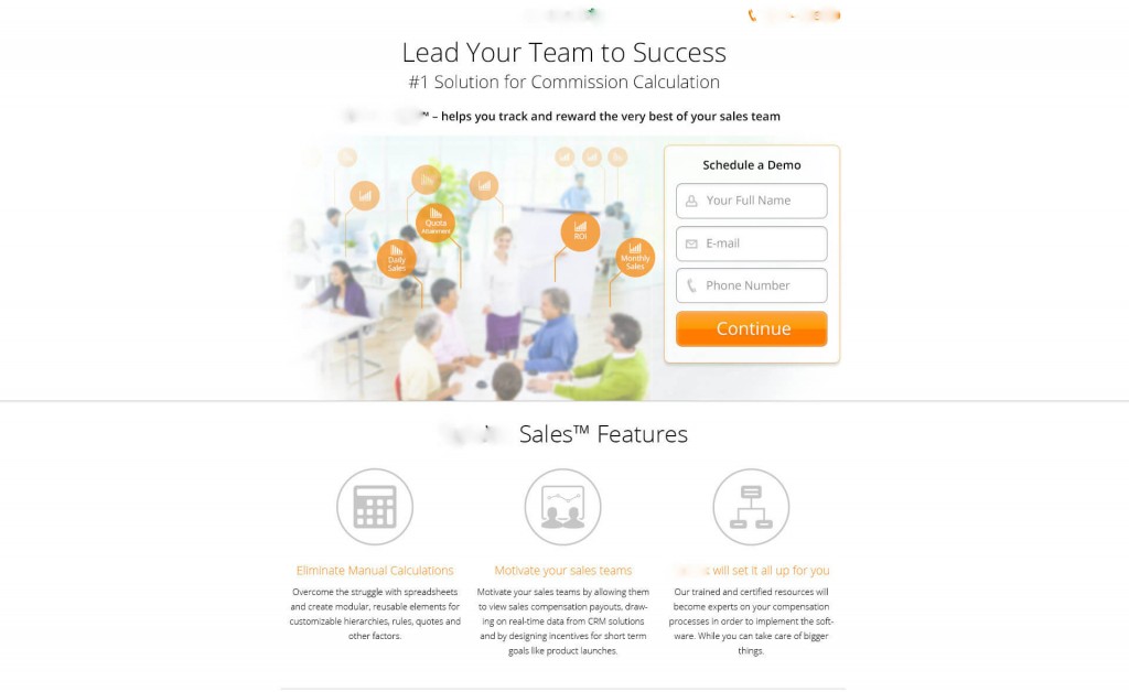
And here is Variation 2:
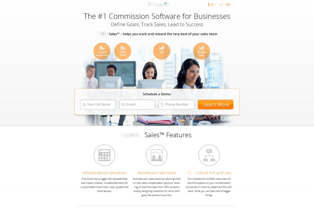
And here are the final results!
Variation 1 increased leads collection by 98%.
Variation 2 increased leads collection by 33%
So whoever guessed variation 1 was correct!
If you are working on a landing page for your B2B site and want some advice, feel free to reach out! And if there’s a specific topic that has been nagging you, coming up a lot, or has you curious – let us know! We love writing posts about what interests you.


Pingback: 10 Tips to Optimize B2B Landing Pages – Conversioner |()
Pingback: Your Must-Read Marketing Tech Digest for Thursday, 11/12/15 #MarTech #DigitalMarketing - marketingIO()
Pingback: Recopilatorio #134: Cómo crear una estrategia de contenidos sin necesidad de tener blog()